Turning Web Design on Its Side for Square Co-Founder Jim McKelvey
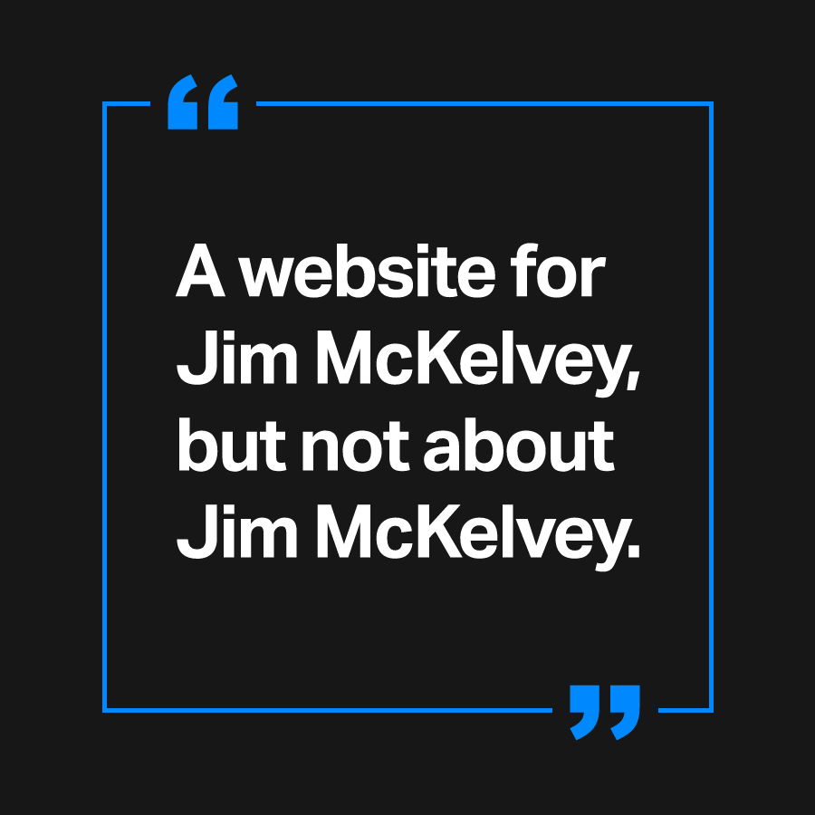
“The world doesn’t need another Wikipedia page about Jim McKelvey.”
That’s what Jim McKelvey himself told our team during our first meeting, as we discussed the goals for his new website.
The artist, philanthropist and tech mogul (Jim co-founded Square in 2009) was about to publish a book, called The Innovation Stack. He needed a place to share his ideas and opinions. A place that could be a conduit to ideas, and share interesting articles or write about problems he wants to solve—all in the hopes of inspiring others to innovate. A website for Jim McKelvey, but not about Jim McKelvey.
So we got to work.

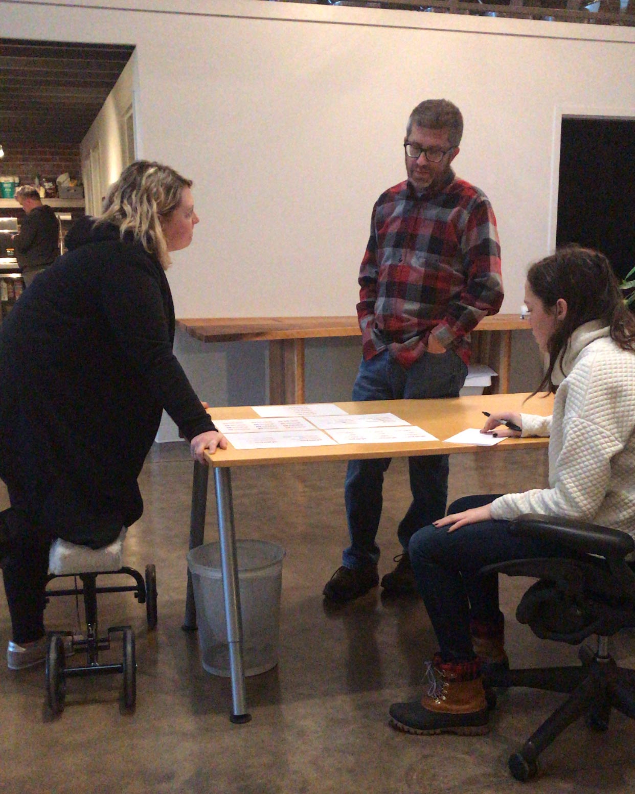
Early concepts.
Our first iterations of the website designs were pretty much a straightforward author website—and not at all what he was looking for.
We kept the design simple to reflect Jim’s minimalist style, but it focused too much on Jim, promoting him and his book.
Jim’s a cool guy, and by making the site all about him, that coolness was obscured. He has a long list of impressive accomplishments, and he didn’t like the idea of a site that might make it seem like he was boasting or egotistical. (Besides, if you ask us, those accomplishments speak for themselves anyway.)
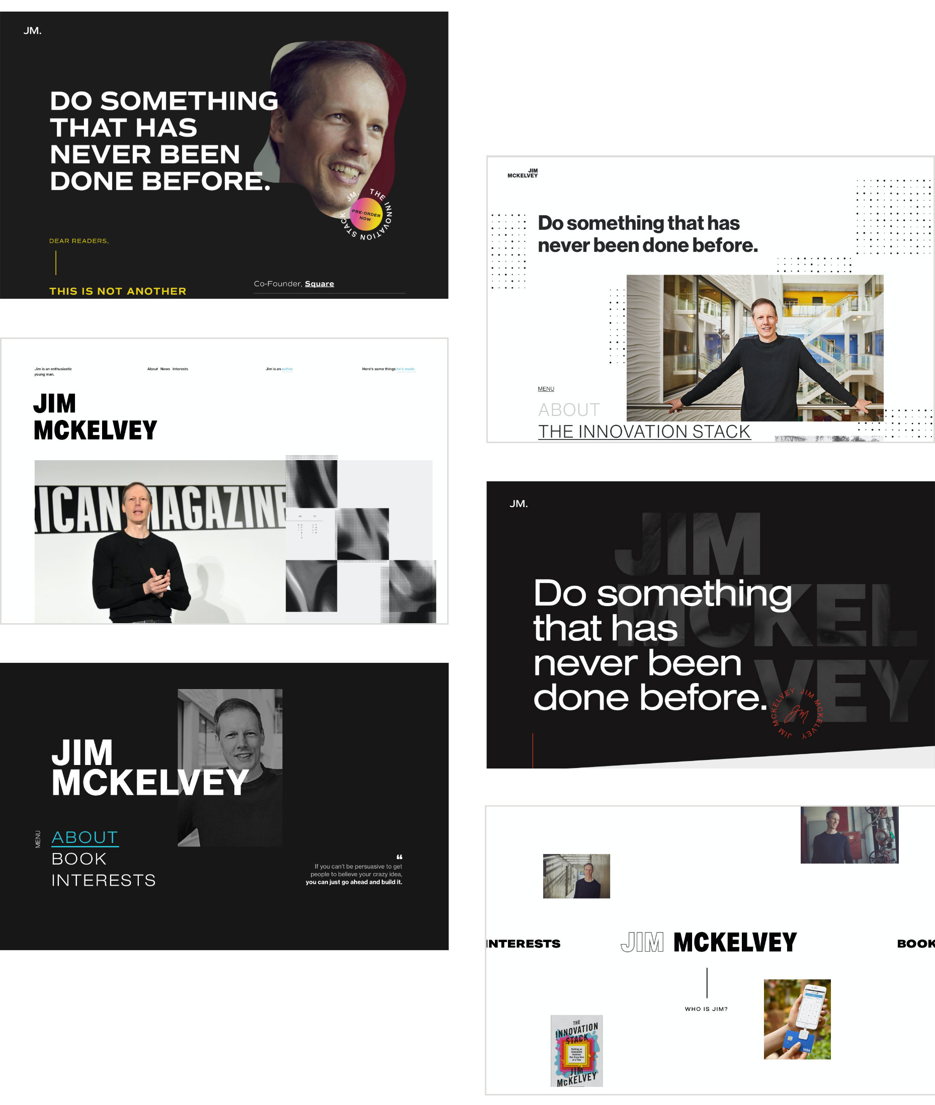
First iterations of Jim McKelvey’s Website Design
The leader in innovation and tech needed a website that was more innovative and tech-forward.
We went back to the drawing board Adobe XD.
Something to mess it all up.
Most designers are familiar with grid systems, which allow them to arrange elements in an organized, balanced and coherent way. Most modern websites are based on the framework, including this one—but usually they’re invisible to the untrained eye.
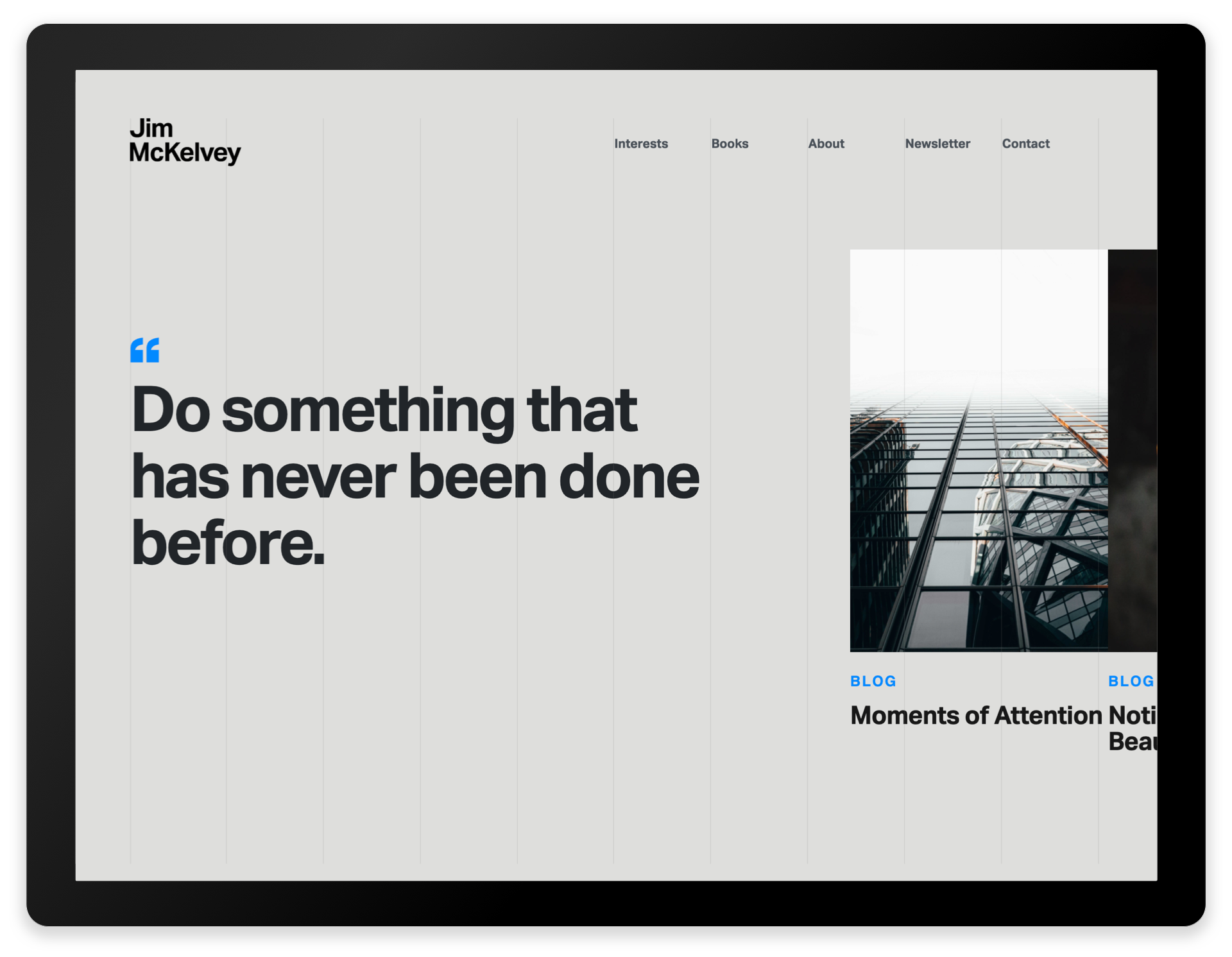
To make things interesting, we made the grid visible.
We added thin, vertical lines against the background to hint at the grid structure. By using a grid, and therefore the negative space, we could hang the content in a way that’s visually interesting.


It still needed something else though. As Atomicdust’s Partner/Creative Director Mike Spakowski says, good design is a cool image, a legible typeface and something to mess it all up.
That’s when we added the horizontal scroll, to break convention and surprise the user. Using Adobe XD, the tool we mentioned earlier, we set up a prototype of the site where we could test the feature and see how it worked.
We were hooked—the horizontal scroll added a little unexpected element, without compromising the usability of the site. The horizontal scroll was the element to mess it all up.
Now we just needed to nail down the rest.
Setting the tone.
We approached the website’s language as if Jim were writing it himself, which was, if you ask our senior copywriter Rich, pretty intimidating.
In addition to being an extremely successful businessman and now published author, Jim has both a sharp sense of humor and unique insights. As he told us, there’s a reason he’s not personally very active on Facebook or Twitter: disclaimers can’t fit into 280 characters—it takes two lawyers to defend his sense of humor.
So, we wrote copy that, like Jim, is both inspiring and candid. At times it’s self-deprecating and irreverent. The language pushes the visitor to push boundaries, and themselves.
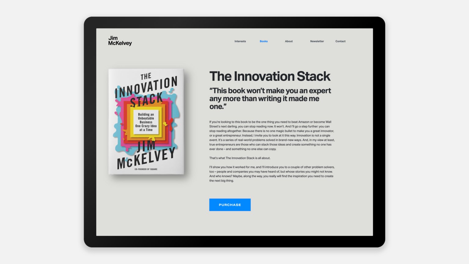
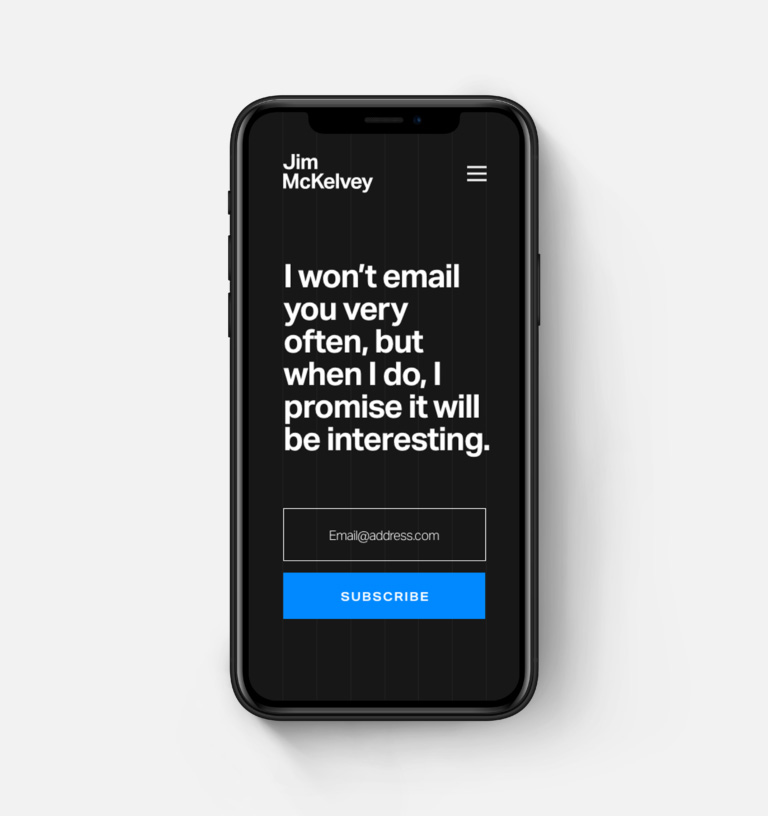
An important aspect of the website is the blog, or as we dubbed it, Interests. This is where Jim can share his ideas and experiences, as well as connect with visitors. More than merely connecting, Jim wanted to inspire people—to show the power of ideas and innovation to transform the world and solve some of our most vexing problems.
We bucked convention by making the header photo thumbnails on the Insights page vertical, and the page’s headline makes visitors feel like they’re having a coffee with Jim: “Here’s what I’ve been thinking about lately.”
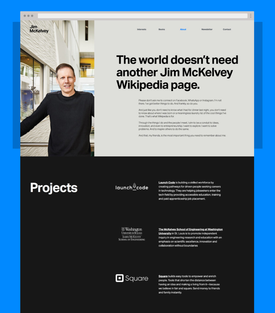
We did include information about Jim’s accomplishments, but made sure the focus was on the ideas, and not Jim, by placing them “below the fold” on the About page and describing the projects themselves—not Jim’s involvement with them.
Stop, collaborate and listen.
Jim loved the new version of the website. High fives all around.
Ironically, this process was similar to Jim’s experiences in bringing new ideas to life, as he described in his book, The Innovation Stack—when you’re doing something that’s never been done before, failing at first is part of the process. Without the initial designs and Jim’s feedback, we never would have arrived at the final outcome.
But the best projects are collaborative, both client and agency pushing the other and forming the end result together.
And it’s about as different from a Wikipedia page as you can get, so I’d say it’s a success.
Since the site went live, it’s won numerous awards, including a 2021 AVA Digital Award, GDUSA American Graphic Design Award, dotCOMM Award and MarCom Award. The site was also featured on Awwwards. Explore the site.


