Welcome Home: New Branding and Website for Local Residential Management Company
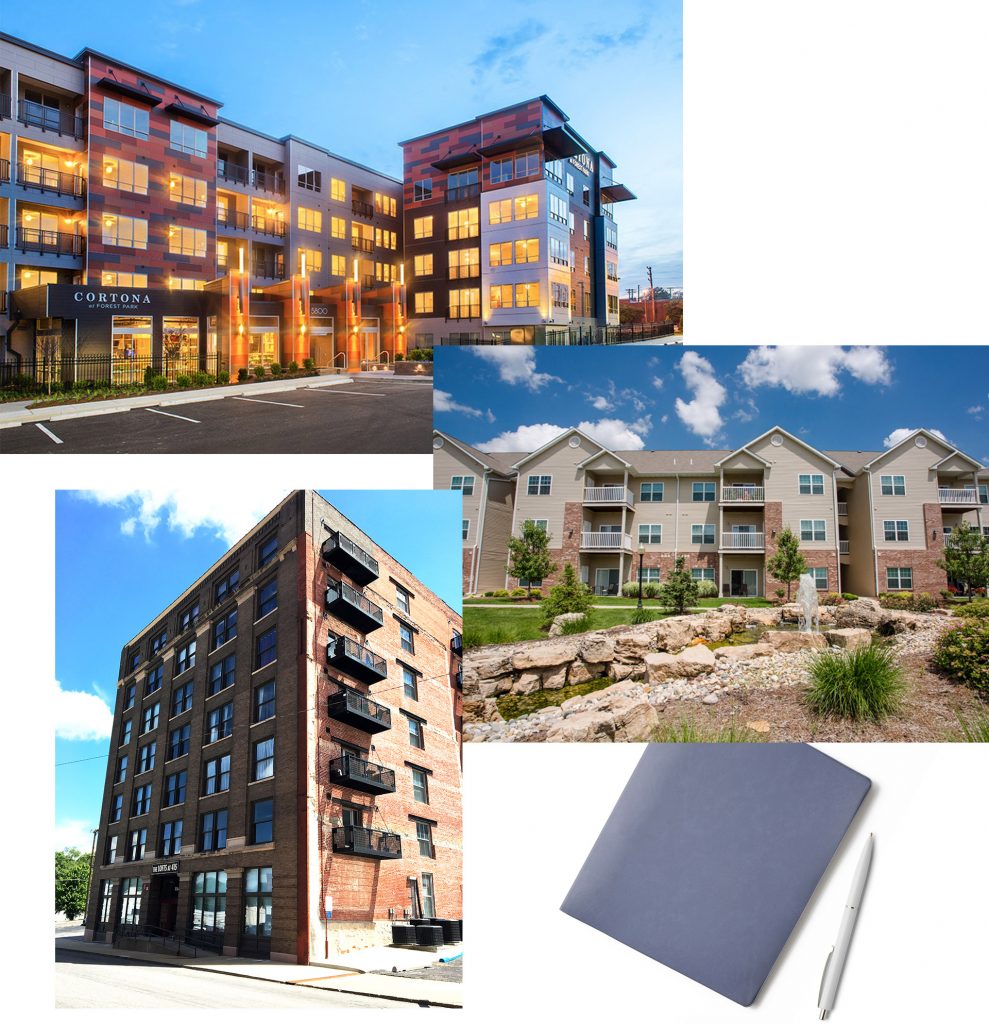
Thanks to the success of high-end, high-visibility, award-winning projects like Cortona at Forest Park, Balke Brown’s Residential Management division is flourishing. Looking to continue this growth, they turned to Atomicdust earlier this year to give the division its own identity.
While Balke Brown was the developer on Cortona, it also manages the property, providing marketing and support, and a range of high-touch, resident-facing services like front-desk staffing, maintenance, security and more.
The company was looking to continue growing the management side of the business, which often means partnering with firms it may compete against on the development side. A separate brand would help Balke Brown avoid questions of conflicts and establish a solid footing on its own merits.
It also meant the new brand identity needed to appeal to two disparate audiences: first, the prospective developers or property owners looking for third-party management partners; and second, future residents looking for apartments in the areas served by the brand.
Through our branding process, we learned that while property developers, owners and residents each have their own distinct motivations and concerns, they do share a common trait – they’re looking for community.
After all, property management companies are only as strong as the communities they manage. This brand needed to be about more than “apartments” which are, essentially, a commodity. We had to capture that warm and friendly approach – and in turn, show potential third-party management clients the benefits of working with Balke Brown’s Residential Management division.
What’s in a Name?
Early on in the process, during one of our marathon name-list-making sessions, a name landed on our list that seemed to check all of the boxes.
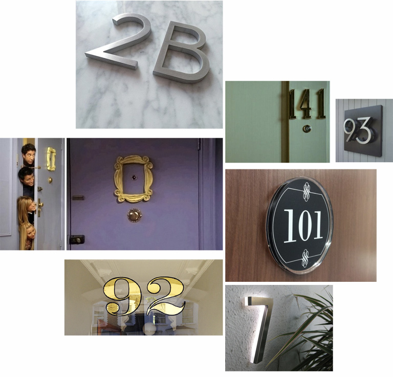
It honored the Balke Brown heritage but also stood out on its own. It would appeal to prospective residents, but also to potential business partners.
![]()
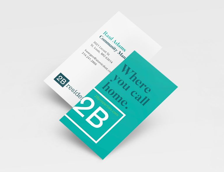
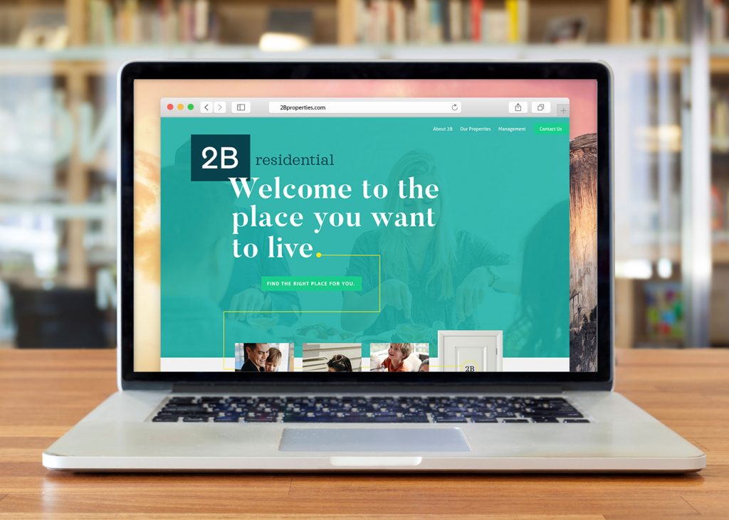
The name was 2B Residential.
The two B’s are, of course, a nod to the parent company, Balke Brown. But what we loved most about it was it’s neighborly feel — as in, “Hi, this is Rich from 2B.” We imagined property managers introducing themselves in this way to potential tenants, a reflection of the friendly atmosphere. At the same time, it also has the professional air that will give property owners and developers confidence.
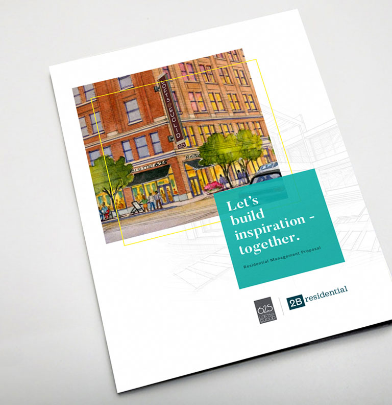
Bringing 2B Residential to Life
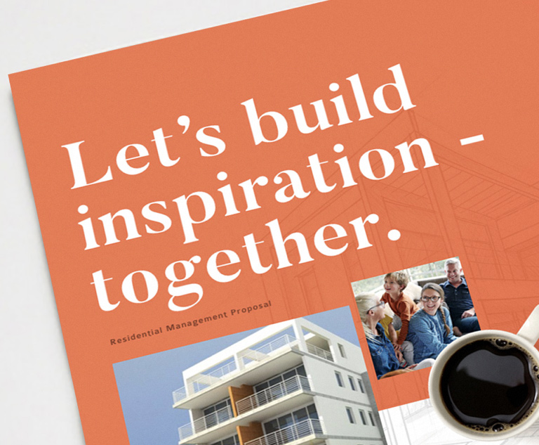
At 2B, it’s not just about an apartment. It’s about the home. And we designed the brand messaging to reflect those values.
Phrases like Welcome to the place you want to live and Communities people are proud to call home remind prospective developers, property owners and residents of 2B’s focus. Even on the website, the typical navigation link for “Apartments” or “Properties” was replaced with “Our Communities,” a small, but significant, reinforcement of the brand’s values.
![]()
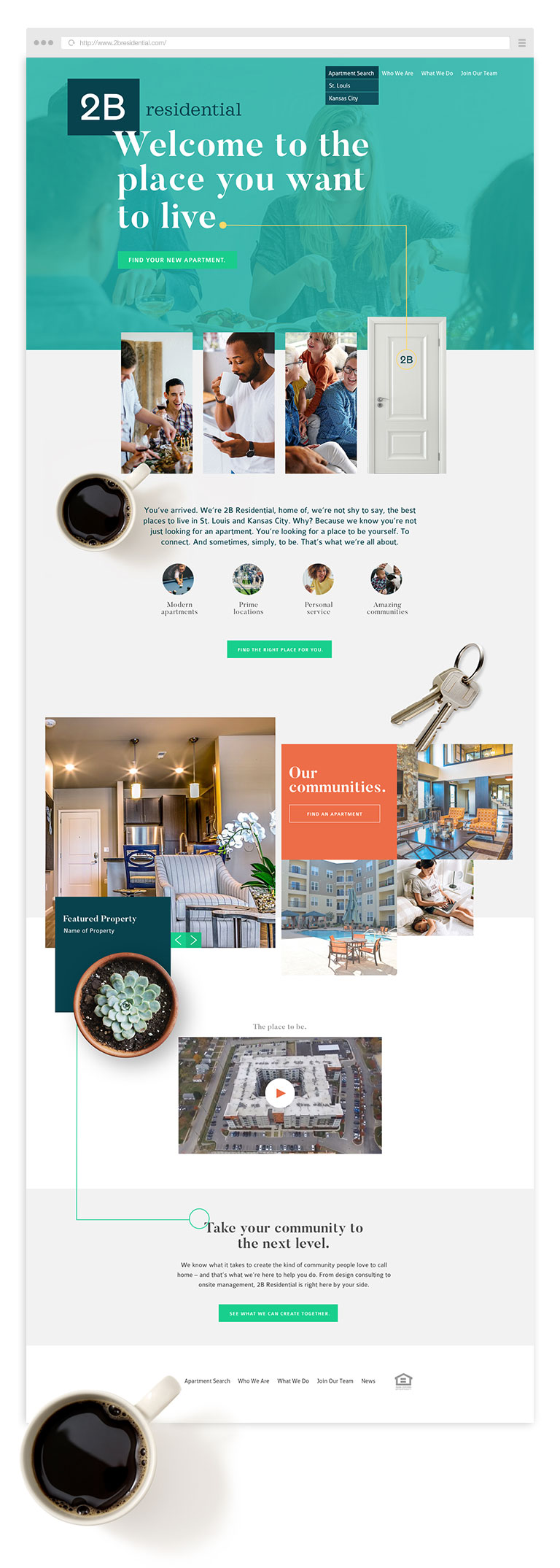
When it came to designing the visual identity of 2B, we wanted to communicate this same sense of community. The vibrant color palette exudes friendly energy. Clean lines, a healthy dose of white space and sophisticated typography give the brand a modern look.
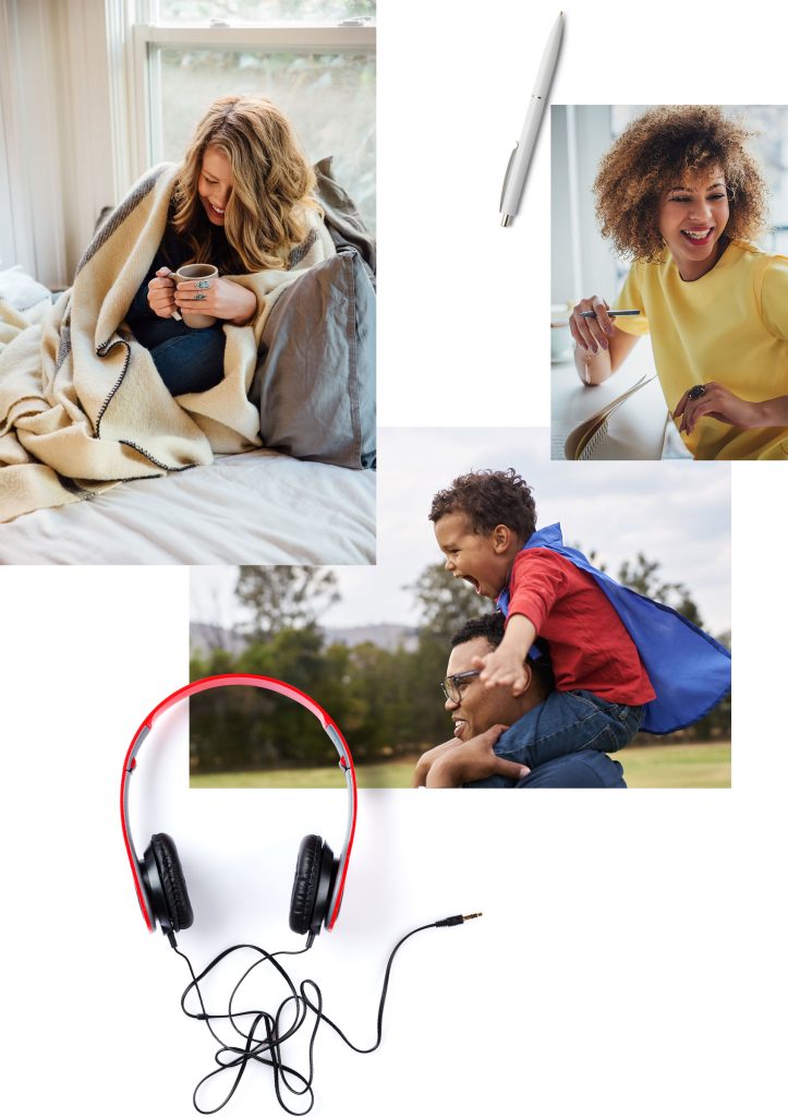
It’s common in the real estate industry to rely on photos of beautifully furnished apartments. And while we still have plenty of those, we approached 2B as a lifestyle brand. The photography focuses on authentic human interactions, pairing interior photos with familiar scenes – cooking dinner, playing pool and signing a lease.
And to add some depth, we incorporated items that make a house (or apartment, rather) a home — a set of keys, a morning cup of coffee, a big bowl of popcorn for movie night. These items became an ownable brand element on the web and other sales collateral.
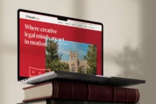
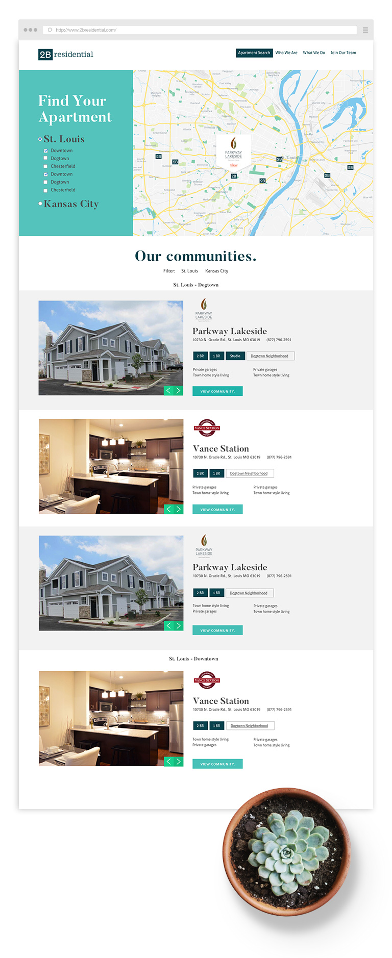
In an industry where just about every competitor is touting “attention to detail,” we knew that it was important for the website to show, rather than tell. With comprehensive search tools, an interactive map and in-depth community pages, we’ve made it easy for prospective residents to find a place that fits their needs and feels like home. These same tools demonstrate to property owners the breadth of 2B’s experience, and establishes the level of quality everyone can expect from one of their properties.
Room to Grow
As is our custom here at Atomicdust, we built the 2B website with an eye toward expansion. As the company manages more and more properties, they’ll easily be able to add them to the portfolio, further reinforcing the brand – both for residents and clients.
Check out the new 2B Residential website – just try not to catch apartment envy.
Want to keep up with the latest work from Atomicdust?
Subscribe to our newsletter for all the latest news, events and weekly marketing tips from our team.