20 Years of Street Fest Magic: Grove Fest Visual Identity
In the area between downtown St. Louis, Forest Park and South City, there’s a stretch of Manchester Ave. where culture and creativity thrive.
To locals, the six or seven blocks are known simply as “The Grove.”
From its roots as a thoroughfare lined with factories, it has evolved into one of St. Louis’ most vibrant cultural destinations.
Known for its iconic neon sign, global-inspired dining options, vibrant nightlife, colorful street art and strong ties to the LGBTQ+ community, The Grove has become a destination where art, music and food come together in murals, festivals and events. It’s a place that celebrates reinvention while staying rooted in the city limits—a destination that makes everyone feel like they belong.
A community gathering
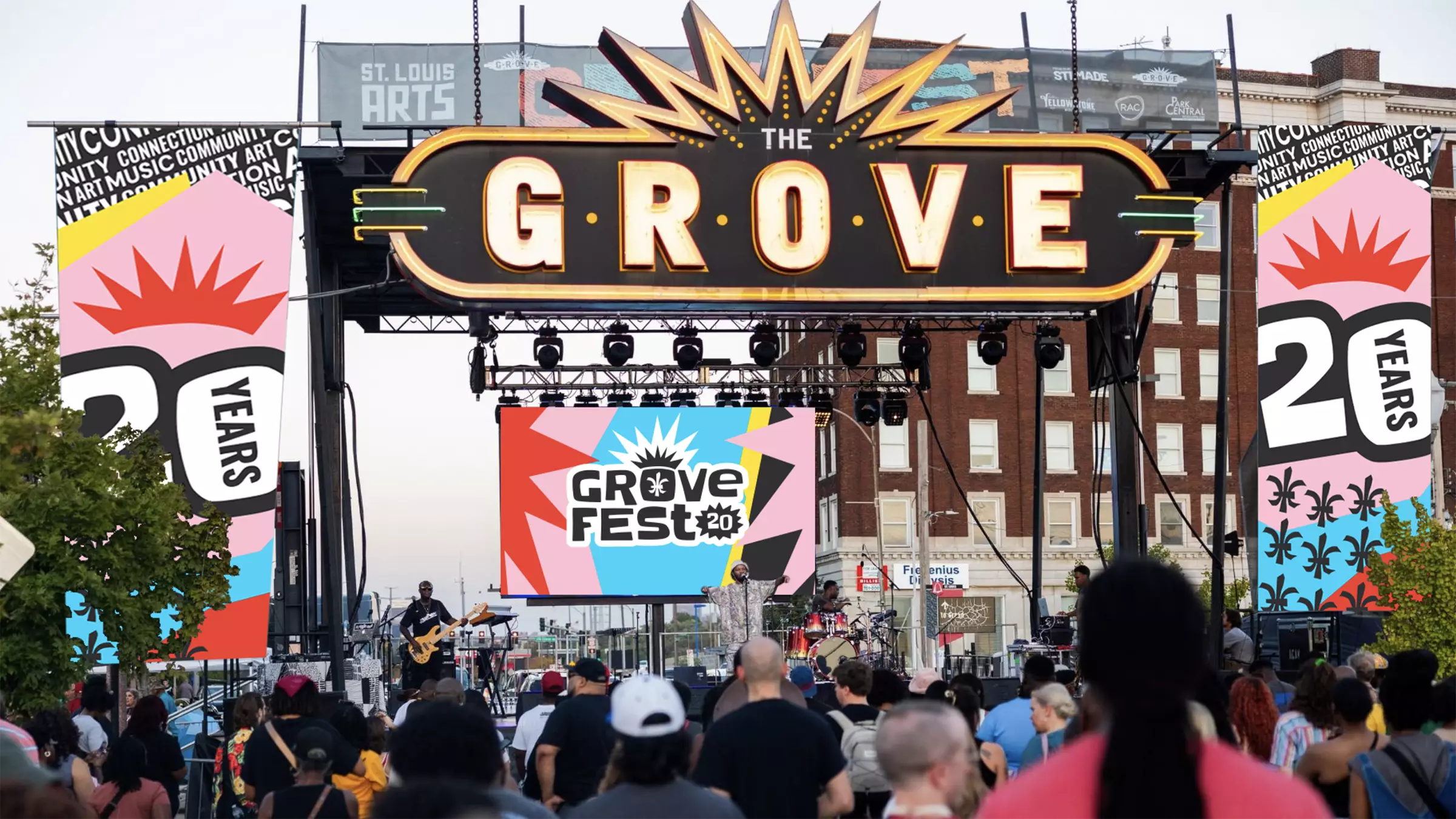
Every October, community development organization Park Central Development hosts Grove Fest—a celebration of local creativity and business, and a magnet for people throughout the metro region to stop by the neighborhood.
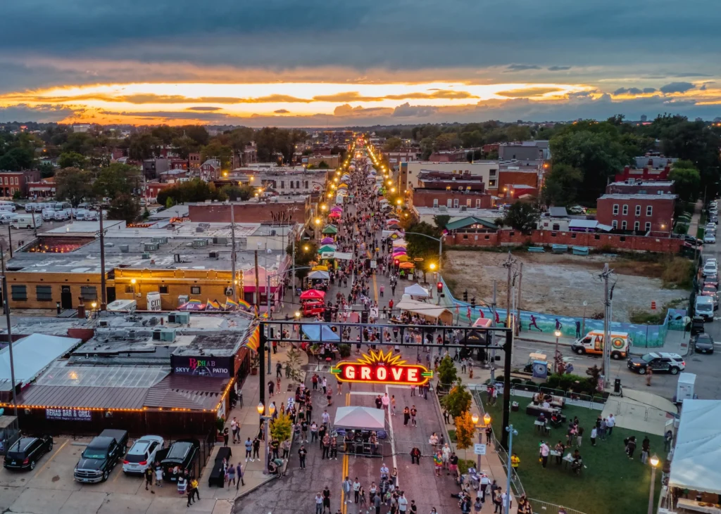
Photo by Christopher Taber (via The Grove website)
Grove Fest pulls off something pretty special. It transforms Manchester Avenue into an incredible collision of art, food, music and energy. For 20 years now, the celebration has been showcasing everything bold and creative about the region.
So naturally, when Park Central Development asked us to design a visual brand identity for the 20th anniversary of the event, we agreed.
How hard could it be to capture two decades of unforgettable culture in a single mark?
Finding the vibe
The brief was simple—kind of: develop a visual system that blends art, music, vibrancy, the Grove neighborhood and the number “20” in the design.
Weaving together those ideas led us to overlapping shapes, textured layers and bright and bold colors in a patchwork design that feels like The Grove itself.
Every element of the logo was designed with intention.
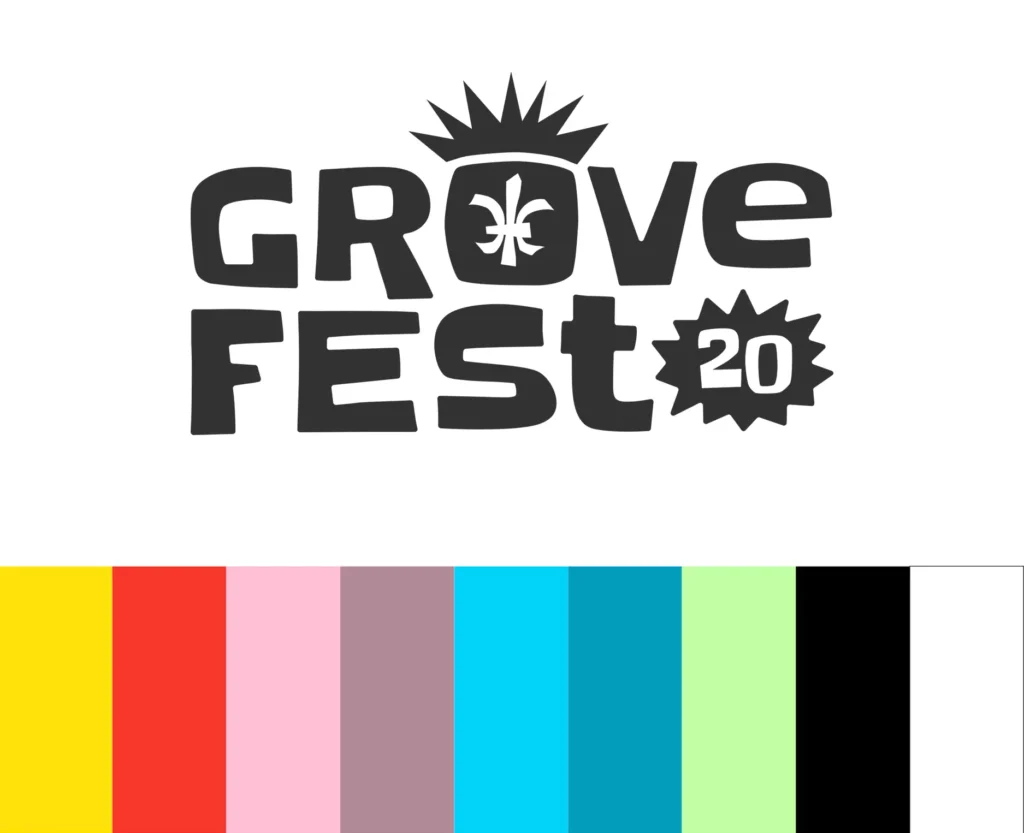
The fleur-de-lis, a symbol of St. Louis and its French roots, is integrated to highlight the festival’s role as one of the city’s premier street events.
The typography matches the dynamic, retro-meets-modern energy established in the color palette. Nodding to the event’s 20-year history, clear because of the milestone anniversary, ensuring the logo celebrates the two decades of culture and art.
The “crown” element was our little nod to the iconic Grove entrance signs, plus a not-so-subtle hint that this festival has earned its place as cultural royalty around here. Just like the event itself, the overall aesthetic is casual, approachable and bright.


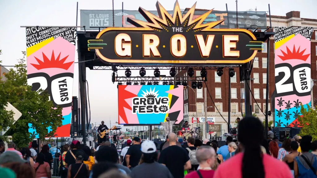


To help the event team use the identity, we developed mockups of how the brand could live in the real world, from swag to signage to social media. With these in hand, they had a clear blueprint of how to apply the visual elements across mediums.
We were even more excited about Grove Fest than usual this year—and like always, felt inspired by and proud of The Grove, St. Louis and the people that make it amazing.
