Mergers can be like marriages—thrilling and risky, combined with serious discussions around identity, responsibilities and who makes better coffee.
When Lightedge and Connectria tied the corporate knot, they needed an identity that felt true to both their pasts and shared future.
We’d already worked with Connectria on a previous website project, so we knew the space. But this time, the stakes were higher. The challenge? IT infrastructure is a crowded space. Everyone talks about the cloud. Everyone promises scale, security and expertise. But not everyone delivers. And not every client needs the same cookie-cutter, all-in-one solution.
The new team came to us with a big ask and a bigger opportunity. They needed a brand that would unite the two companies and capture the best of their distinct cultures. They needed to speak with a single, clear voice in a crowded field.
In turn, they also needed a website that would help them express their difference in bold new ways. They needed the site to drive interest and leads, and be a platform for thought leadership.
No small ask, right?
Brightening the future of two technical teams.
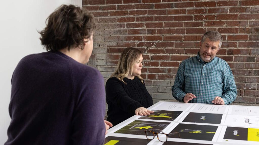
We started by talking to key people at all levels of both companies. The goal? To uncover points of agreement and dissent. We dug into their service approaches and philosophies, all to discover the combined values that drive their success.
From there we analyzed how their key competitors position themselves, because the only way to say something unique is to know what everyone else is saying.
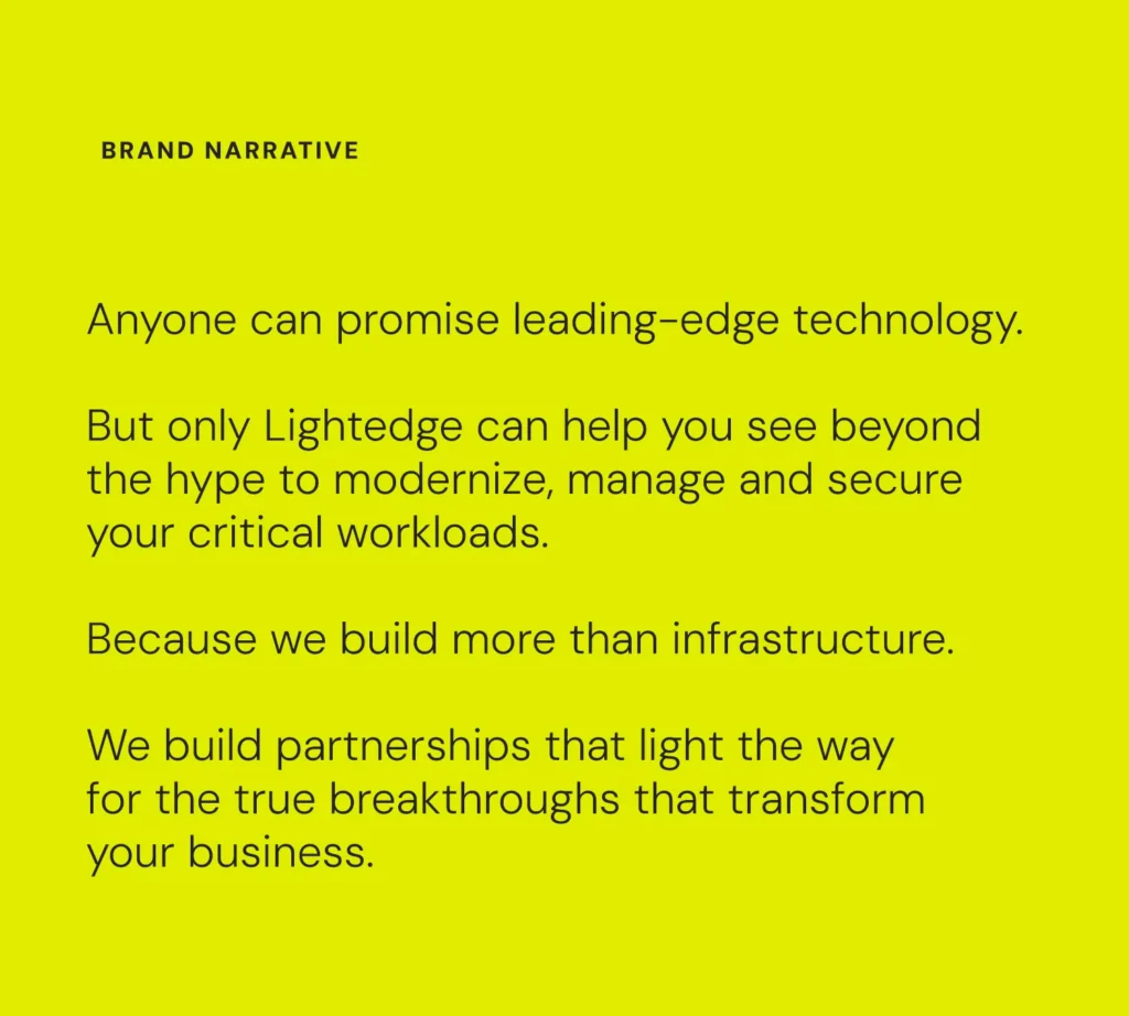
Our study of the industry landscape revealed an opportunity to make an intriguing promise—rooted in IT infrastructure, of course, but also in the consultative nature of Lightedge’s approach.

Lightedge isn’t about chasing the latest hype-driven buzzwords or going all-in on the flashiest new technology for technology’s sake. With their combined services, the new Lightedge is about hand-selecting the right solutions for every client.
It might be the public cloud that has been the darling of the industry in recent years. It could be old standards like on-prem or colocation. It could be private cloud. Or it could be a hybrid model that brings it all together.
And with that insight—that Lightedge helps clients look past the noise and find solutions that actually work—our brand-focused brains were off to the races.
Routing the right message.
It’s worth repeating: IT infrastructure is a crowded industry. Everyone is making the same big promises around the biggest, newest tech. This noise, and Lightedge’s ability to rise above it, became central to our messaging.
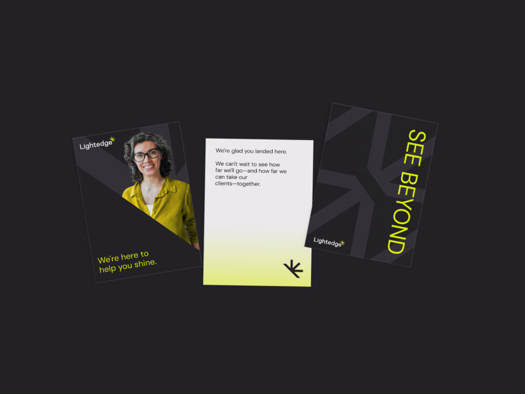
The tagline, “See Beyond,” works on so many levels. It’s a bold promise to clients that Lightedge is willing to reach past flash to build long-term partnerships. It’s also a reminder to Lightedge’s employees—now united under a single name—that their jobs are about more than technology. They’re about helping clients achieve real business breakthroughs.
It’s a lot to ask of two simple words, but “See beyond” is up to the task.
Subtly smoothing the way to clarity.
One of the first things we did was change Lightedge’s name.
Well, not exactly. In the former iteration of the brand, they capitalized the “E.” As in, LightEdge.
As we envisioned the brand’s clean lines (more on that in a bit), based on how their experts create smooth-running solutions that streamline IT infrastructure, we thought the lowercase “e” was more appropriate.
This nice, even name lit the way for the rest of our design approach.
Illuminating the competition.
But we still had a big question looming: what does it look like?
What does it look like when you promise to build more than IT infrastructure—and IT infrastructure is exactly what you’re building?
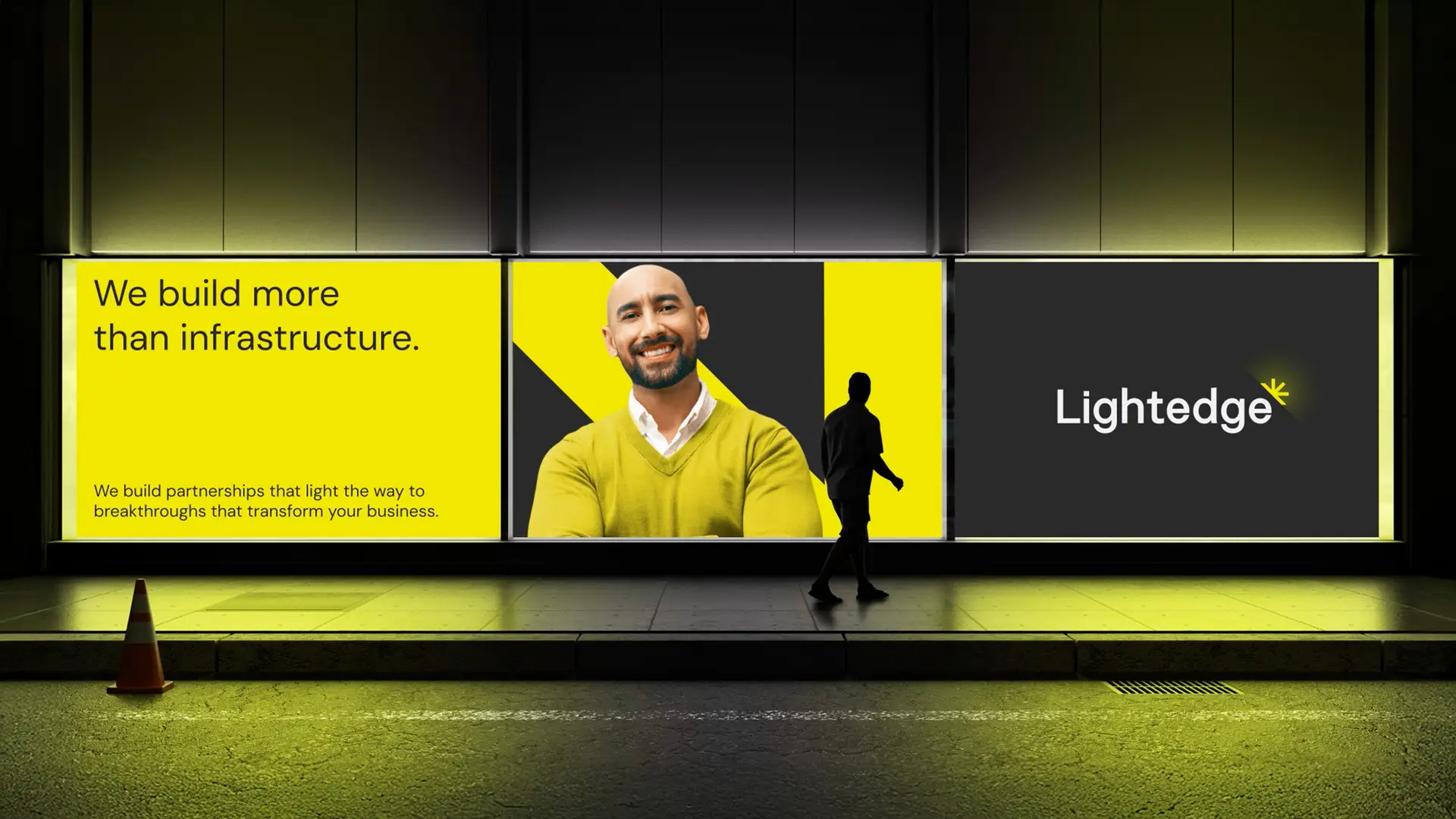
While most competitors play it safe, we saw an opportunity to go bold. To step beyond the often-used sea tones and deep purples saturating the industry.
![]()
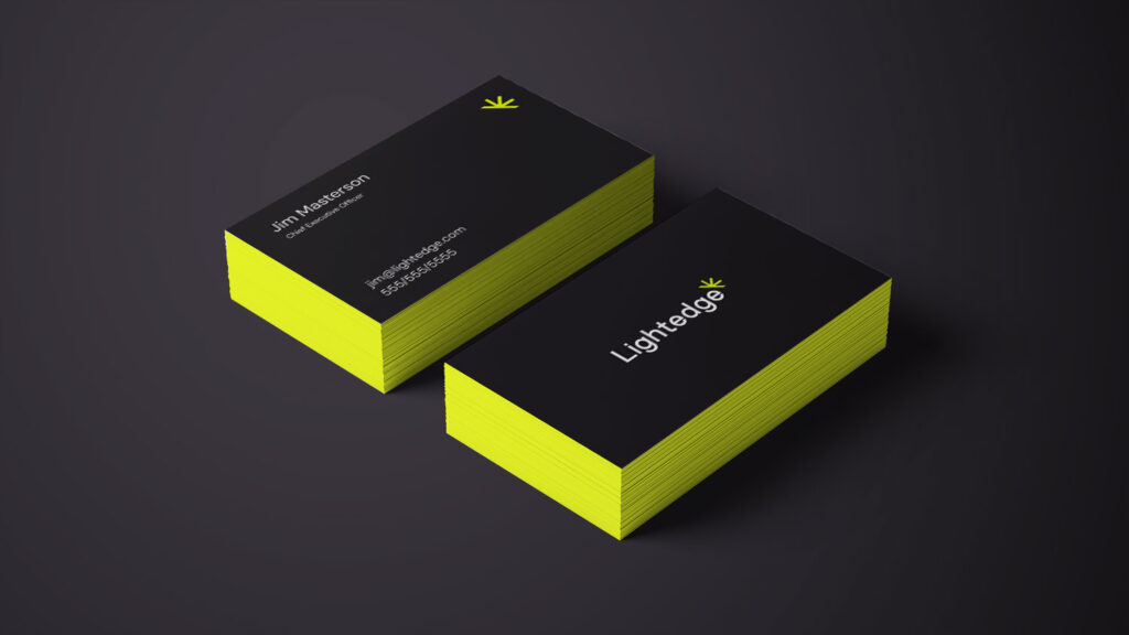
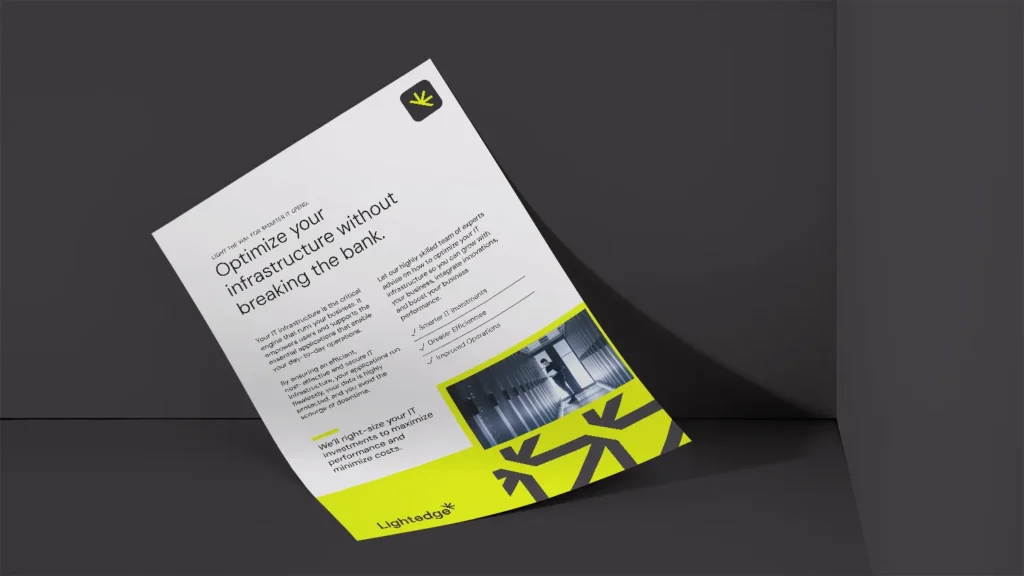
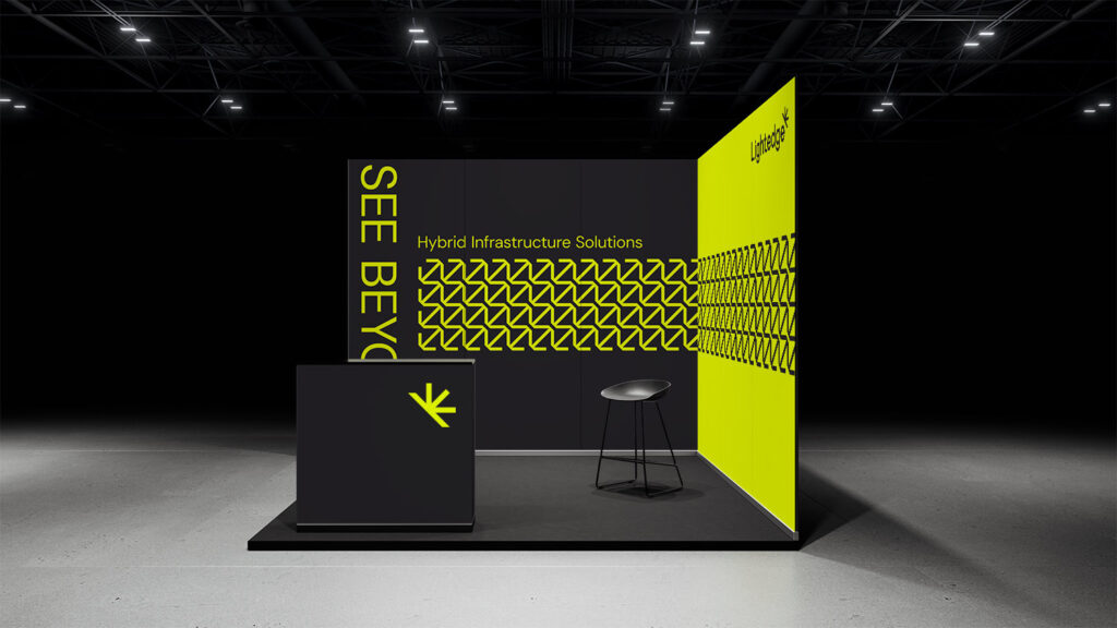
Inspired by the brand language of “lighting the way,” we introduced a fresh, high-contrast palette, pairing black with purposeful pops of highlighter yellow, bringing attention to what’s important.
The eye-catching, angular logo feels current, trustworthy and stable. With nods to fiber optics and light—and a bright sunburst hanging off the final “e”—everything comes together to be modern and memorable.
![]()
The best logos tell a story, and this one absolutely does. It’s tech-forward. It’s friendly. It’s smart. It’s bold. You can almost hear the echoes of “lighting the way” and “breaking through” in the key strokes of the mark.

![]()
And just as Lightedge builds its IT solutions for flexibility, we build the logo system to scale. Of course, it looks sharp at any size. And the sunburst mark stands solidly on its own for social media and other small-space applications.
Now, with the visual identity in place, it was time to put it into action—with a shiny new website.
A unified brand, now online.
The Lightedge website had a big job to do.
When you’re promising to solve clients’ tech challenges, a mediocre website just won’t cut it.
We wanted to create a site that does more than showcase the new brand. We wanted to convey illumination and movement through a consistent, carefully curated experience. And of course, the site needed to drive interest and leads.
These thoughtful animations are more than eye candy. They purposefully tell the story of how Lightedge lights the way to possibility for their clients, helping them see beyond their business challenges and reach toward real business solutions.
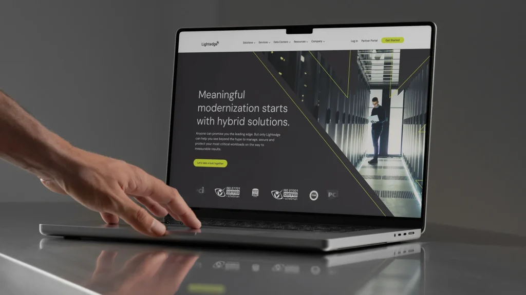
Big and bold on the homepage, an animated outline highlights the logo, symbolizing the company’s forward momentum while drawing visitors in. As users scroll, load animations literally highlight key messaging—a subtle nod to the positioning that brings important concepts to light.
We worked closely with the client to deliver a one-two-three punch of proof. A dynamic section of the homepage lists key tech challenges mid- to large-size businesses may be facing, and maps them directly to Lightedge solutions.
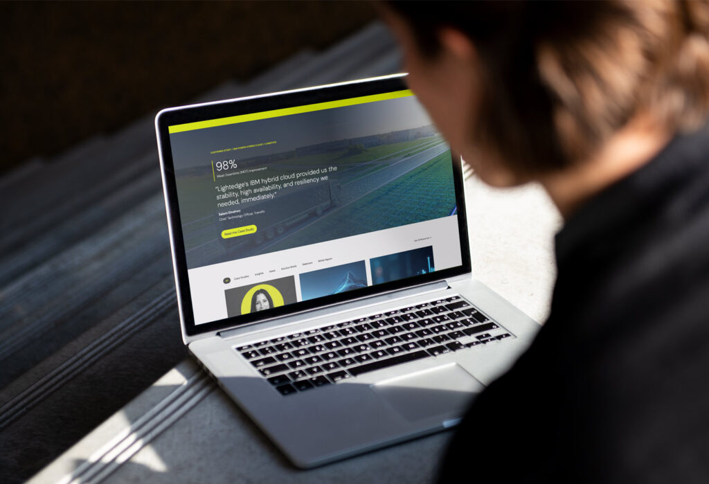
It’s all backed up by robust, data-centric case studies, highlighted in an eye-catching, tabbed component on the homepage that shows the real impact Lightedge’s forward-looking approach can have on clients.

And the “Real Business Results” slider showcases measurable results alongside client testimonials. It’s visually compelling, of course, and brings interactivity to a traditionally static section of a page. But it’s also meaningful, putting an exclamation point on the key promises Lightedge is making on the page.
While so many competitors use their homepages to simply list capabilities and services, Lightedge now leads the way with a client-focused, problem-solution conversation that leads to the final call to action, “Let’s break through together.” A great way to start a partnership.
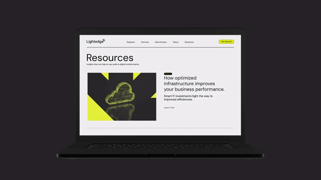
The logomark lent itself well to a pattern in the footer. The pattern (sometimes used more subtly in dark gray) becomes a foundational graphic device through the site, bringing consistency without sacrificing variety or visual interest.
Simplifying complex navigation.
Across the industry, websites are notoriously complex, with long lists of undifferentiated services, industries and tasks‚ and little hierarchy between it all.
A comprehensive megamenu makes the plethora of options visible without overwhelming visitors. Whether users are browsing by industry, technology, service or business goal, the navigation structure makes it easy—just as Lightedge makes navigating complex technical problems easy for their clients.

The individual industry, solution and technology pages are strategically written and designed to bring Lightedge’s differentiators front and center. From their hybrid-first approach to their unique global scale, selling points, calls to action and case studies are tightly curated to be compelling, relevant and timely.
Lighting the way forward.
The new Lightedge brand identity and website are a great example of the old writing maxim, “Show, don’t tell.” From the versatile mark and high-contrast color palette to every animation and interaction, the marriage of Lightedge and Connectria truly is one that helps clients, “See beyond.”
![]()
We can’t wait to see what’s on their horizon.
Sign up for Atomicdust’s newsletter to get marketing insights, ideas and projects every month.