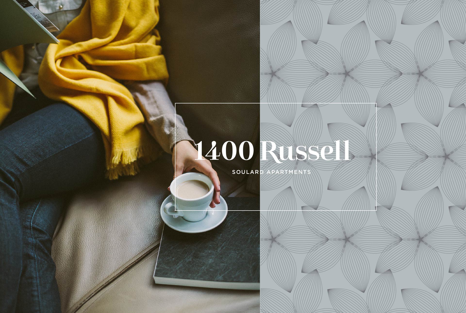
Early in my career, I worked for an agency that referred to great work that never got a chance to shine as, “It may not run, but it sure does fly.” This is certainly the case as we approached our latest real estate branding project for 1400 Russell.
This high-end development in St. Louis’ Soulard neighborhood represents the first brand-new construction in the historic district in years. We were honored that Propper Construction Services looked to us the shape the brand and web experience.
Shortly after we completed the branding and web project, and as 1400 Russell entered pre-leasing, a new management company took over. This is not unusual in the real estate business, but what was unusual was what happened next: two days after the site we created went live, it was replaced with a different site, built on a different content management system, using only some of our original branding and language.
Every project has its twists and turns – but even with the last-minute change, we’re proud of the work. Yes, because it’s beautiful, but also because it worked for our client. As 1400 Russell opened its doors in recent weeks, it was already more than 40% leased.
Where This Real Estate Brand Started
In a relatively forgotten corner of one of the most storied neighborhoods in St. Louis, our client, Propper Construction, was looking to start something new. At the same time, early renderings showed this brand-new building somehow would feel right at home amidst Soulard’s red brick buildings.
It’s an approach you can see in the logo. The bold, beautiful serif typeface feels like it belongs in historic Soulard, while at the same time also feeling brand new.
This provided the spark for our core approach for 1400 Russell’s real estate branding: Here, alongside history, you can make your own stories.
When we first shared this idea with our client, in the form of an initial homepage, there was silence – followed by, we’re not ashamed to say, a heavy dose of praise.
By listening to our clients (and their various stakeholders) during our initial meetings, with literally only exterior renderings to fuel our approach to the real estate branding, we had captured the exact vibe they were looking for. In fact, it even aligned perfectly with what their interior designers had crafted – and revealed only hours before our meeting.
We carefully built the remainder of the site to reflect this vibe, while still serving the ultimate purpose: to get people to reserve a place to live in a building that did not yet exist. We made these calls to action prominent on every page.
But more than that, we designed the website to feel like a cohesive narrative. No page is a dead end. On the amenities page, we invite prospective residents to explore the neighborhood. A stroll through Soulard on the site leads people to floorplans and apartment selectors.
It’s certainly a little sad that the work we love did not have a chance to live in the world – but we’re honestly ecstatic that 1400 Russell has been so well-received by residents, and we’re proud to have played a role in the story.
Stay up to date on the latest branding work from Atomicdust.
Sign up for our newsletter and we’ll send you monthly marketing tips, branding insights from our team, and the latest news and work from Atomicdust.