Naming, Branding & Breaking Ground for Residential Developments in The Grove
It was a pretty normal new-business meeting.
We sat in a conference room in the Atomicdust office talking to a few people from Green Street, a real estate development company we’d worked with before. They told us about a new project they were hoping we’d take on.
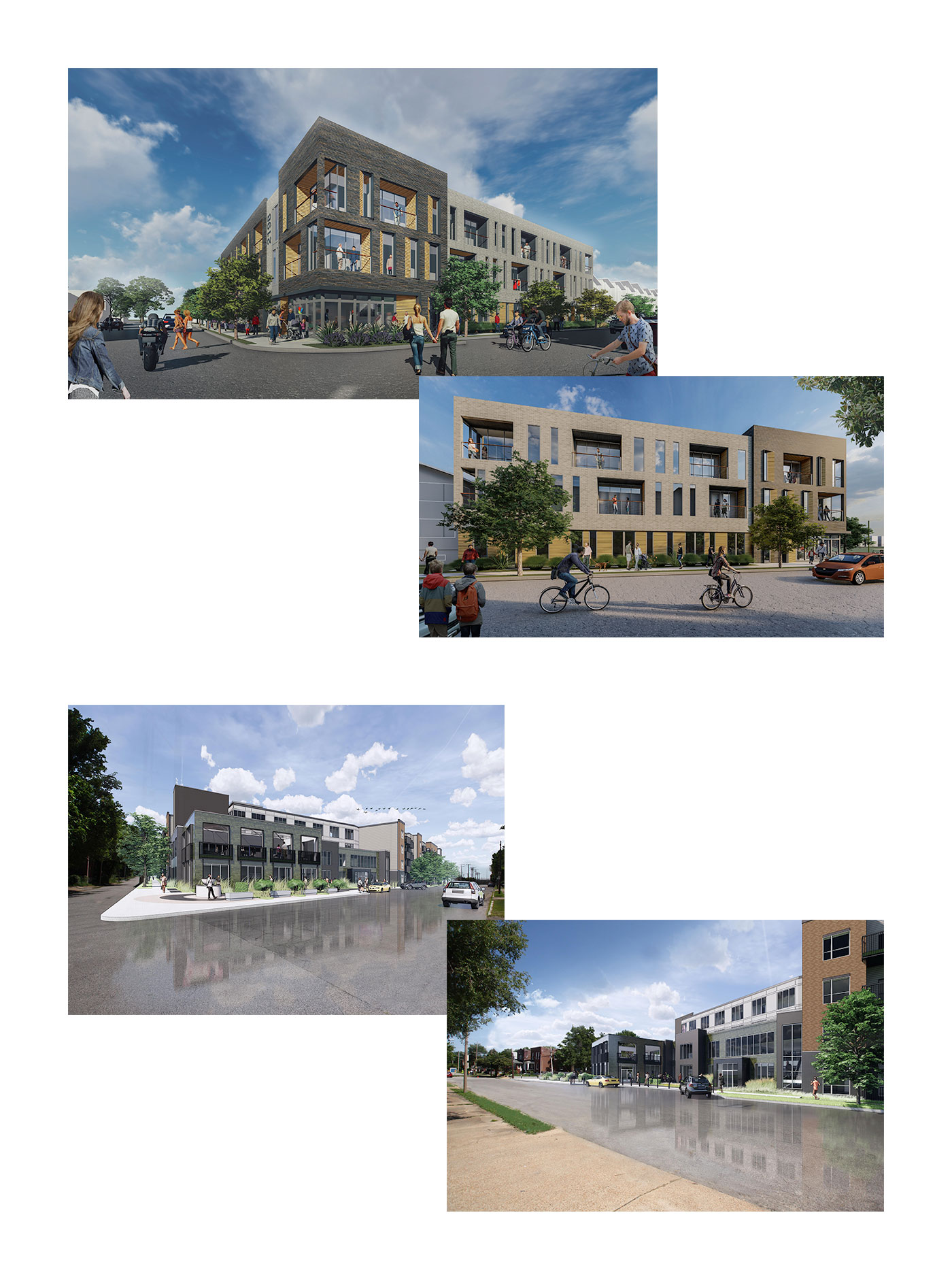
Green Street had spent years preparing to develop new residential buildings in The Grove neighborhood of St. Louis and was almost ready to begin construction. They needed names and branding for the buildings (all seven of them). We love the Green Street team. We love creating brand identities. We love The Grove. The project would be a cinch.
It was mid-March 2020.
A new development.
You know where this is going. It was a pretty normal new-business meeting, in an overall normal time. But by the next week, the country had shut down, and so had our office.
The team regrouped online to talk about the project. We had to come up with names and brands for the residential buildings, keeping in mind a few requirements. The largest building (located where Recess had once stood) was designed around wellness and healthy lifestyles, with a bike repair shop, walking trails, high-end exercise facility and pool.
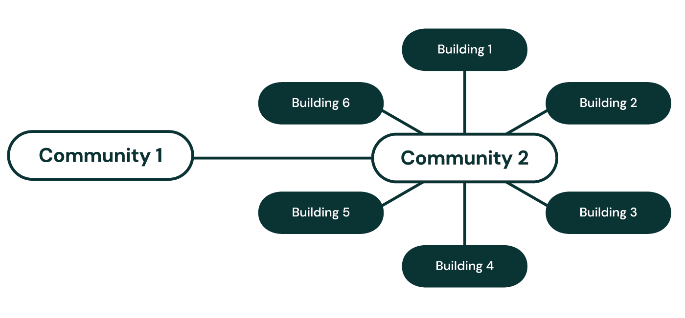
The other six buildings would all be under one community umbrella, but each would have its own location, unique design and name. The group of six would be related, but they needed to have names that could work on their own.
We added some meetings to the calendar to start brainstorming. But we wondered how creative collaboration would even work with each of us in a different location, acclimating to working from home and dependent on technology to connect.
Would our outcomes suffer? Would we be able to produce the same level of work?
What’s in a name? For us, a lot.
Connecting via Slack video calls and using a shared Google Doc in lieu of a whiteboard, we started brainstorming.
We knew we wanted the names and brands to reflect The Grove, so we started there. We researched the area’s geography, culture and history, even famous St. Louisans. Inspired by the wellness focus and modern building designs, we wrote down names inspired by nature and architecture: types of stones and trees, bodies of water, schools of design. Names inspired by The Grove’s hip reputation, and pace of life. Names inspired by constellations and space. Names inspired by community.
We wrote down pages and pages of names.
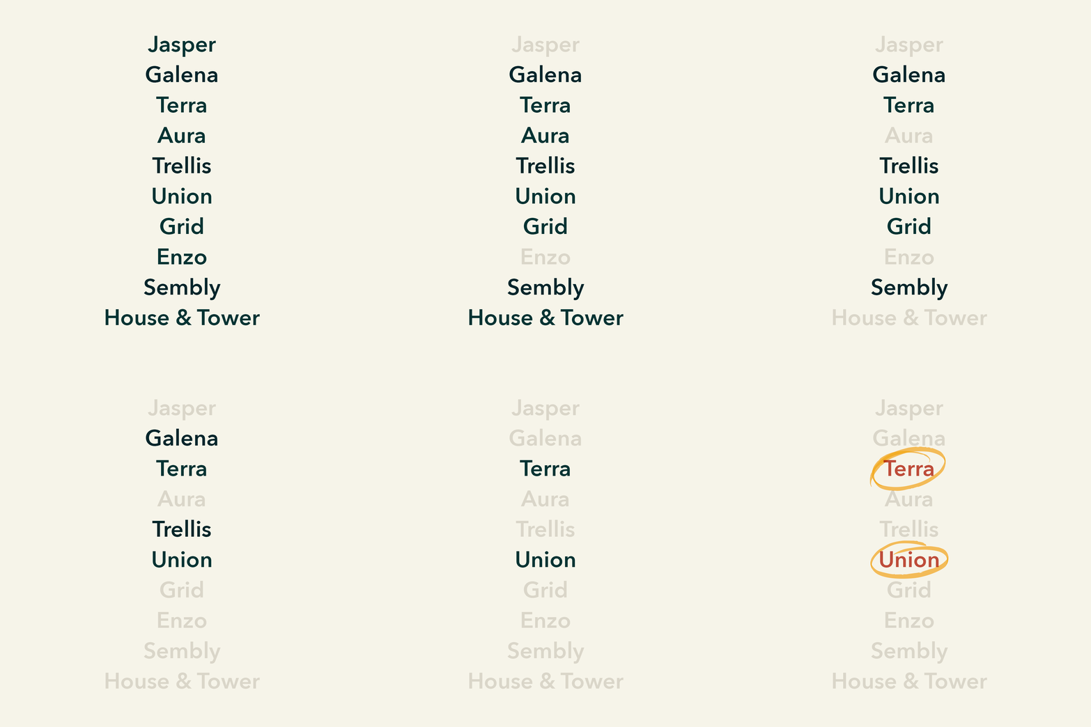
We shared a shortlist with Green Street, and they homed in on one: Terra, the Latin word for Earth. Their team loved the concept for the largest building and wanted to see more ideas around it.
Back at the whiteboard Google Doc, we reviewed the ideas we’d already come up with and remembered Union. It would be perfect for the umbrella brand for the six smaller buildings. We just had to figure out what to name those.
Down-to-earth branding.
My Google search history during a naming project probably looks pretty strange. In brand naming, the answer can come from anywhere. Going on tangents and researching seemingly weird topics is encouraged.
That’s how we ended up looking at a map of Missouri soils. Soils, like earth. Or Terra.
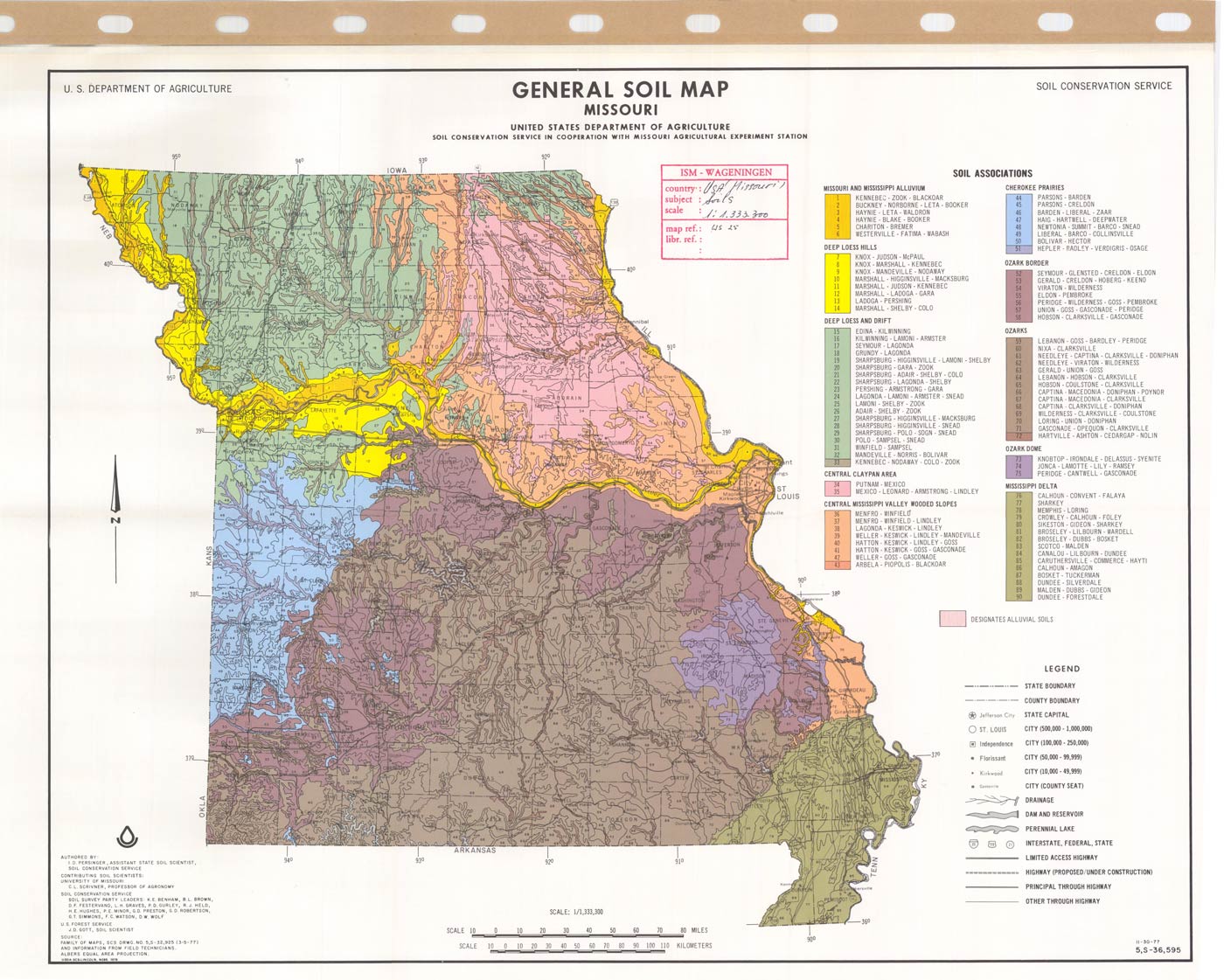
Map of Missouri soil types, found on the European Soil Data Centre website
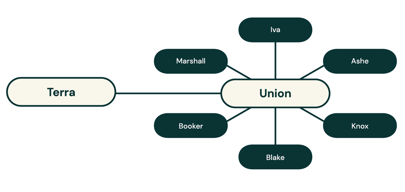
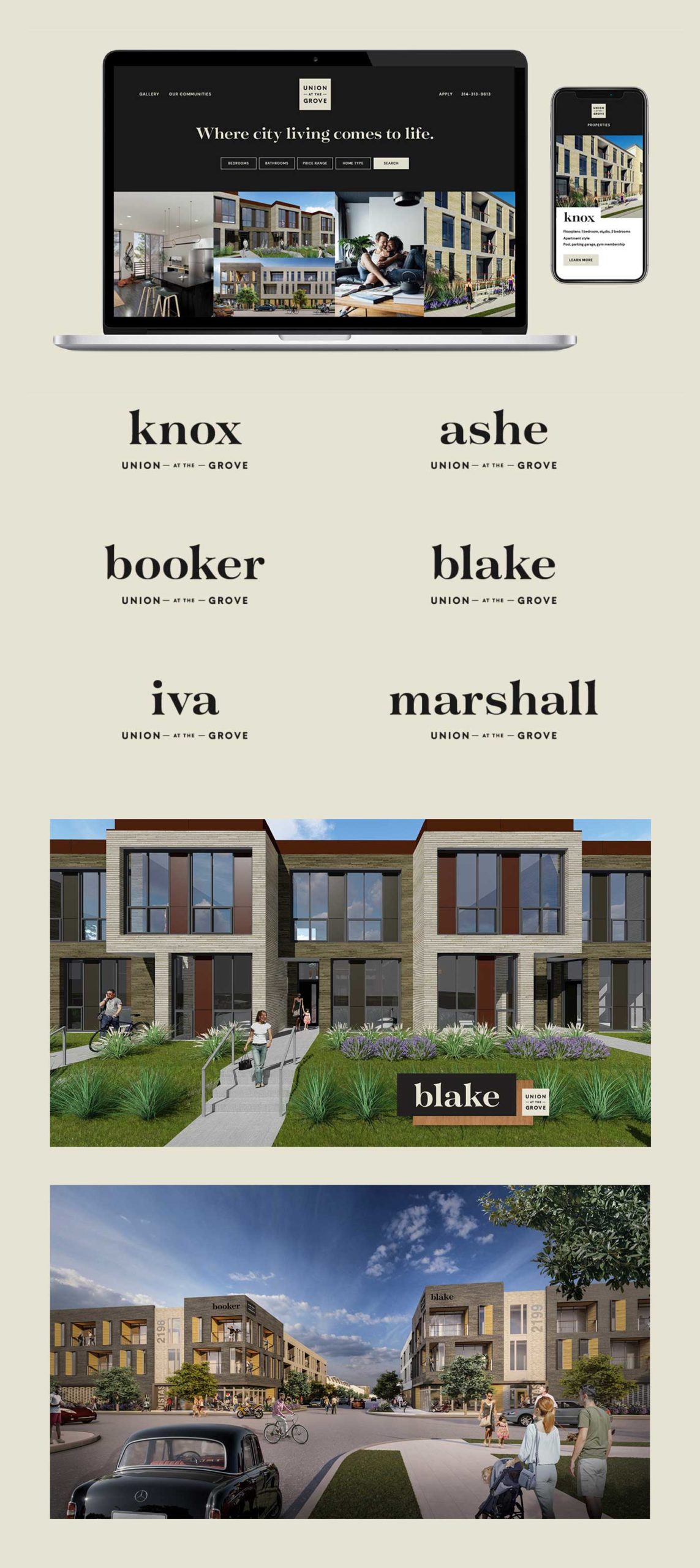
The soil names were perfect: Ashe, Knox, Booker, Iva, Marshall, Blake and more. A cross between Midwestern Americana and urban hip.
We had the names down. Next came brand language and visual identities.
A solid foundation.
By now, a month or two into the project, we’d realized that we were, in fact, able to work just as well from home as we did in the office. All it took were some added tools—Slack video calls, VPN access to the server, more Google Docs—mixed in with the old—brainstorms, review and feedback processes, our same push for elevated brand identities.
Developing brand language for both Terra and Union gave us a foundation on which we could build the rest of the brand identity.
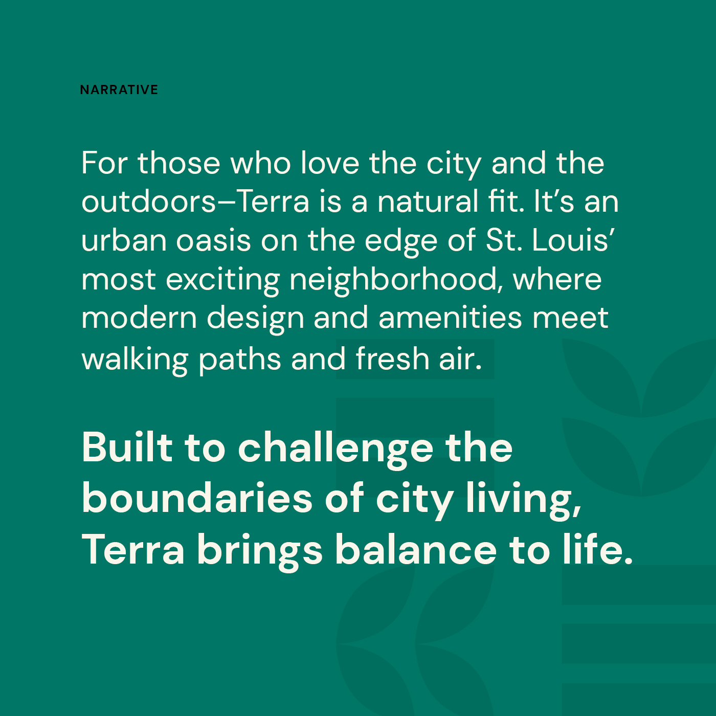
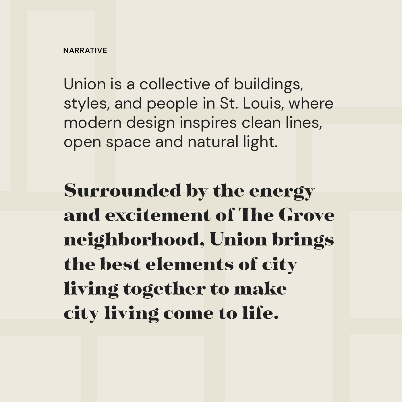
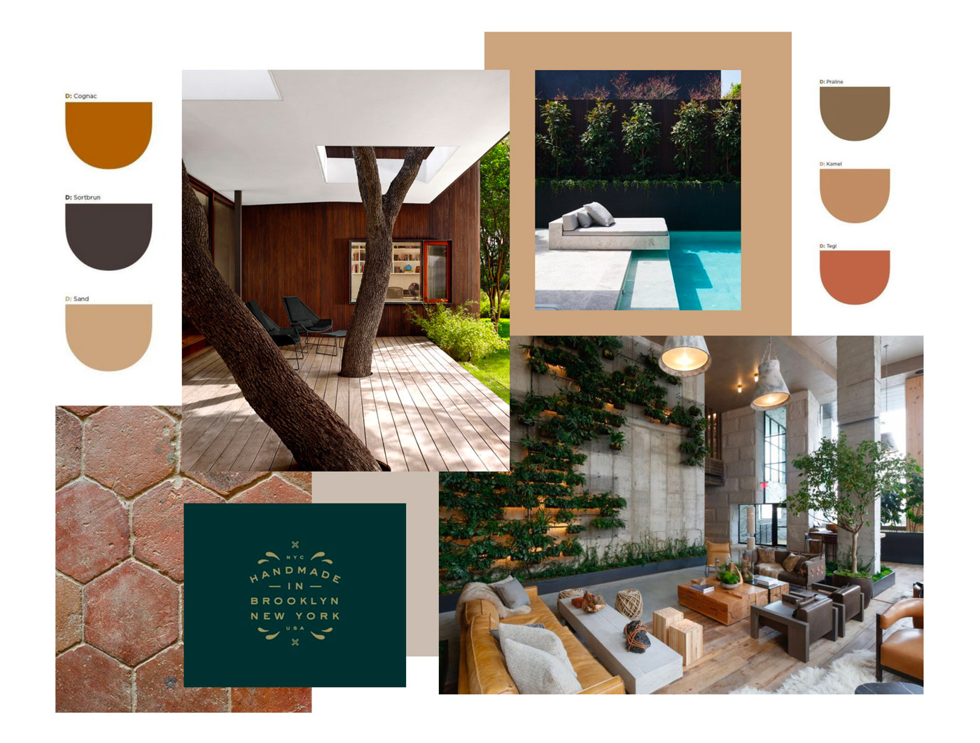
The renderings Green Street had shared of Terra showed a refreshing juxtaposition of Scandinavian design against an urban backdrop lush with greenery. Our team started exploring various shapes, patterns and colors incorporating Terra’s focus on wellness and its modern, geometric aesthetic.
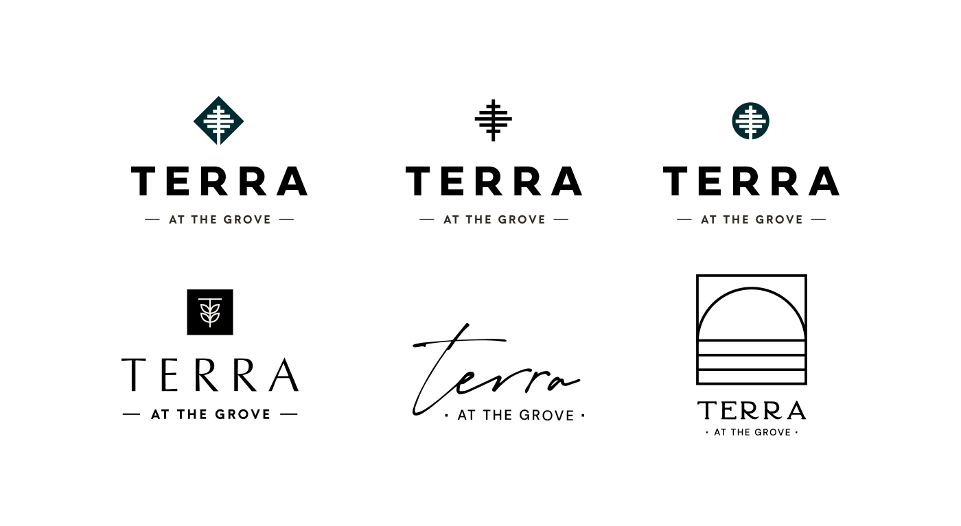
But we had to be careful—this brand would help attract prospective tenants, and we didn’t want to make it seem too young and feminine or too industrial and modern and risk alienating any audiences.
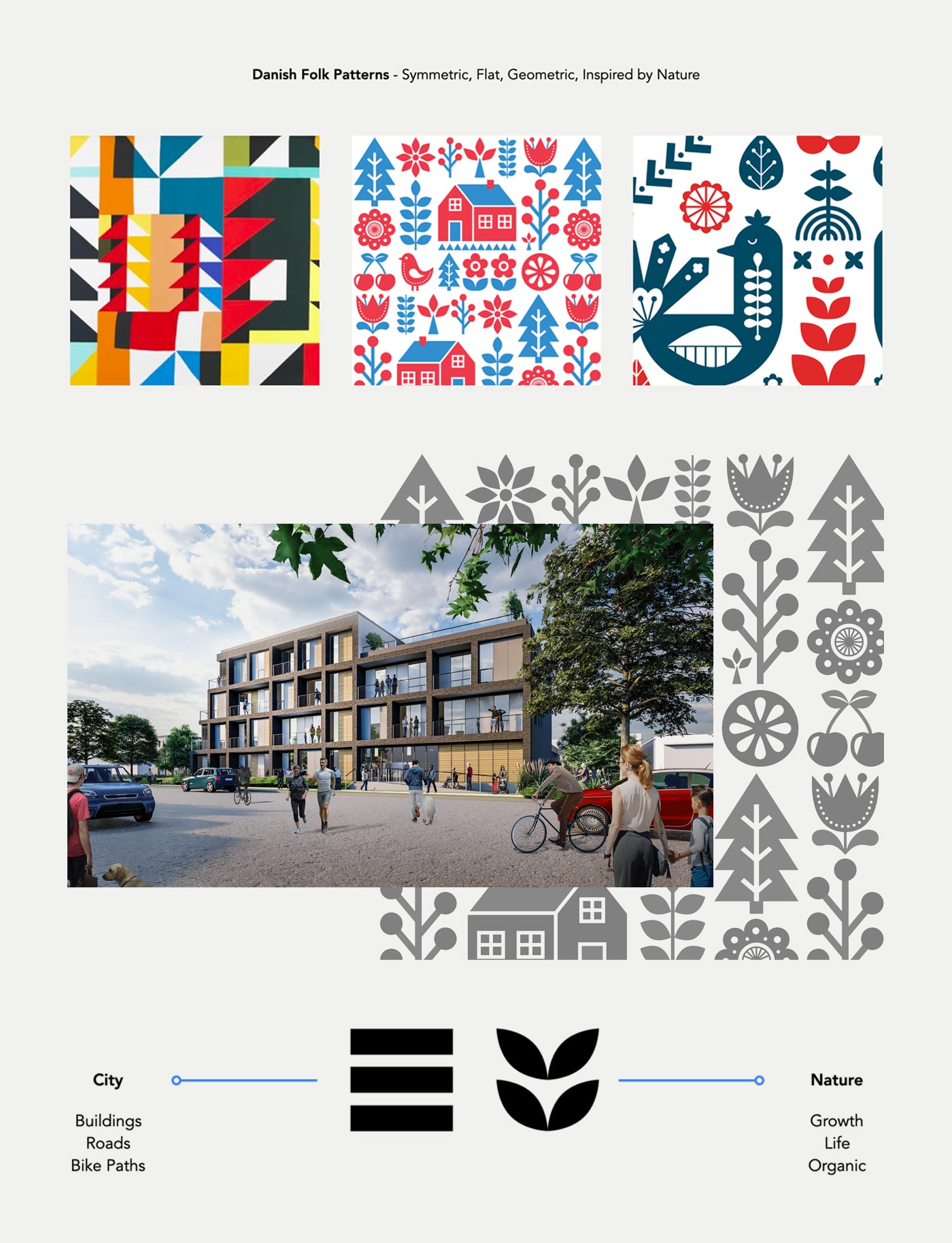
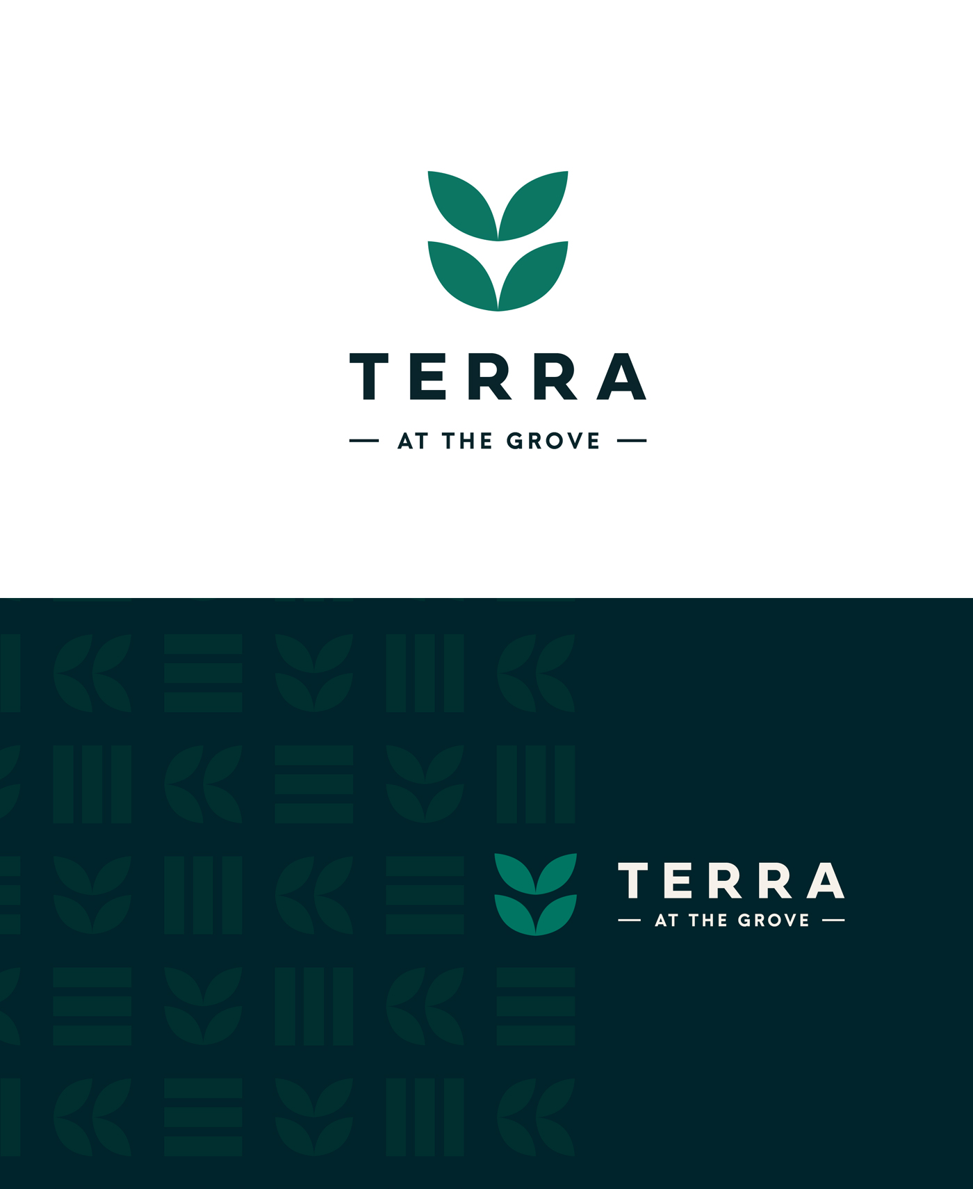
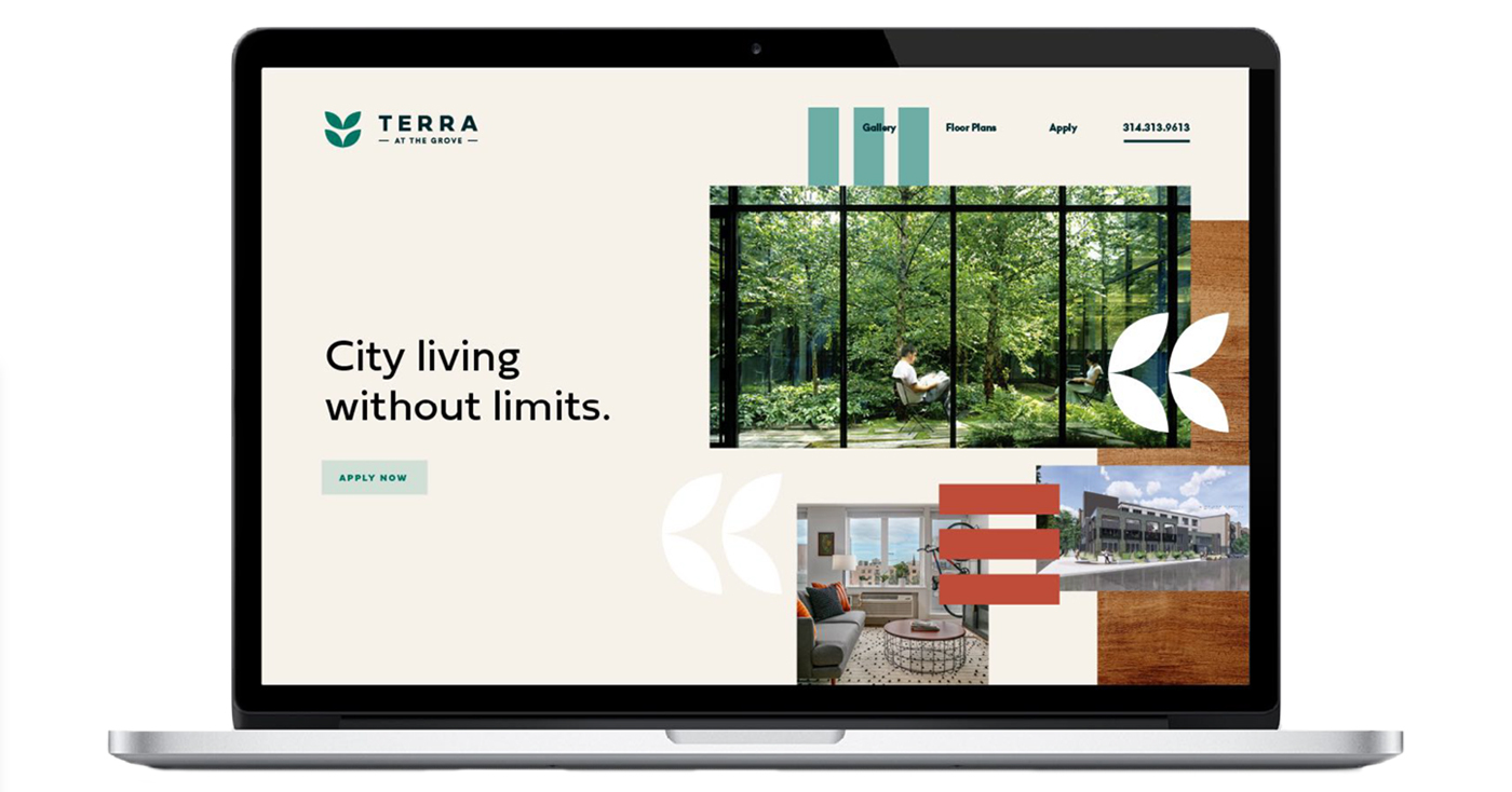
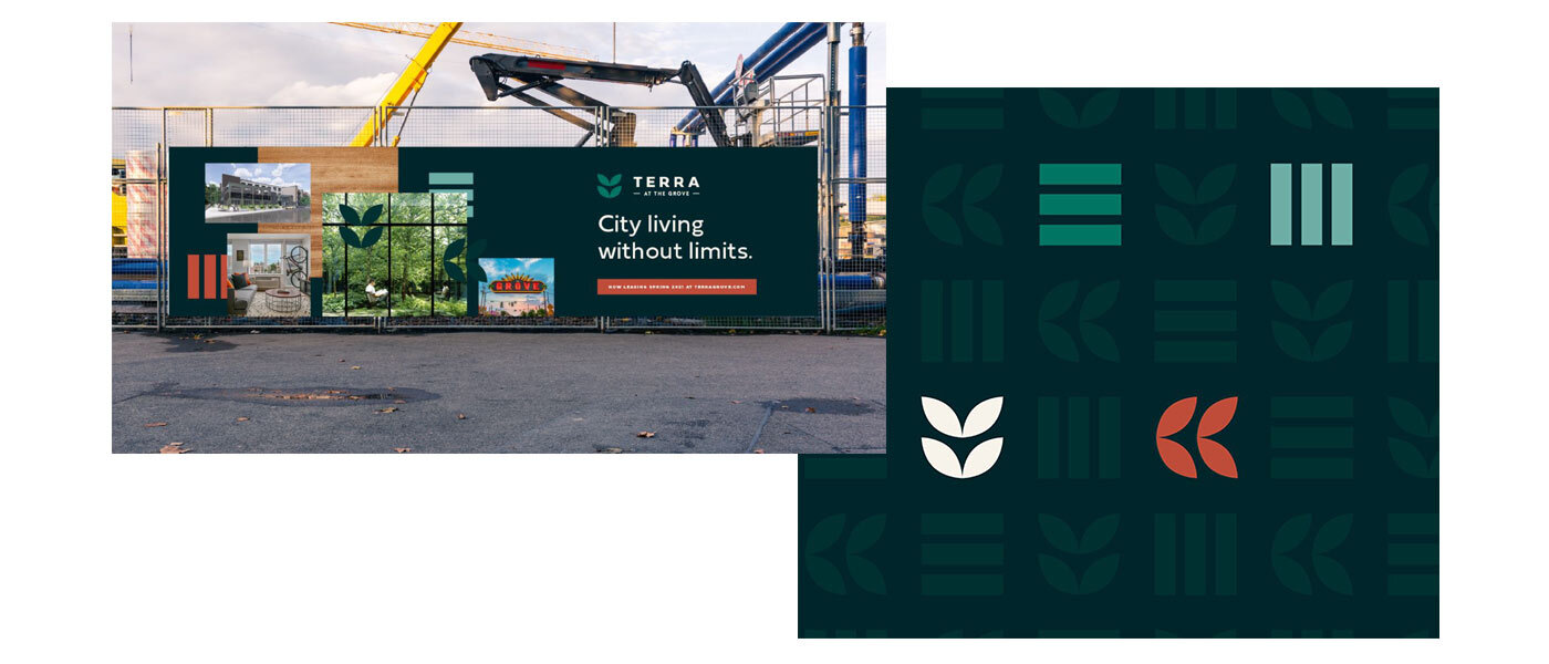
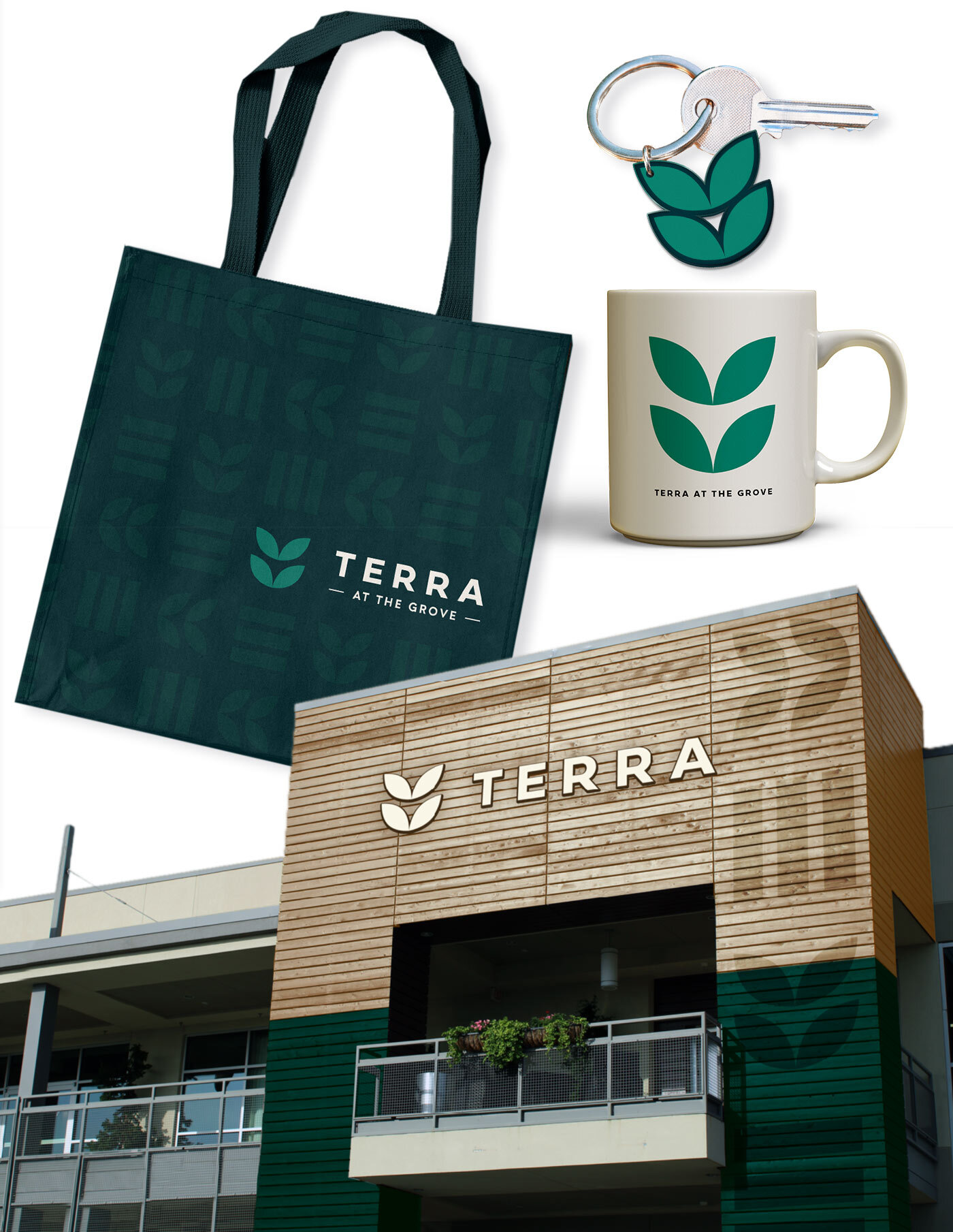
Inspiration came in the form of Danish folk art. Bold colors and a mix of organic and geometric shapes set the perfect tone (and paired nicely with) the Scandinavian architectural style of the building. We developed a repeat pattern of shapes representing Terra’s natural feel in a city setting. 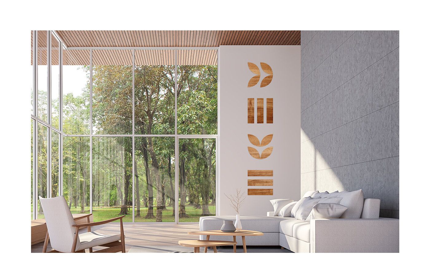
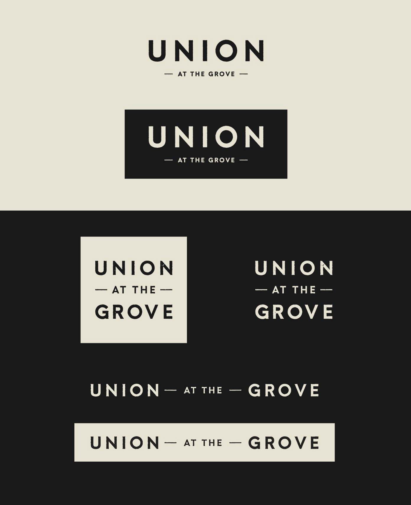
Creating the visuals for Union came with its own challenges: each building had its own style, and the brand needed to encompass them all. So we designed a sleek, modern logo and brand pattern, with rectangles alluding to city blocks and buildings, in a muted color palette.
A brand in action.
We delivered the brand to the client and their partners. The teams at Roseman & Associates, Arcturis and JEMA took the identities and found ways to bring them to life inside of the buildings. Signage, carpeting and even unique wallpaper for each floor (to help prevent people from stepping off the elevator on the wrong level) support the brand and enhance the environment.
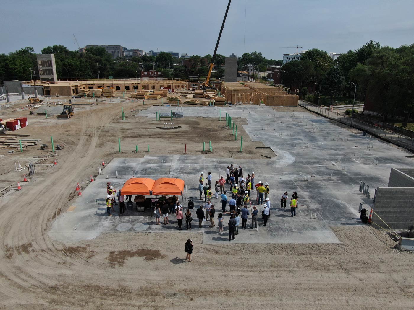
Green Street recently broke ground on Terra at the Grove and Union at the Grove and invited our team to tour the site. Of course, the buildings won’t be move-in ready until later next year, but it was exciting to see the development underway.
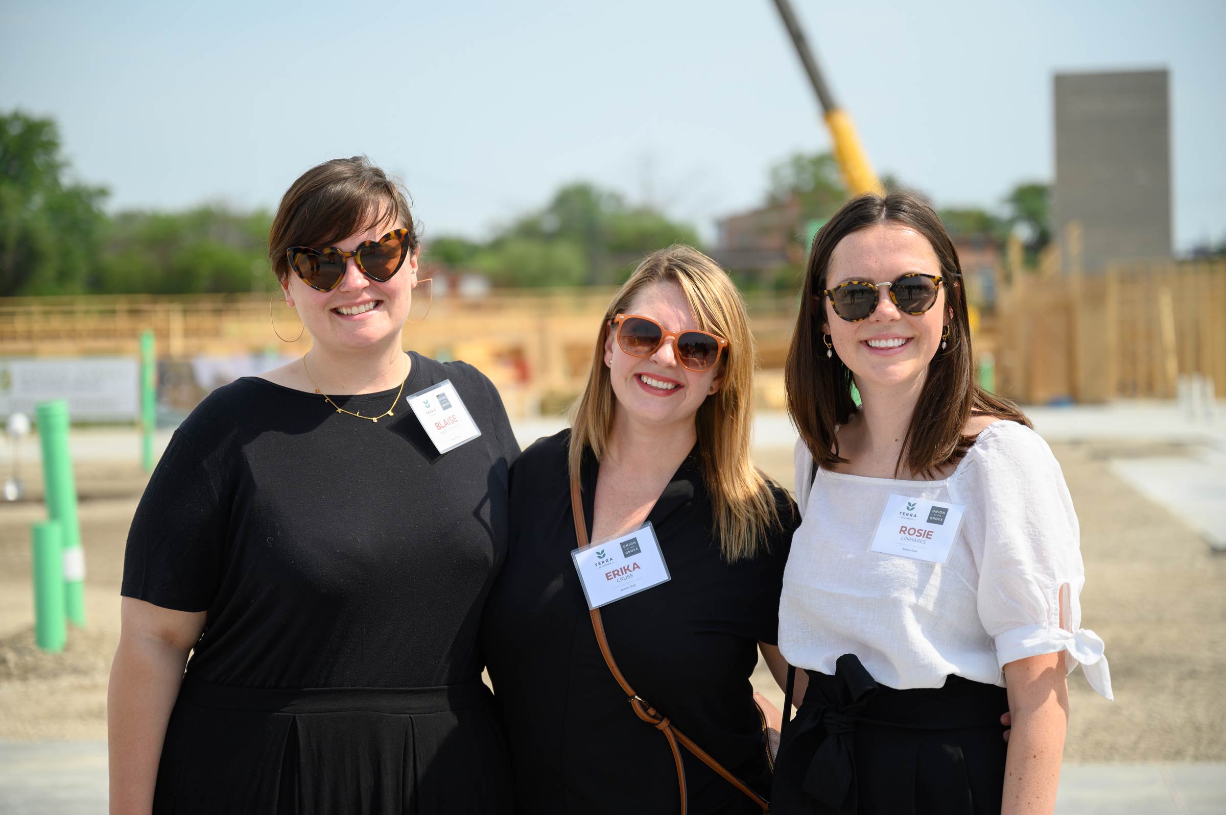
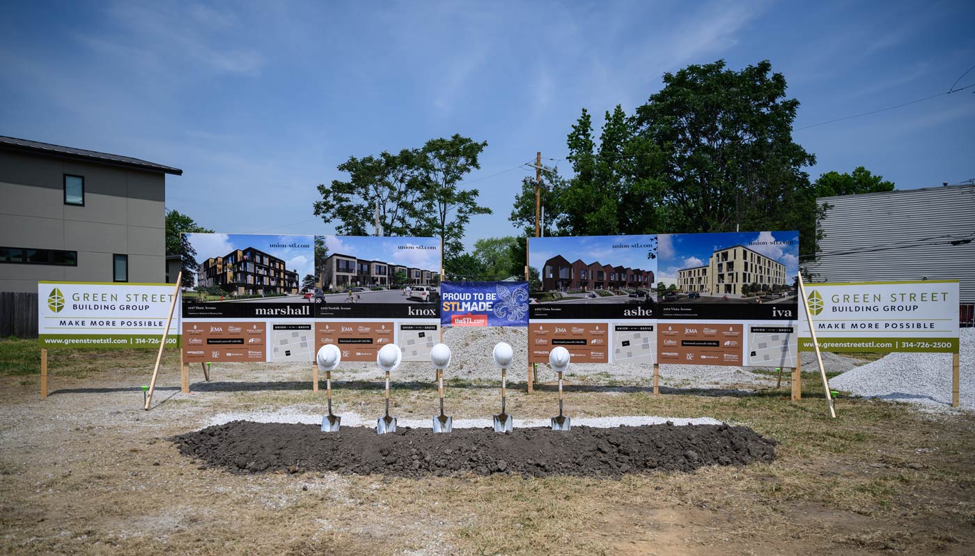
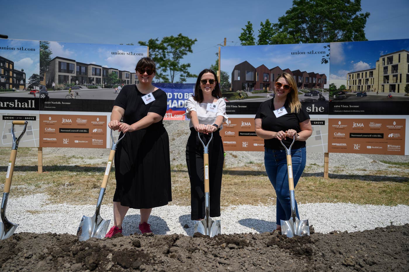
In a vibrant neighborhood in our beloved city, Terra and Union will bring even more life and community to The Grove—and we’re thrilled to have been a part of it.
