“Do you know what makes a city great? A little weirdness. We need to do something weird.”
It’s an idea I heard from a colleague and good friend of mine when we were planning events for St. Louis Design Week a few years ago.
I’ve always agreed with the idea, and I kept remembering it throughout our work for Recess—a new bar and entertainment venue located in the booming Grove neighborhood in St. Louis.
Recess has all the elements for weirdness greatness.
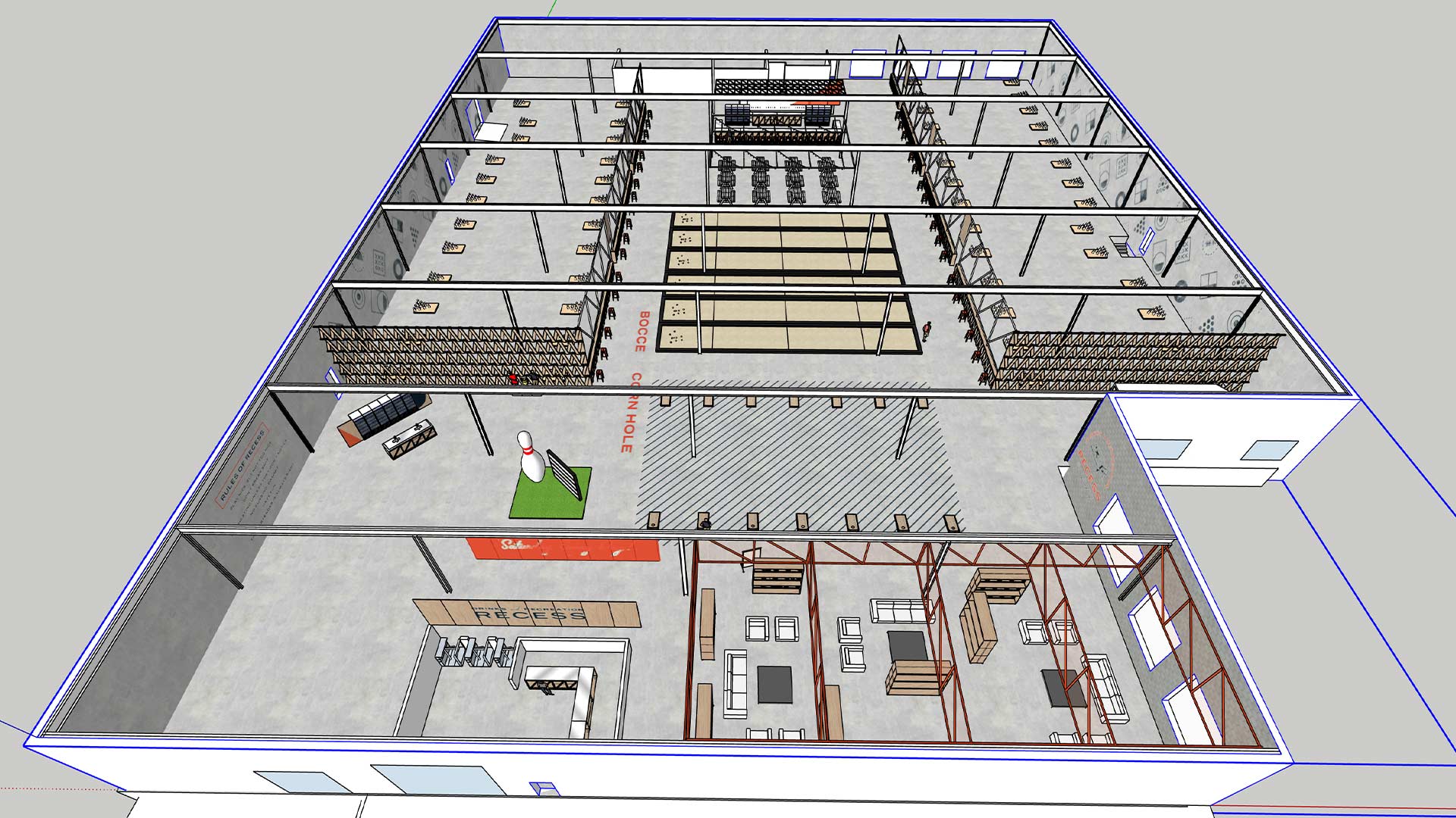
It’s a new concept for St. Louis. It’s in an old warehouse. It’s absolutely huge, at 100,000 square feet. And its first home will only be temporary.
Here’s the story of Recess.
Here’s how the whole thing started.
We met Chris and Saskia Honstain when they came to us for help creating a brand for their backyard-inspired concept they were calling Recess.
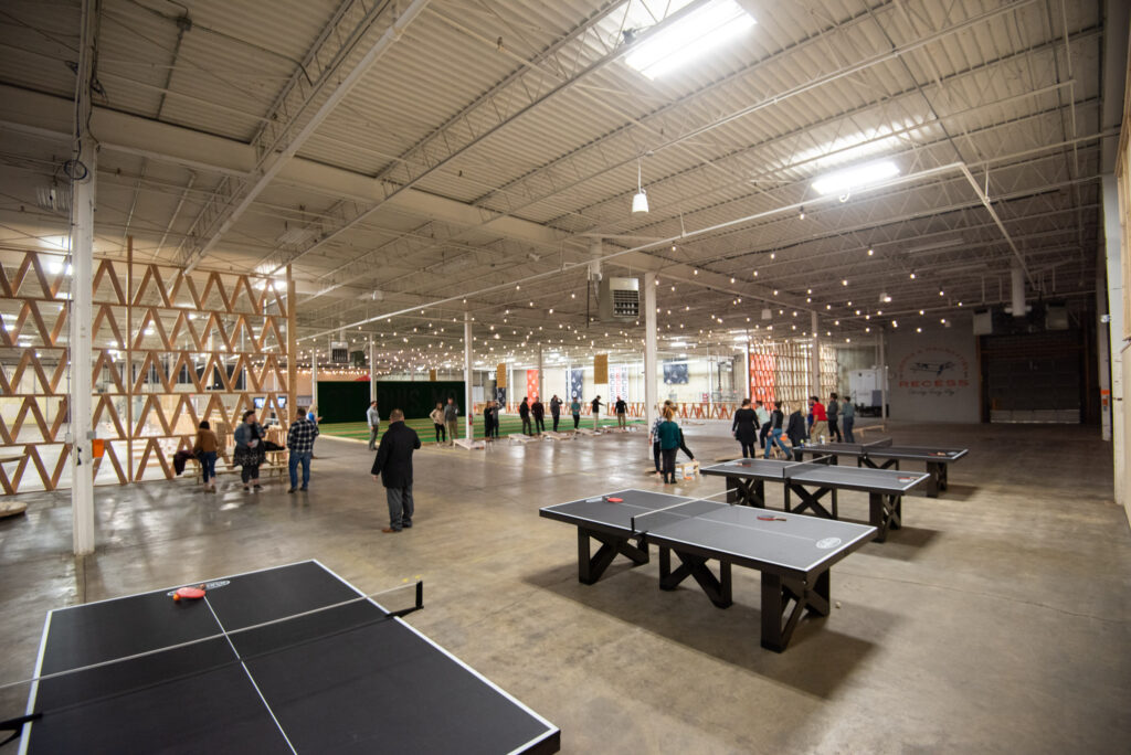
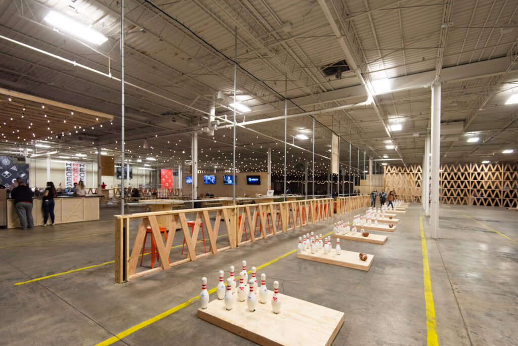
The goal was to build a place where people could hang out and do something besides just drinking. Recess would feature a ton of games.
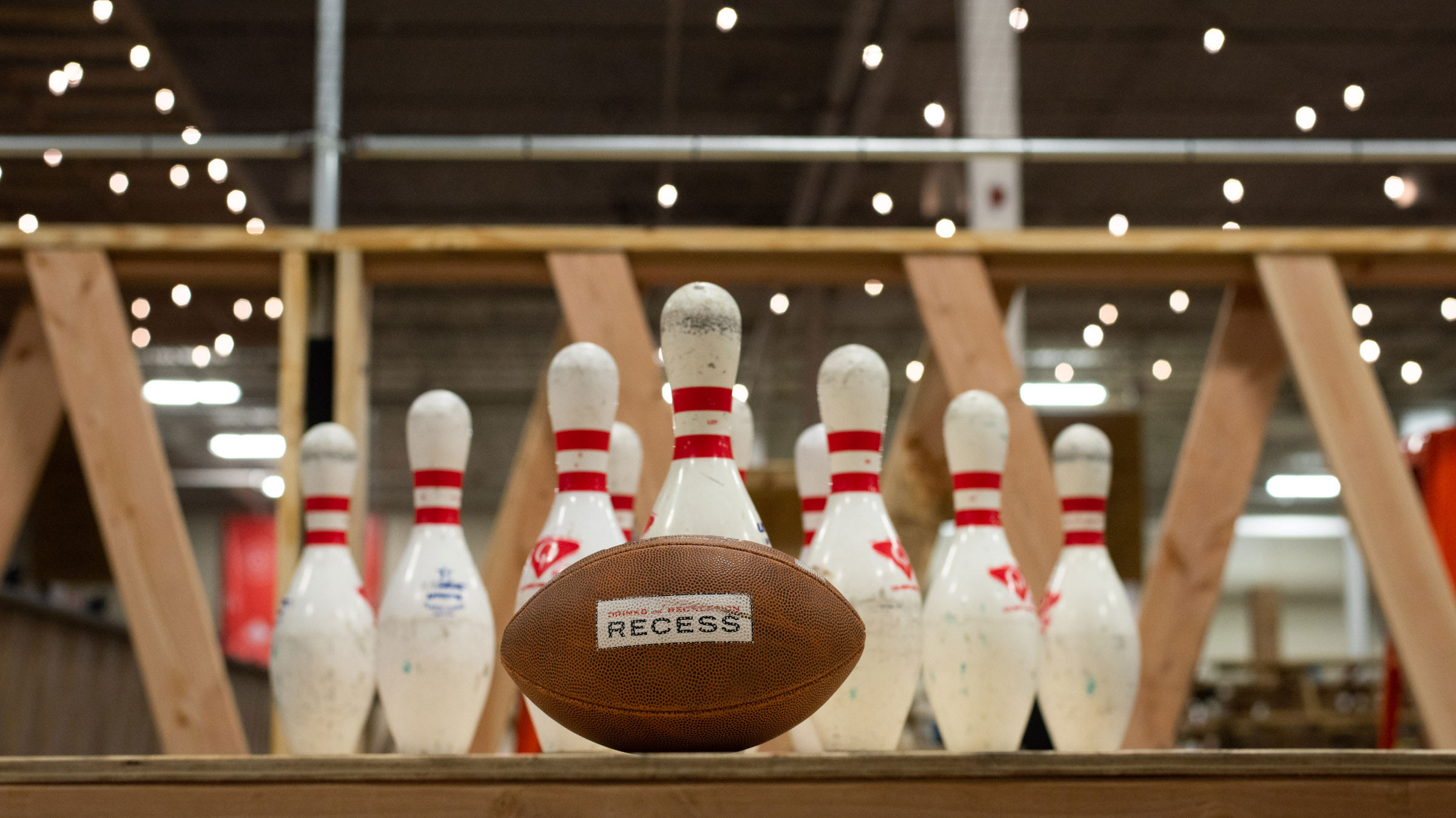
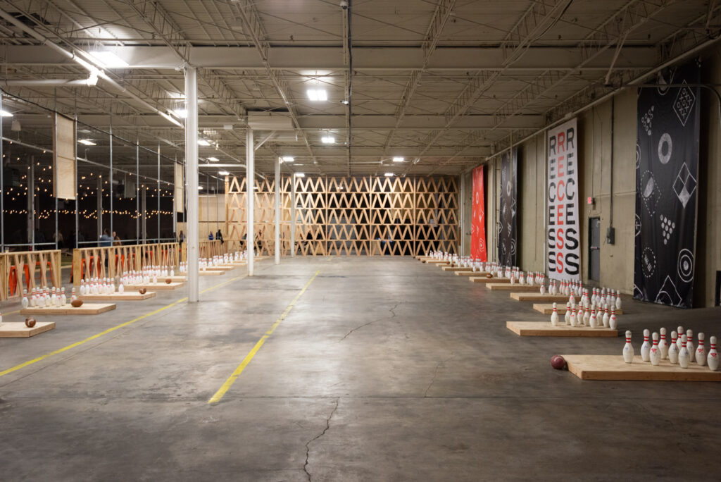
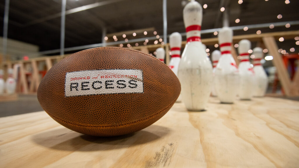
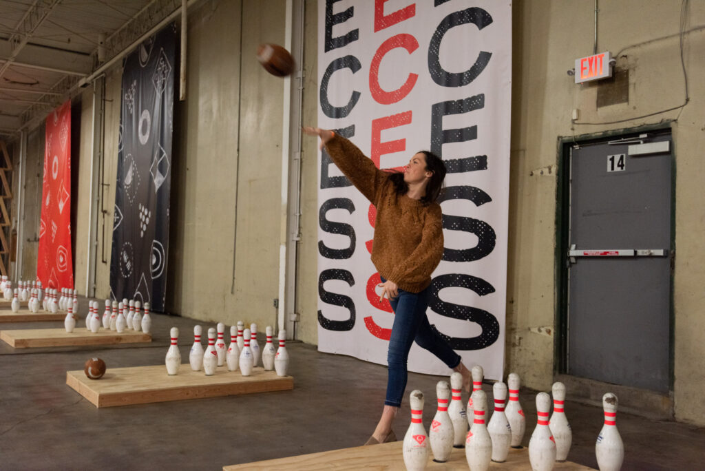
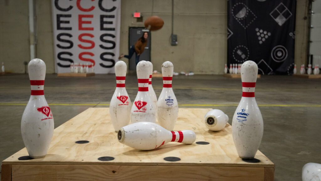
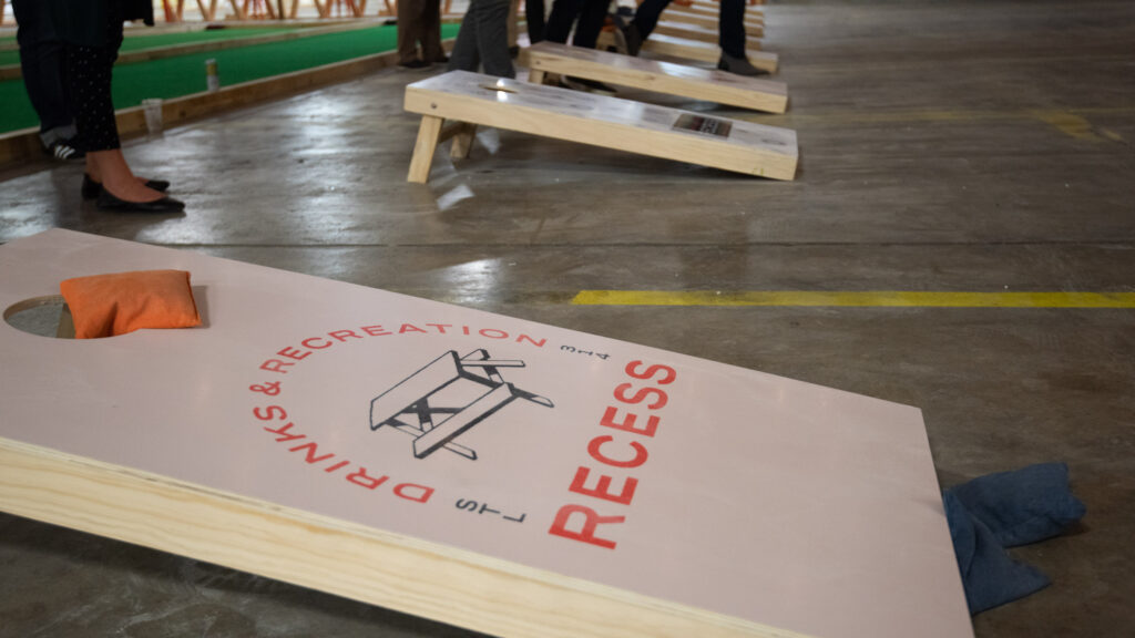
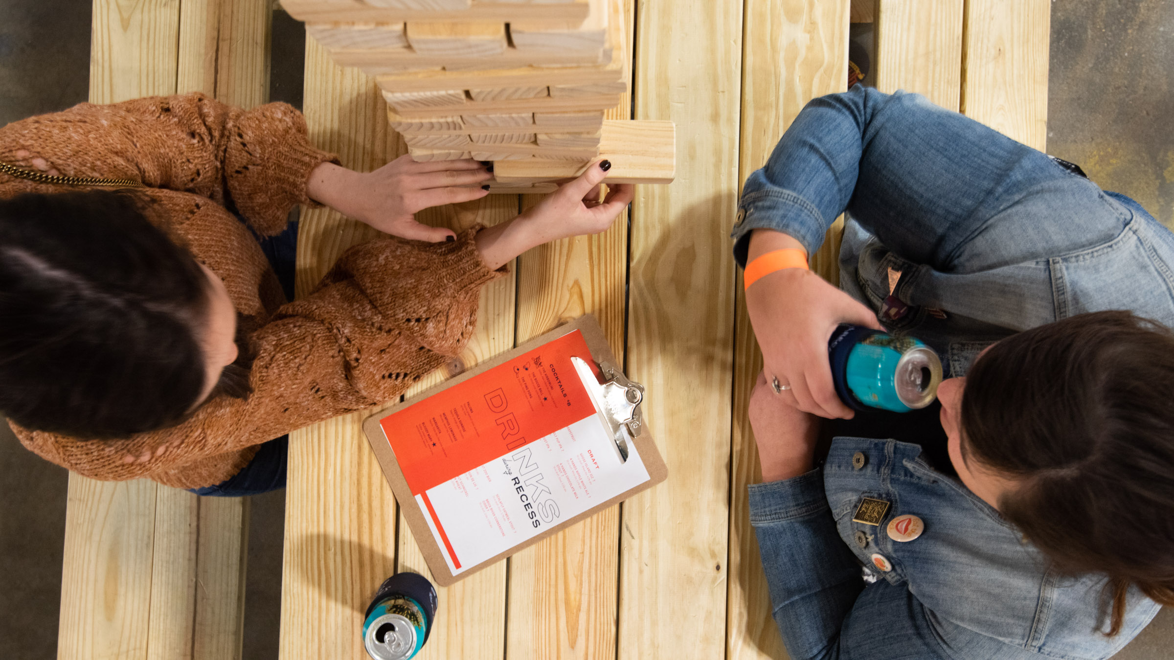
What type of games? Mainly yard games. Classics like corn hole, bocce ball and lawn darts, plus giant Jenga, ping pong and old-school Nintendo games. The headliner would be airbowling, a new-to-St. Louis concept that blends bowling, football and corn hole.
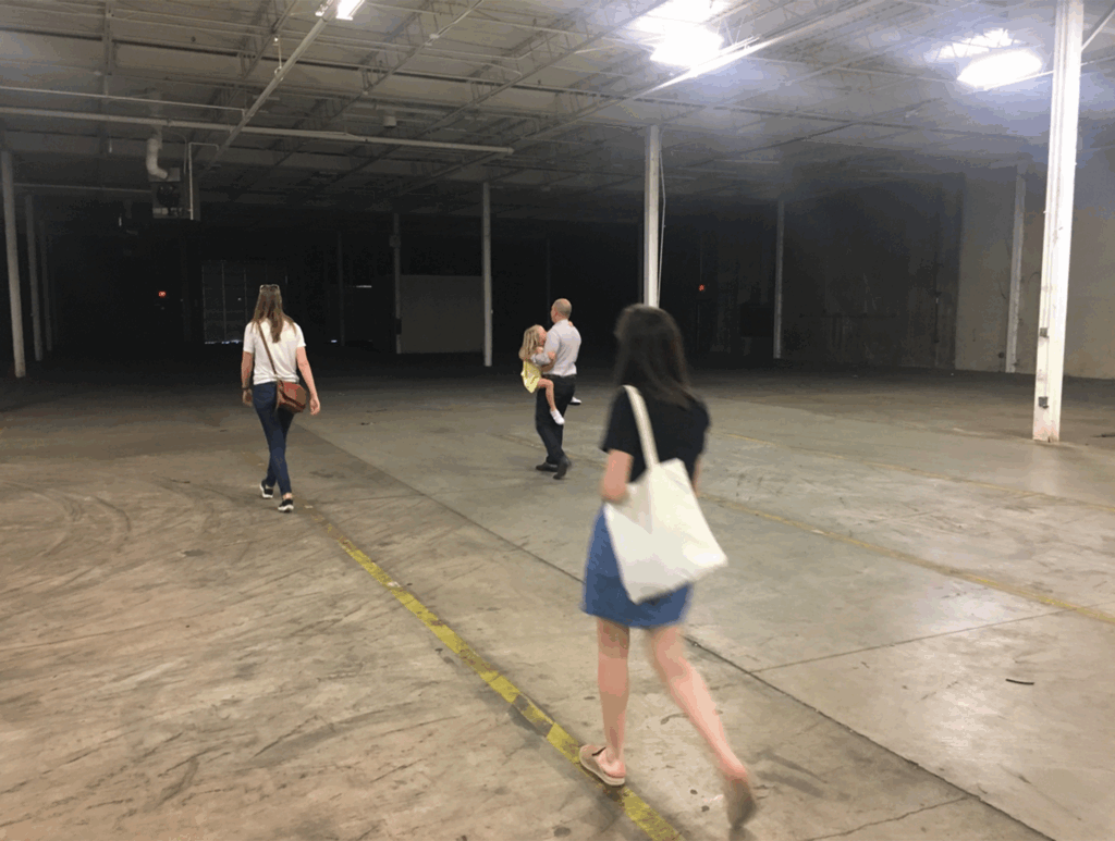
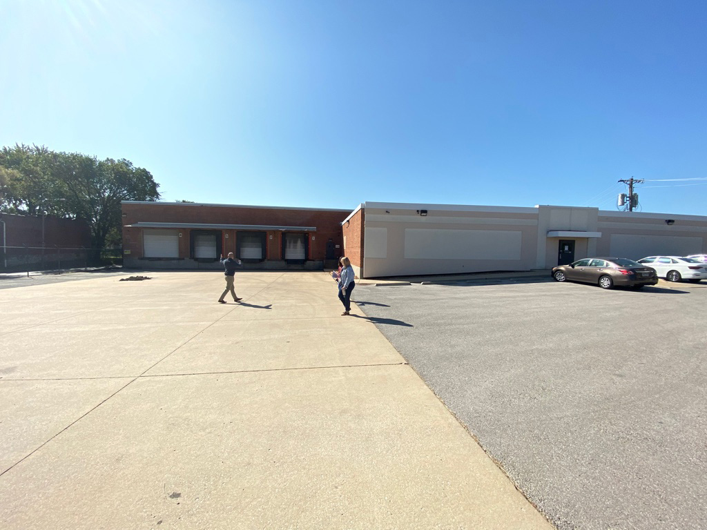
The concept was fun and weird and perfect. Our next step was to take a tour of the space.
Here’s what we didn’t know.
How’s your space perception? Mine is pretty good. If you tell me something is 10,000 square feet, I think I can do a pretty good job of imagining it.
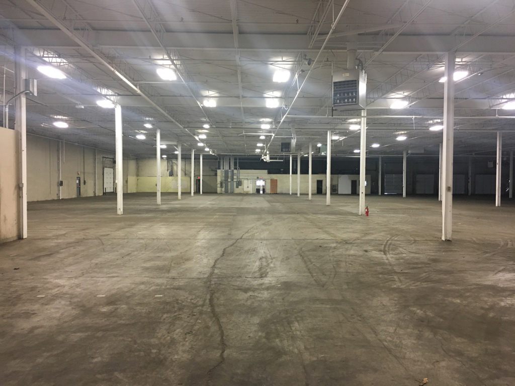
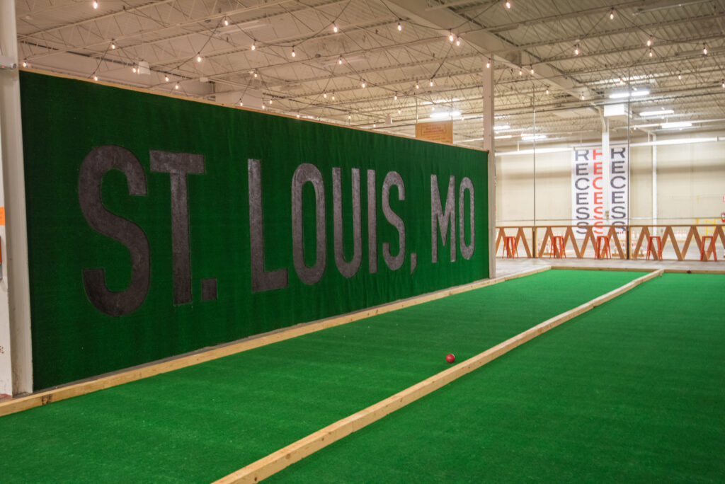
But when they told me Recess was 100,000 square feet, I had a hard time picturing it. And when we took a tour of the empty space, a former plumbing supply warehouse, I realized just how massive the place was going to be.
Recess was four or five times the size of any space we’d worked with before.
It was so big I started to panic wonder how it was going to work. Even the biggest sign or poster or whatever we could come up with would get swallowed by the empty void.
We had to figure out a solution that would make the space feel established while working within the budget.
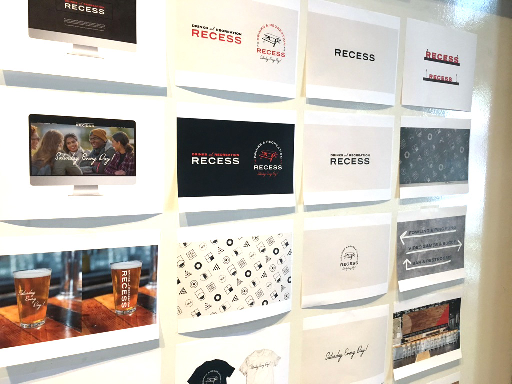
But first, we needed a starting point for the brand.
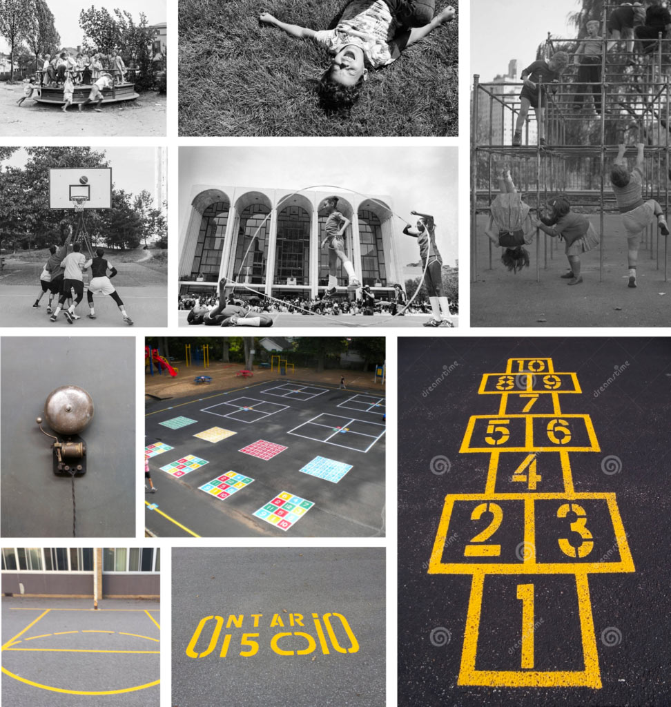
Running out when the bell rings.
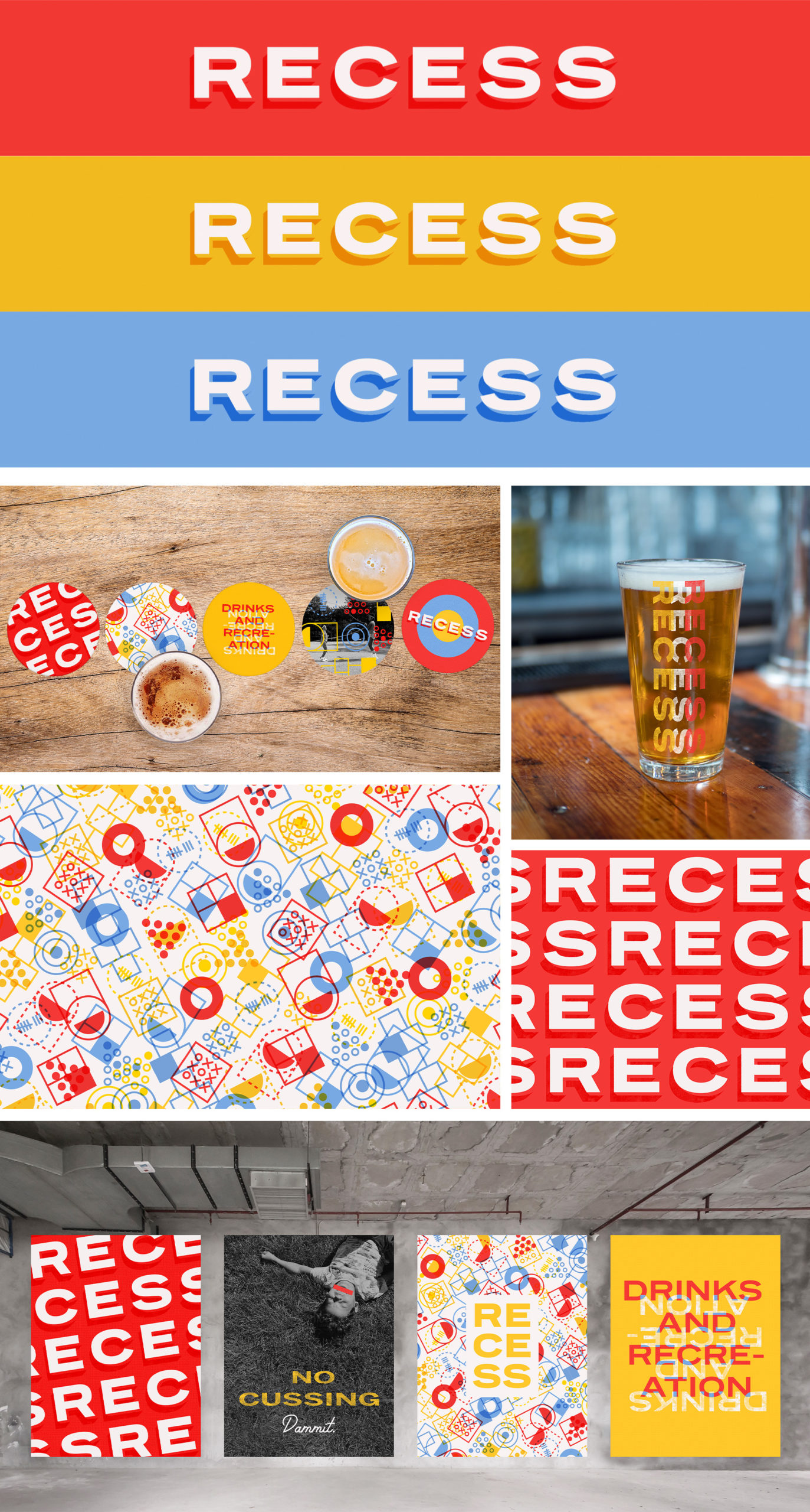
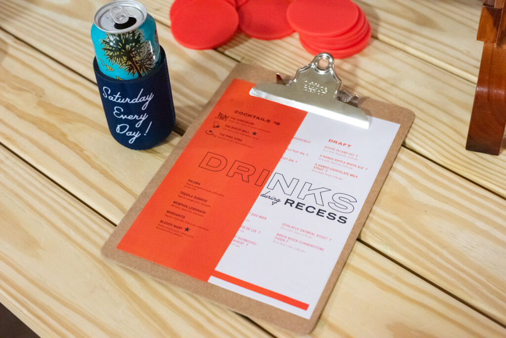
The name Recess immediately made us think of nostalgic childhood. Ringing bells, kids playing on jungle gyms, painted game lines on blacktop, and, of course, four square.
Our early concepts brought the vibe together.
Ultimately, we changed directions and moved away from this idea. It was a little too Norman Rockwell, and we felt it was awkward to use so many images of children at a bar.
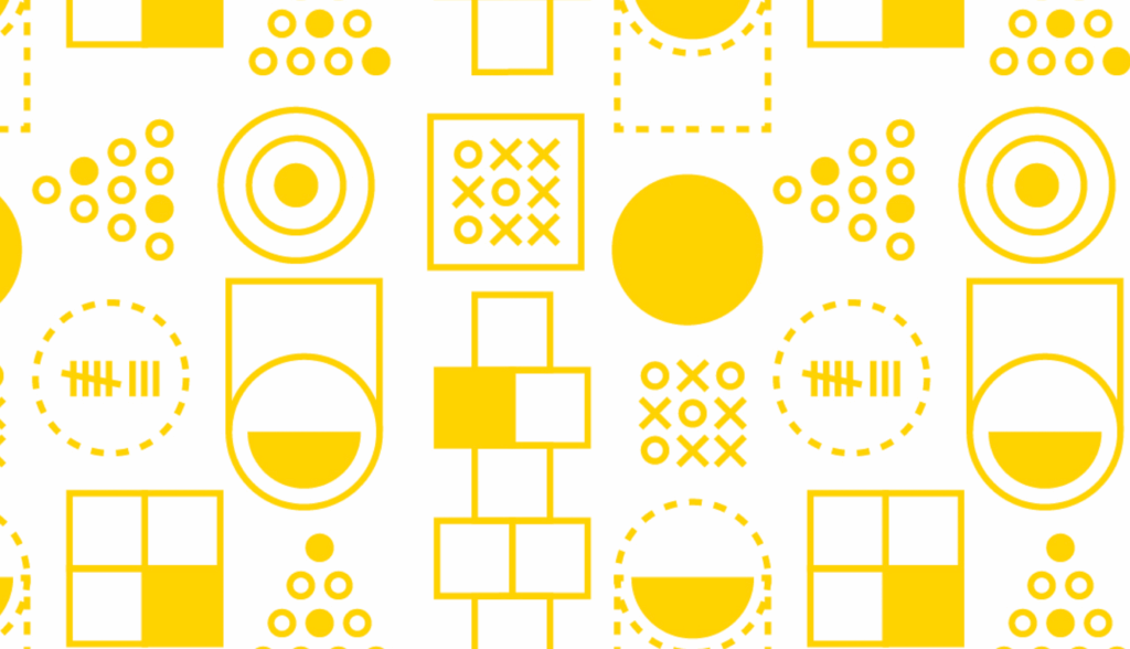
Fewer kids, more color.
We removed the retro images, but didn’t want to remove childhood all together. Our next approach was a bright and vibrant color palette using game lines and simple type. The idea was that the big and bright shapes would draw your eye away from the dark and cavernous warehouse.
It was loud, hectic and fun, just like recess—and ultimately wrong for the brand.
Initially, the client loved it, but after sitting with it for a while, they had second thoughts about the colors.
Tuning in, toning down.
Since the majority of guests at Recess will be adults, we took the bright colors down a notch but kept a lot of the shapes and graphic devices from the earlier concept.
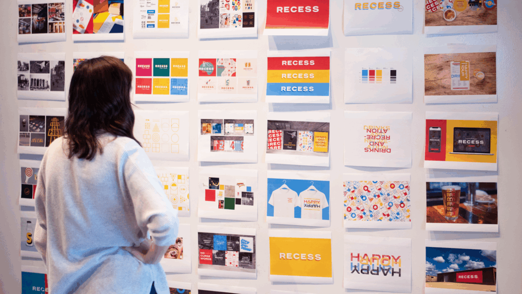
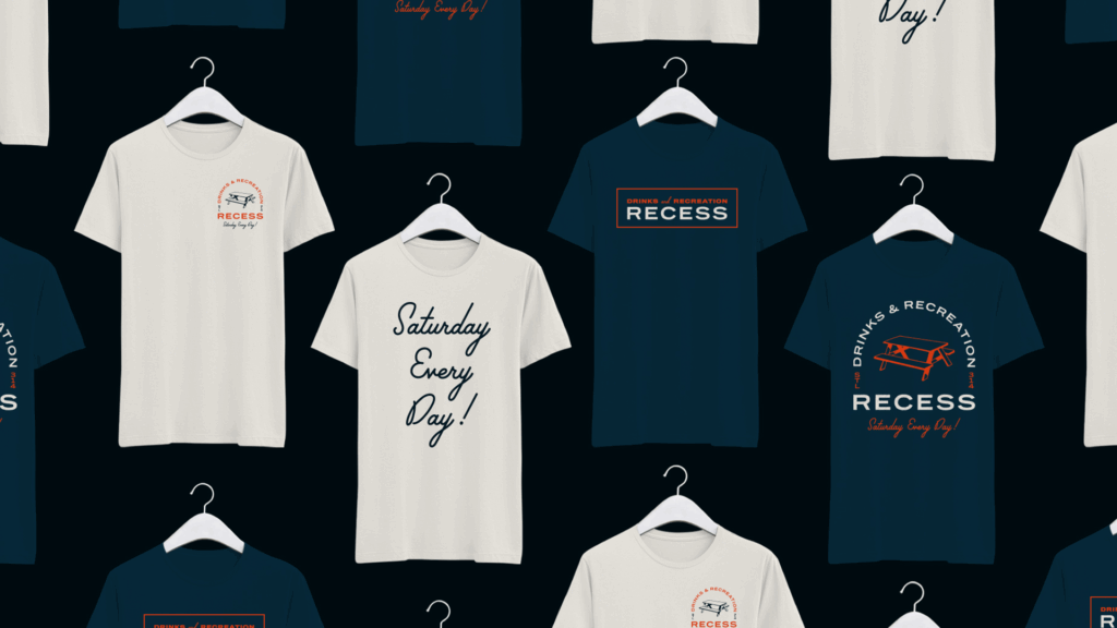
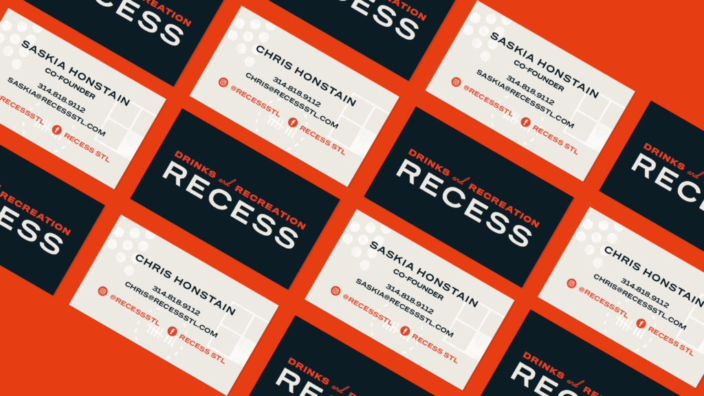
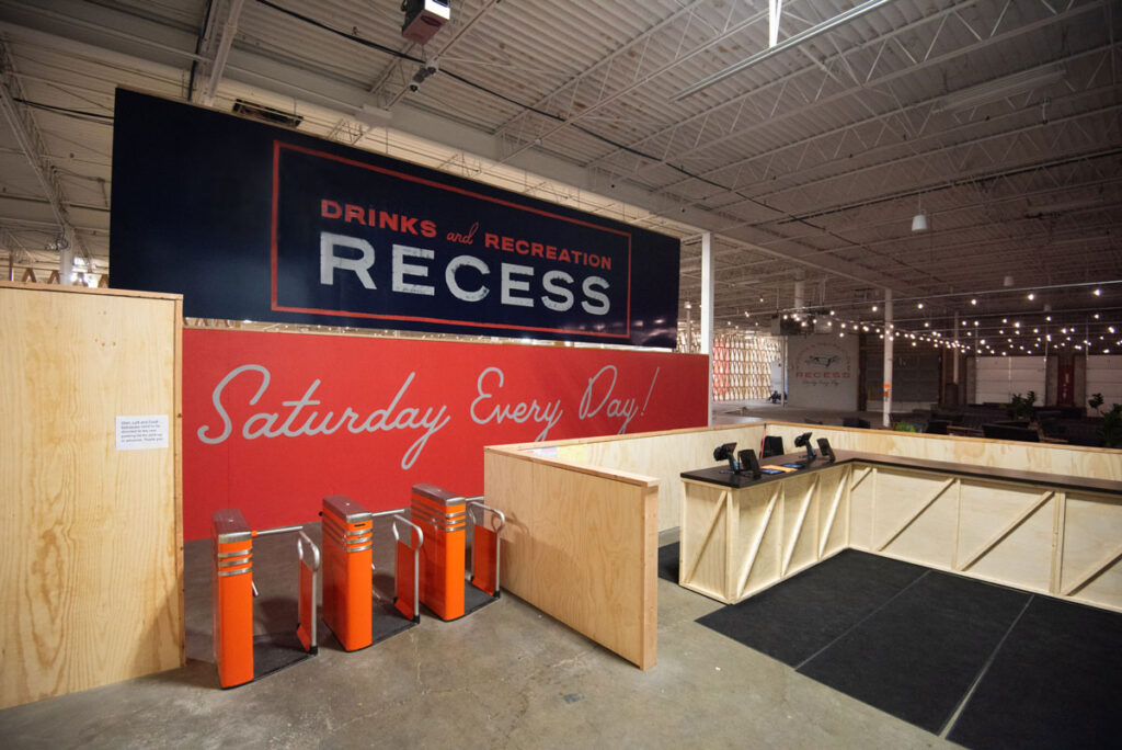
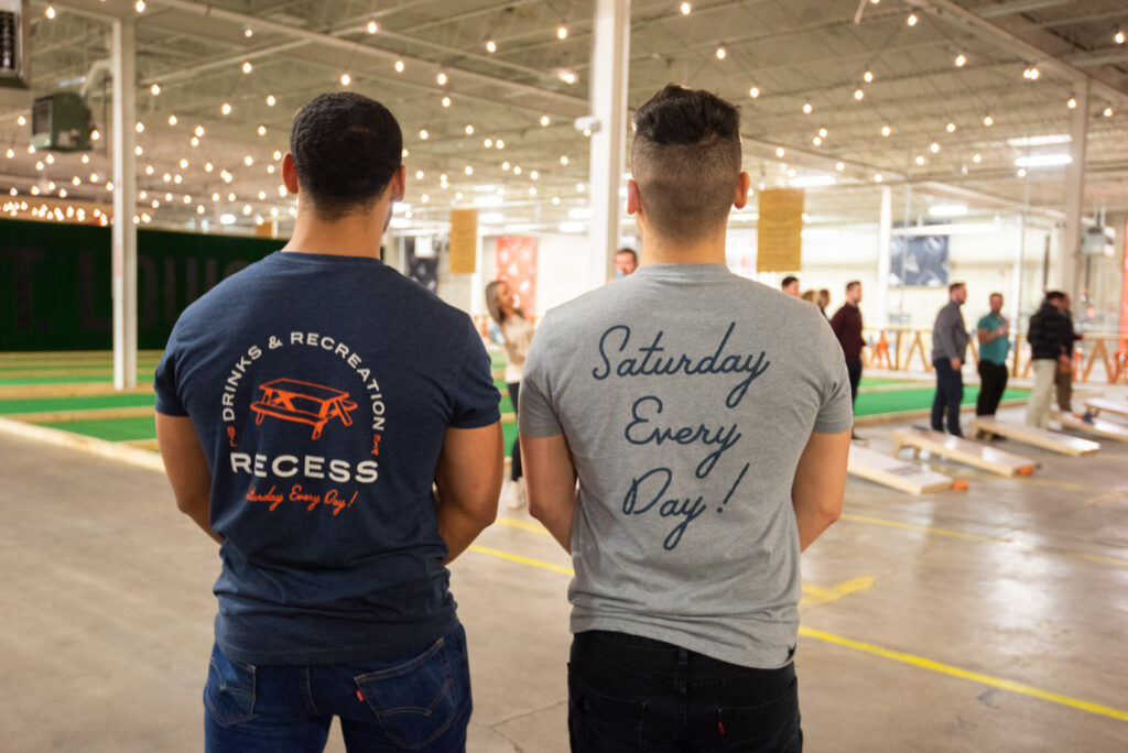
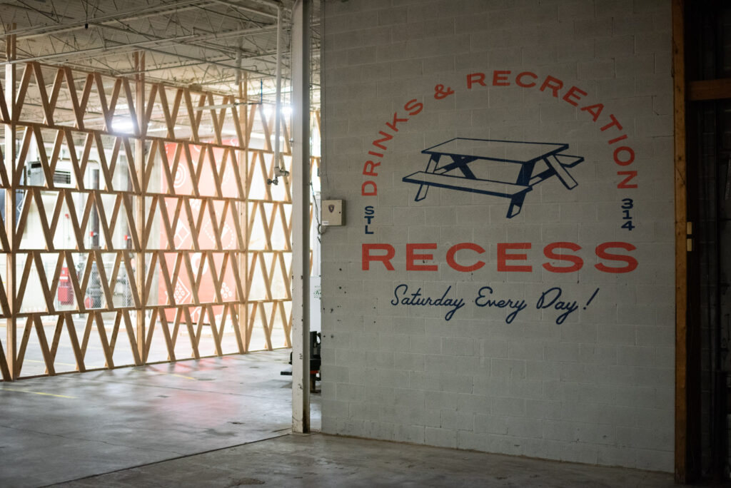
And with that, we arrived at our brand identity for Recess.
![]()
![]()
Oh wait, did I mention that the whole thing is pop-up?
One major detail that impacted our approach for the environmental branding within the space is that the warehouse location isn’t the permanent home of Recess.
Eventually, Recess will move to another location—and anything we created had to be portable enough to go with it.
So we have a giant space with only temporary, moveable elements.
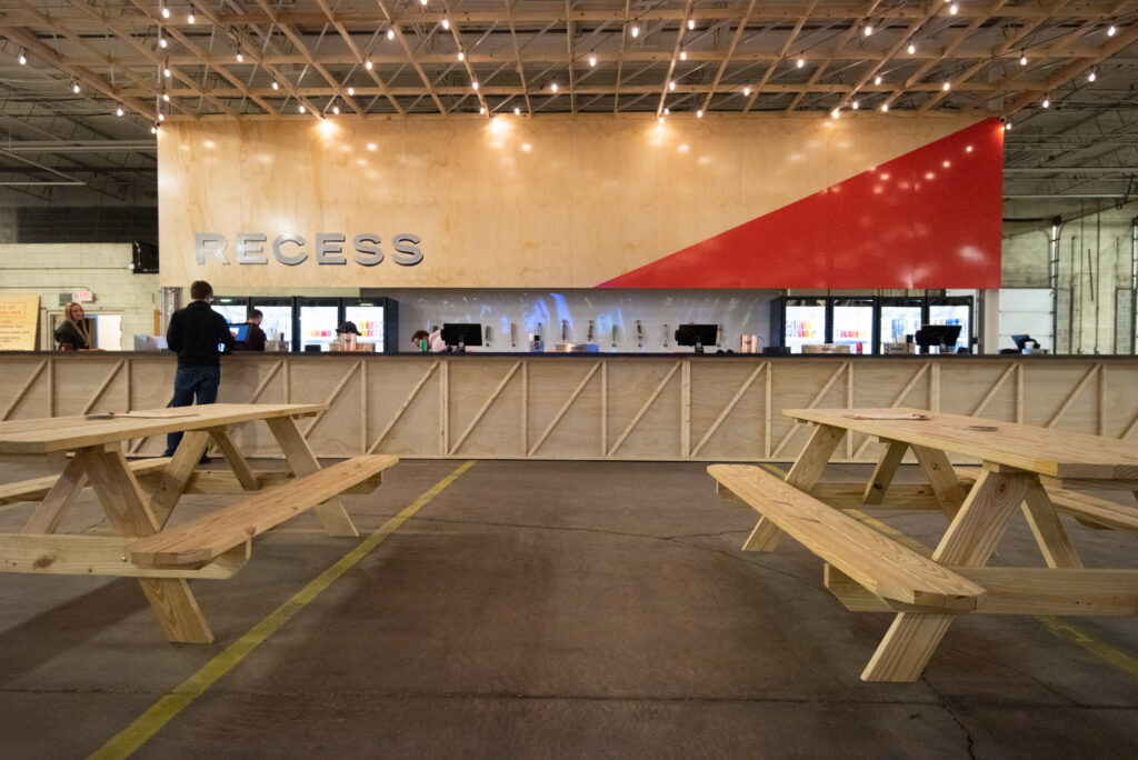
This was a very big detail. It made us choose paint on walls over fancy signs. And moveable graphic panels over wrapped wall graphics.
We get by with a little help from our friends.
Taking 100,000 square feet and turning it into an engaging space is no easy task. We enlisted the help of Mademan Design (we’d worked with them on Yellowbelly last year) for their expertise.
We met, shared our work so far, talked about plywood, 2x4s and other practical building materials, and they came back with a solid plan.
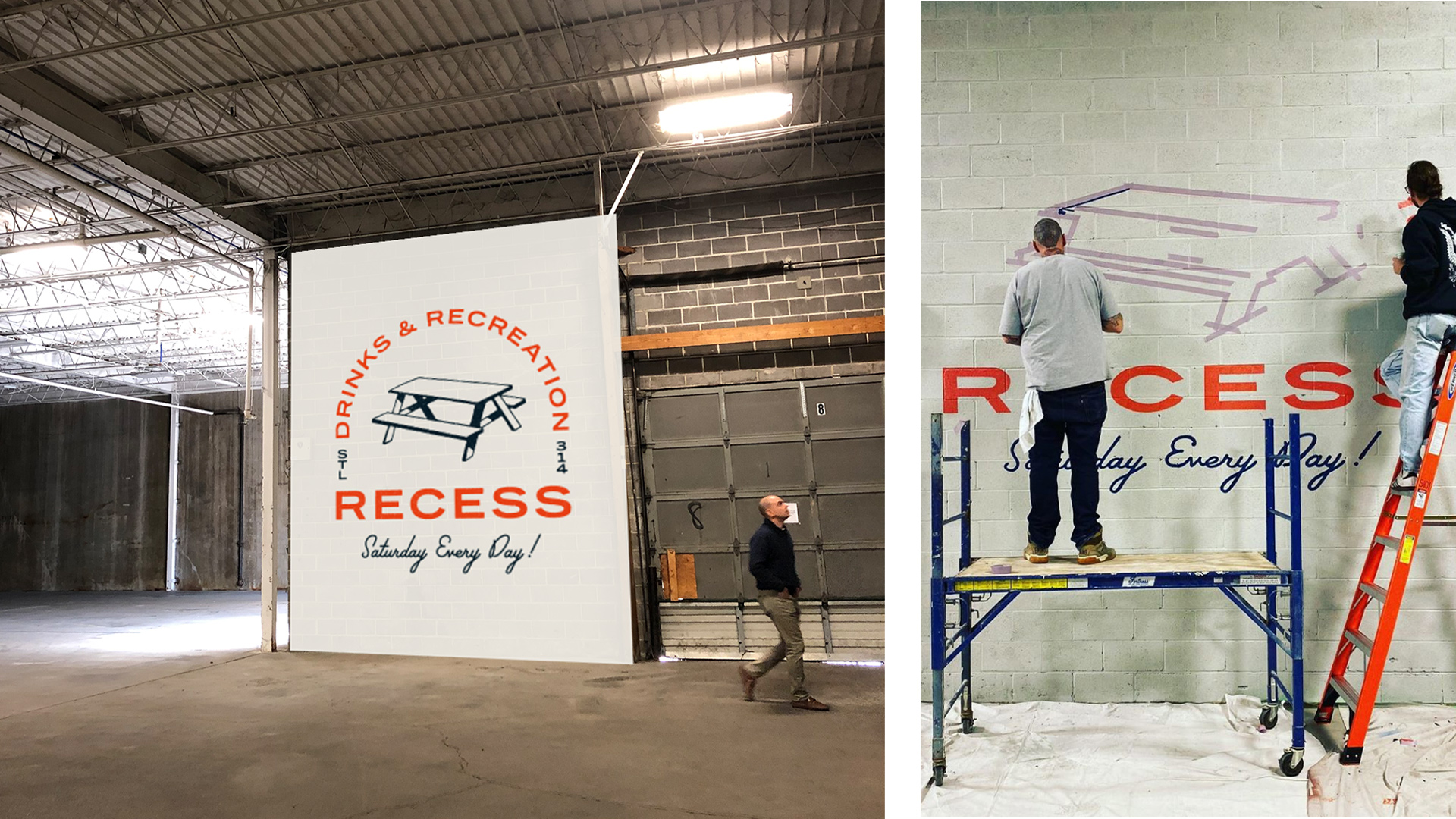
We also called our old friend Shawn Fogle from Swift Print to help with the printing and installation of the banners. Shawn has printed and installed countless tight-turnaround, complicated environmental graphics and we knew we could depend on him.
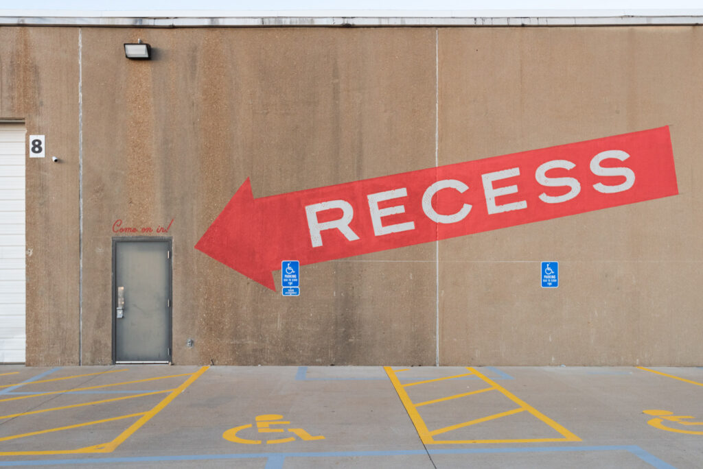
And last but not least, we brought in Topcoat Sign Co. to hand-paint the Recess logo and signs throughout the space—including my favorite, the giant Recess arrow sign on the outside of the building indicating the entrance. These guys are also great at painting giant “M”s.
All together now – bringing the brand to life.
And just like that, everything came together. The images we’d stared at on our screens for months became real.

Time for Recess.
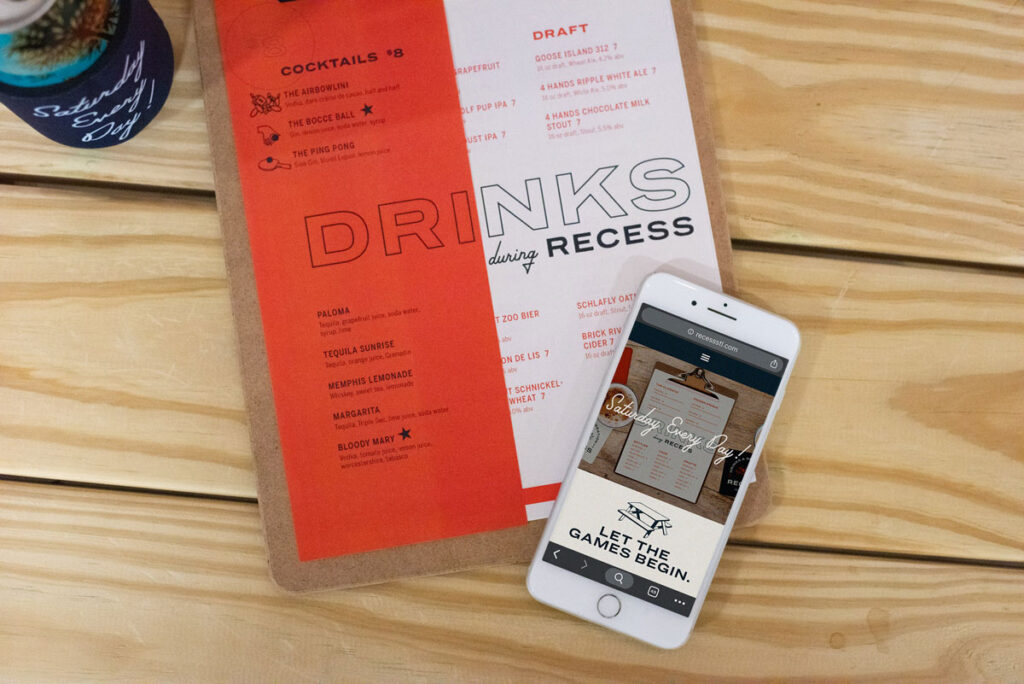
Leading up to the opening, we launched a simple splash page to get people excited, and then the full site with details about the games and rules, plus leagues and tournaments and booking a party.
Thanks to some well-timed pieces in the local media, the opening of Recess was much anticipated. Our team scored invites to the soft opening, and when it opened to the public on Black Friday, Recess saw an influx of people ready to embrace the weird new idea of airbowling and everything else the bar has to offer.
We loved being a part of this project. We love that things like this are happening all around our city, and we’re proud to play a role in making them come alive.
Weird Interesting places like Recess are fun to explore, breathe new life into our city and new experiences into our lives.
It is just weird enough to shift the way you see things – and thoughts like that are wonderfully contagious for everybody.
I am terrible at airbowling though.