Where’d you go to high school?
It’s a fairly common question that St. Louis has adopted as its signature ice breaker. You can learn a lot about someone based on where they went to school. Or at least, people like to think you can.
If you answered the question with Cor Jesu Academy, we’d learn you went to an all-girls school, you’re probably Catholic and you’re likely very bright. Cor Jesu has long had a reputation for strong academics–but the truth is, they have a much bigger story to tell.
They asked Atomicdust to help them share it.
Back to school.
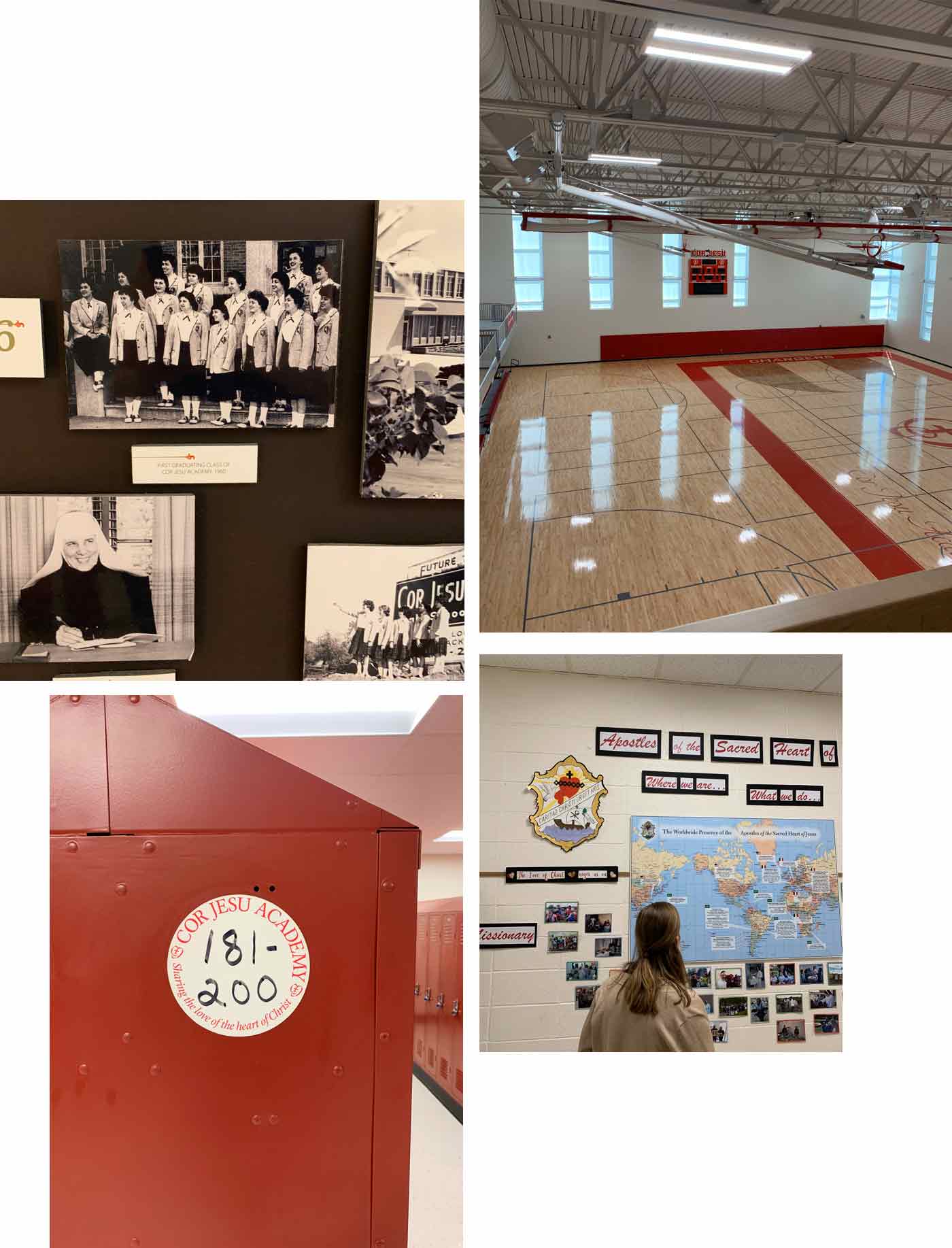
Something to know about the high schools in St. Louis is there are so many choices–and many students start thinking about where to go as early as fifth grade. Schools give presentations to young students and their families on “high school nights” and welcome anyone interested to tour the school or shadow a freshman for a day.
These touchpoints are critical, because they offer the opportunity to showcase what makes a school unique in a crowded market. Cor Jesu asked us for a brand refresh that put their differentiators front and center to help students–and their parents–see why their academics, facilities and culture set them apart.
As a St. Louis native, I had first-hand experience that started, yes, when I was 10 years old. If not younger. I saw the slideshows, visited the open houses and even shadowed a student at Cor Jesu for a day.
This project would have been a breeze if I’d gone to Cor Jesu. But ultimately, I went somewhere else.
New perspective.
At the time–and even before this project began–I perceived Cor Jesu as a performance-driven, rigorously academic school. I thought if I went there, I’d be spending most of my time doing homework.
This was exactly the reputation Cor Jesu wanted to reshape.
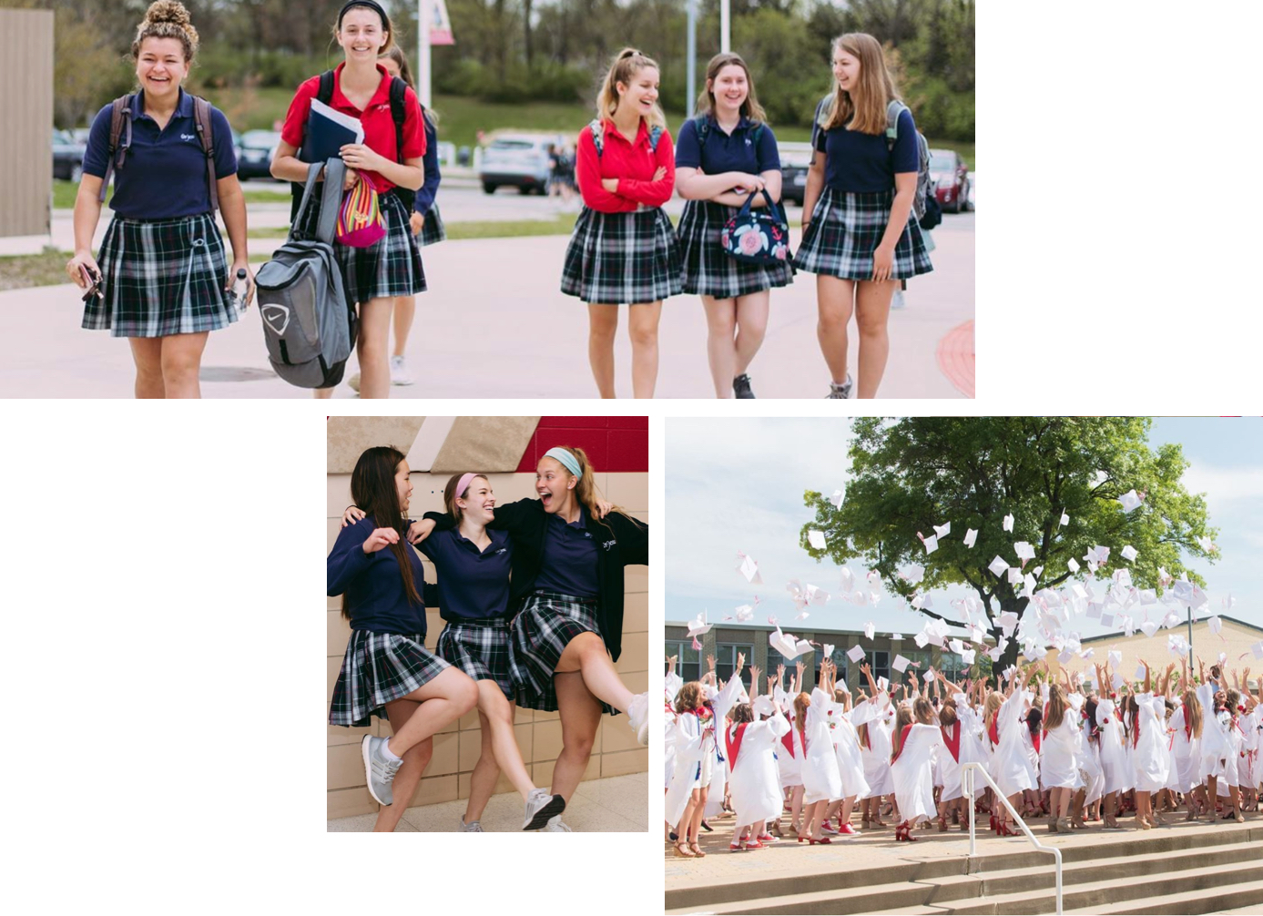
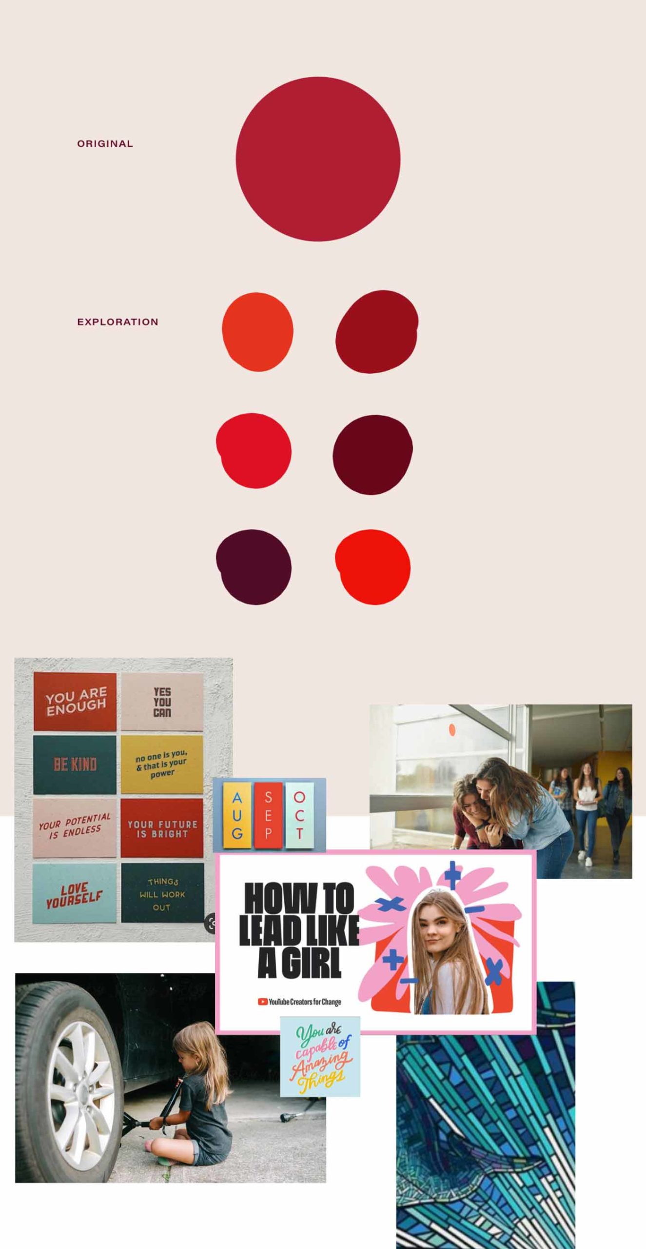
We didn’t want to lose sight of the school’s dedication to academics–we wanted to celebrate it and showcase it alongside all the other things that make them great. The clubs. The athletics. The fun traditions. The emphasis on exploring interests and working towards a career that celebrates those interests.
So the first thing we needed to do was learn more about the school.
Getting to the heart.
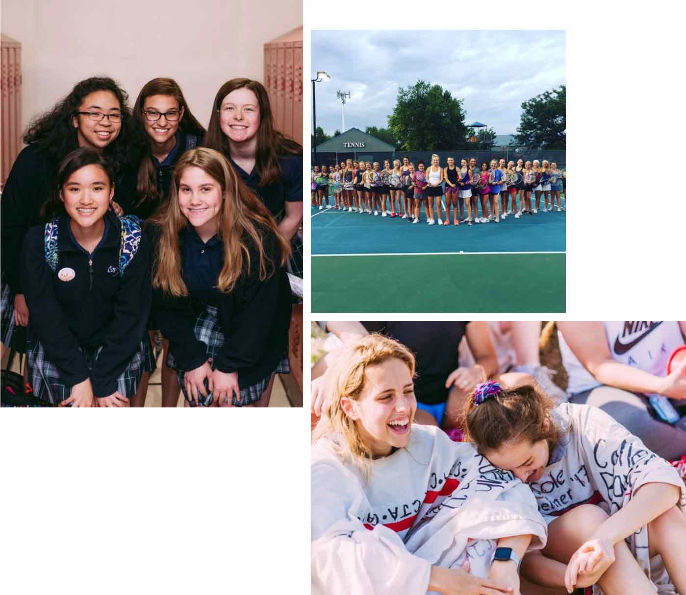
We conduct interviews as part of our branding program, typically with key stakeholders within a company and their clients. In this case, we were talking to parents, teachers, alumnae and even current students. We heard so many stories–from some of the most eloquent 16-year-olds I’ve ever met–about the well-rounded experience that Cor Jesu offers, and the special attention the school pays to bringing out the best in their students.
It brought me back to my own high school experience, that feeling of community and support that came with an all-girls community. Though I went to a “competitor” school, many of the school traditions and stories reminded me of my own. And others made me jealous! Cor Jesu puts a huge focus on exposing their students to different career paths through job shadowing opportunities and summer business and engineering experiences–opportunities that absolutely would have caught my interest when deciding where to go to school.
But Cor Jesu’s story isn’t my story. Though the similarities–and understanding–were there, I was extra motivated to make sure the language we crafted for Cor Jesu would be uniquely theirs.
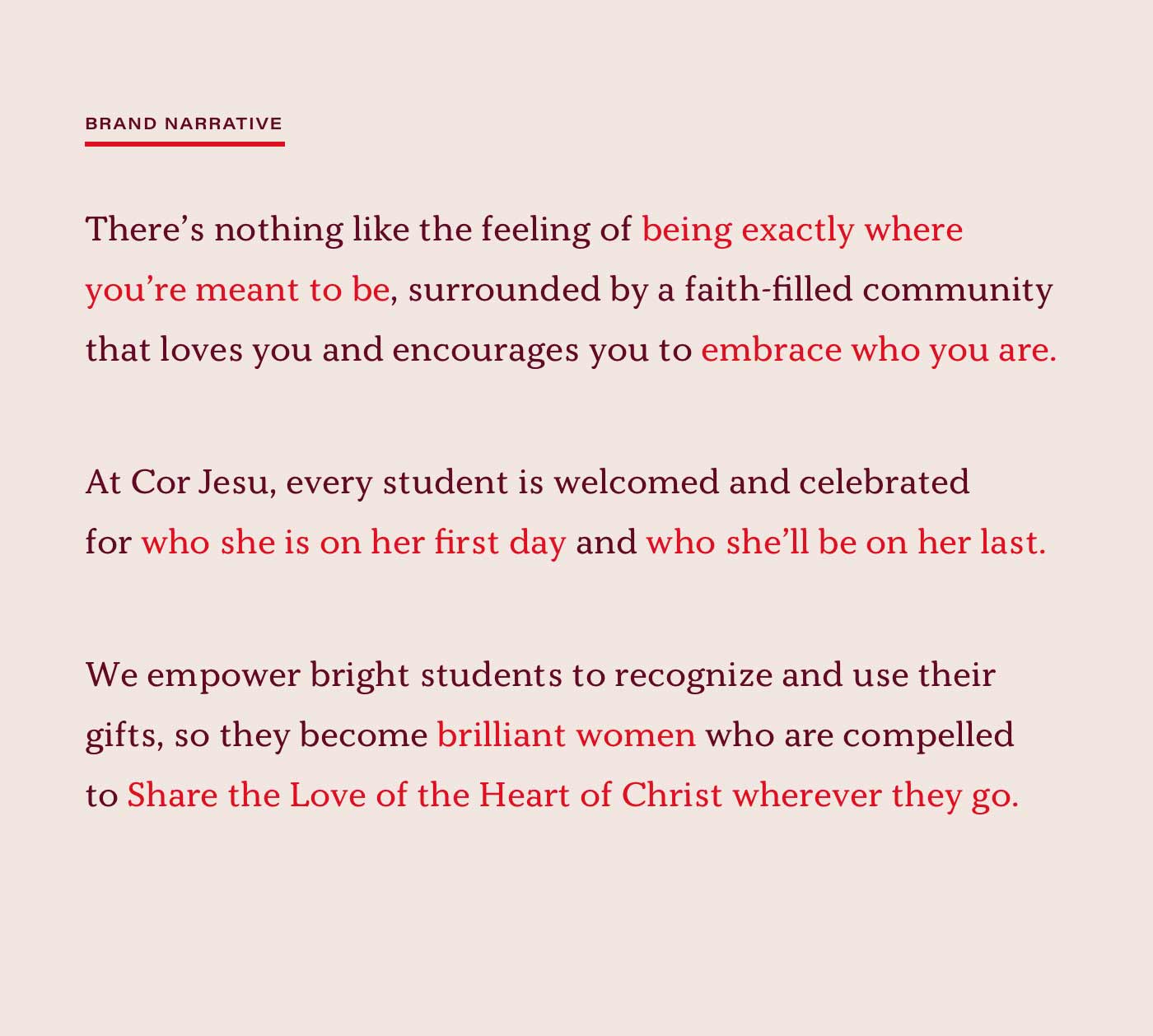
There’s nothing like it.
Sometimes writing a brand narrative is a grueling process. It needs to accomplish a lot in 10 or so lines of copy. It needs to set a foundation for the brand voice and tone, while summing up all the great insights and stories gathered during our research process.
And in this case, it needed to set a foundation for a shifting reputation.
During some projects, we meet for hours over the course of weeks, fighting over single words and phrases, reshaping and redrafting and rethinking until the feeling is just right.
With Cor Jesu, however, the many voices we heard from the school were inspiring. A new story needed to be told, but it was one that teachers, students and parents already knew. We just needed to help sum it up and share it with the community outside of the school.
The tagline, however, was another story.
Keep it simple.
A good tagline is catchy. It’s memorable. It represents the spirit of the brand narrative in as few words as possible. In this case, it needed to be a mantra that would resonate with students and parents (both current and prospective) as well as faculty and alumnae.
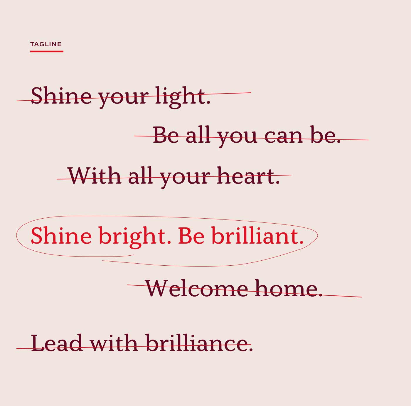
Typically, a tagline isn’t the most complicated part of a project. But after talking through about 50 different options (not an understatement), and referencing the Bible for the first time in my professional career, we landed on the perfect sentiment:
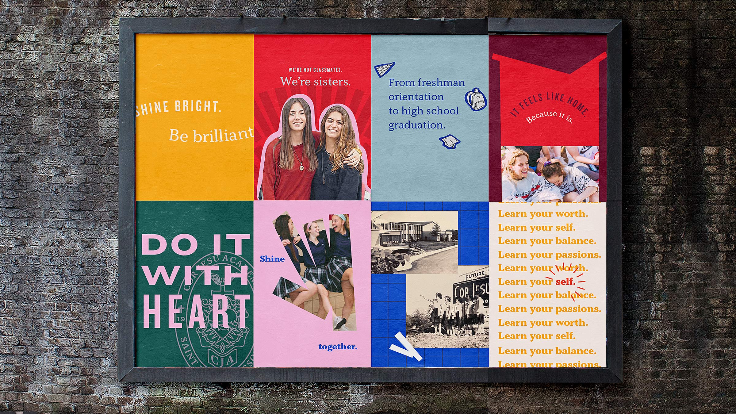
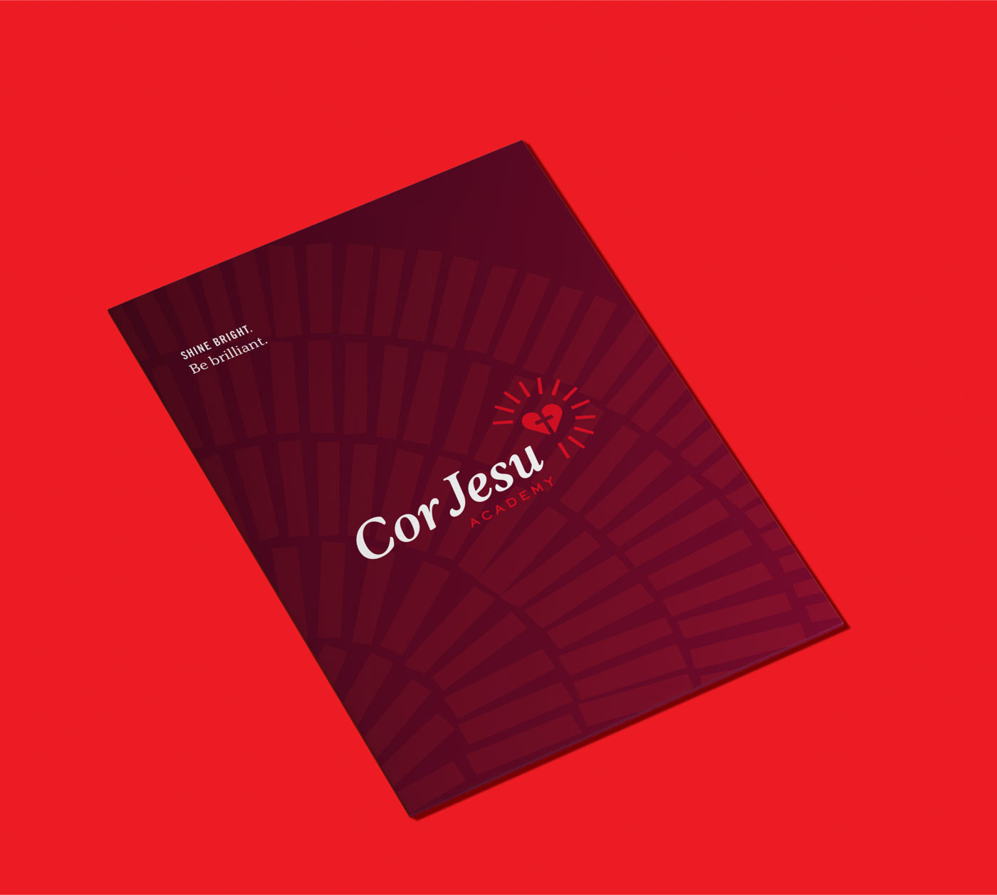
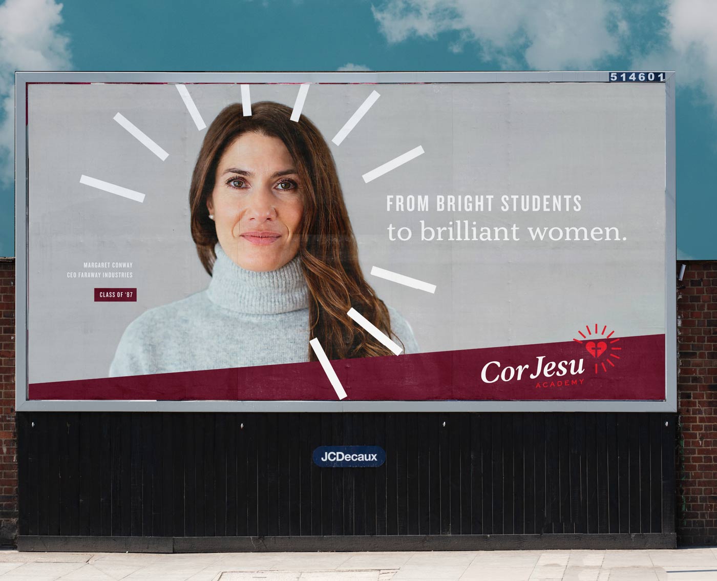
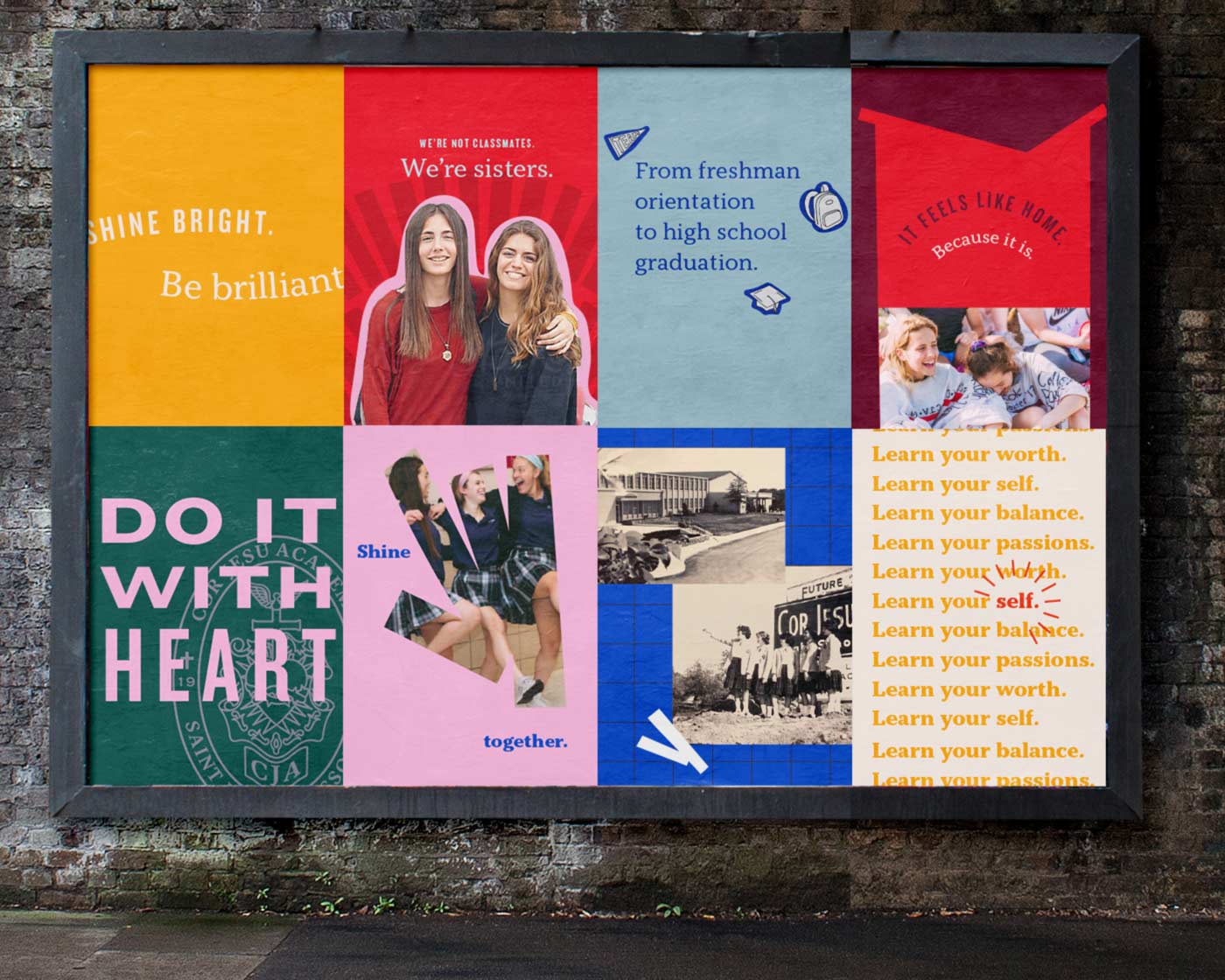
Shine bright. Be brilliant.

It highlighted the individuality of students–when you are your best self, you’re brilliant, while nodding to the academic spirit that has always been an important part of the brand.
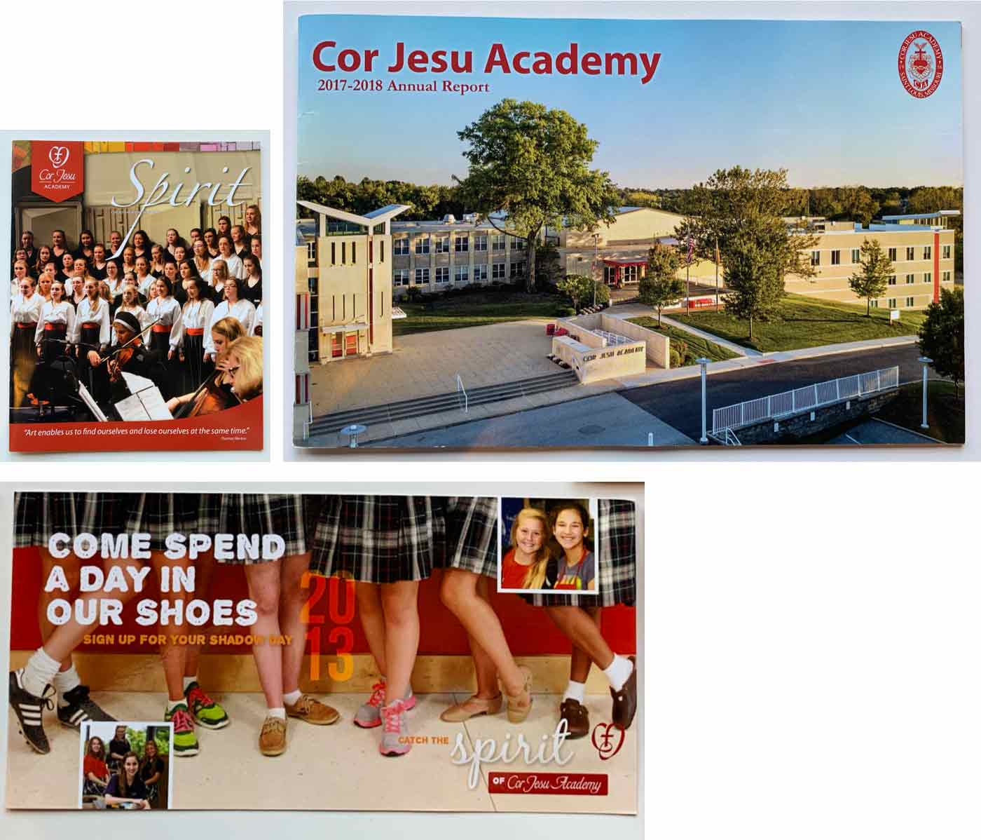
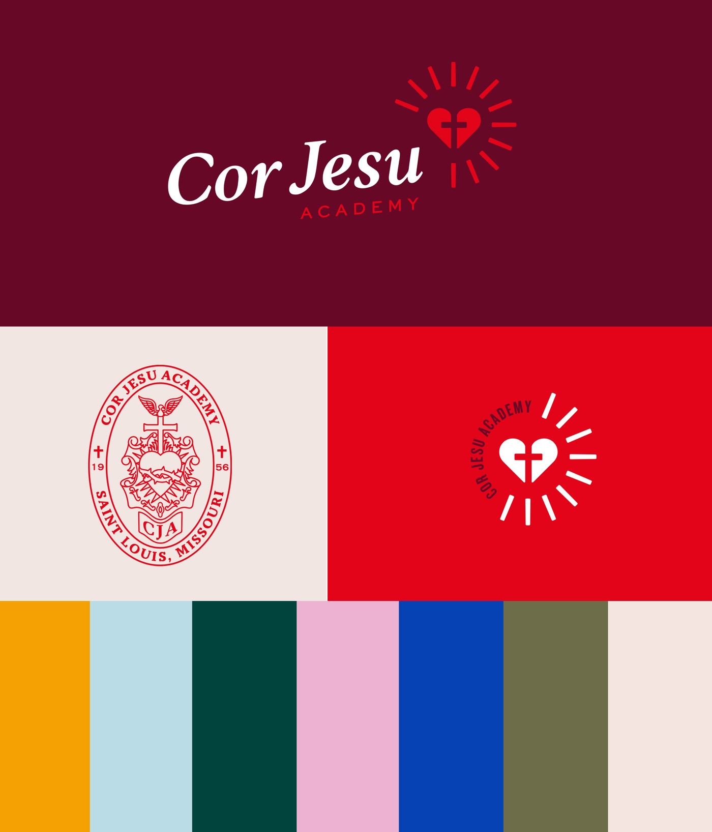
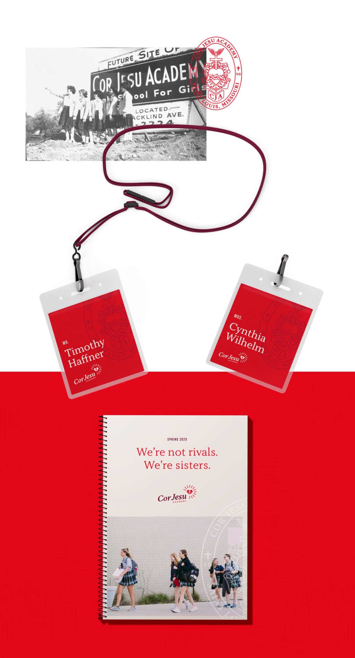
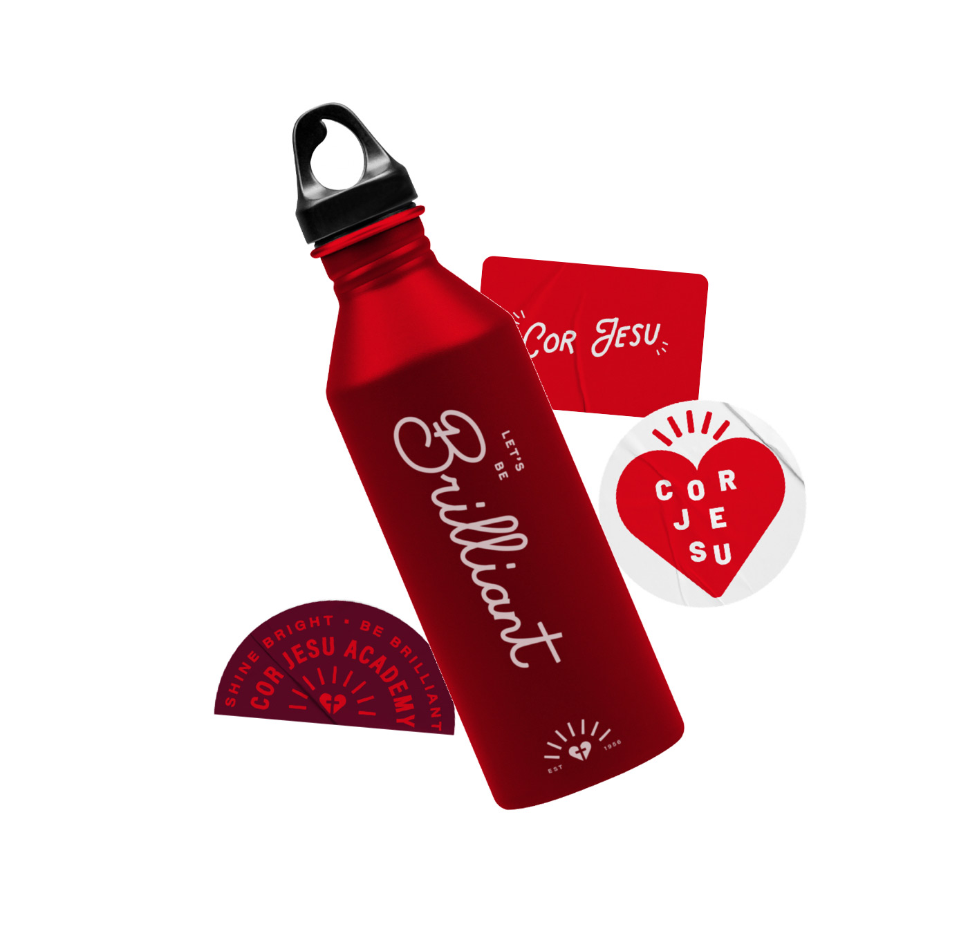
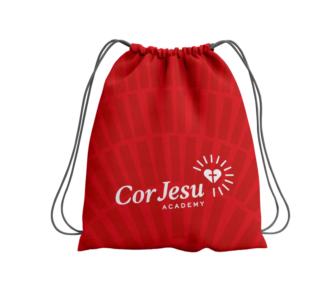
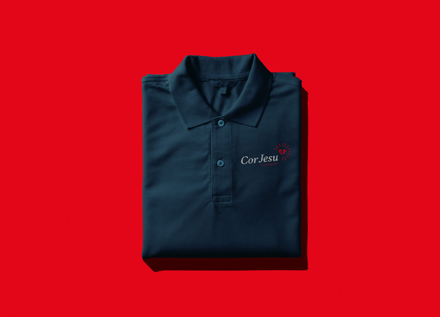
A new look.
![]()
![]()
![]()
A new spark.
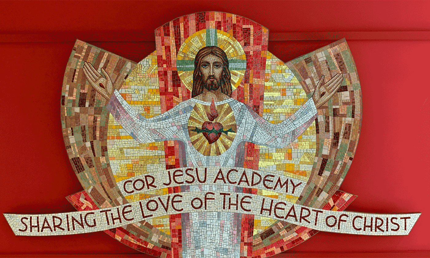
The tagline sparked inspiration in design and logo efforts, too, with bright rays becoming a signature brand graphic, alongside a fresh, young color palette pulled from the mosaic found in Cor Jesu’s entry.
From brand shapers to spectators.
We presented Cor Jesu’s brand in February of 2020. It was one of our last in-person meetings before our office, their school and the world shut down.
There are many things that can hold up a new brand launch, and a global pandemic is definitely one of them.
The launch was delayed and delayed again. This past April, more than a year after our initial presentation, we were pleasantly surprised to hear the brand would finally go live.
Sometimes a company will engage us to help them launch the new brand. Other times, we supply the brand standards, and their team handles the rest.
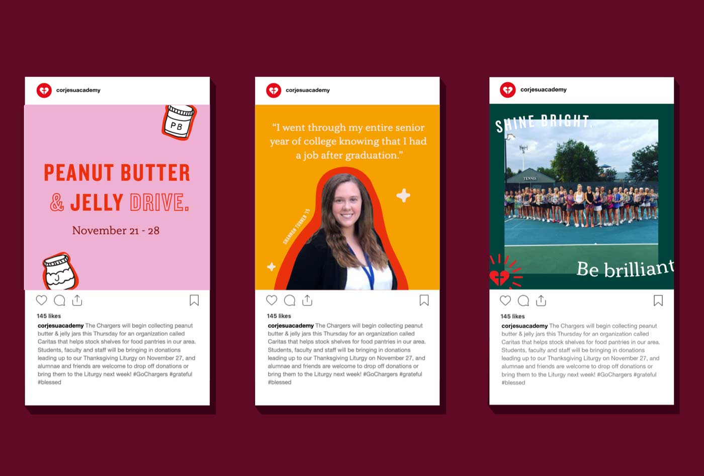
In this case, Cor Jesu’s team lead the launch efforts. When they began to post teasers on the school’s Instagram feed, we were just as excited as the rest of their audience to see how the new brand would roll out.
A bright brand launch.
You may be surprised to hear this, but we love making people cry. Some of our proudest moments have been meetings where a brand narrative, logo or even a coffee cup mockup triggers tears. Because we know we’ve really resonated the way we set out to.
Cor Jesu flipped the tables on us (or at least me) with their brand launch.
The brand launched online, with a video produced by Birdeye Media—a company owned by a Cor Jesu alumna. The video showcases Cor Jesu’s students, culture and spirit, narrated by students reading the brand narrative we’d crafted. By the time the video wrapped up with the new logo and tagline, I was reaching for the Kleenex.
The next day, students were greeted with t-shirts, masks and branded photo ops. It was so exciting to see the brand we’d built being shared with and celebrated by the students.
With a fresh, modern brand in place, we helped Cor Jesu celebrate all the things that make it a great place to learn and grow.
We gave them the tools to attract attention and to shift perceptions as they share their message with the next generation of students–and we can’t wait to see them shine.