The opening of James Beard award-winning chef Gerard Craft’s fifth restaurant has made huge waves on the St. Louis food scene. The fast casual Italian eatery has drawn praise regionally and nationally for its food, branding and environmental design – and we’re incredibly proud to have been a part of its inception.
We’ve been working side-by-side with Gerard since last summer to help him establish the identity, look and feel for Porano Pasta. As the physical space started to take shape on Washington Avenue, we also joined forces with architect Sasha Malinich of CASCO to ensure our vision aligned with his.
Every step of the way, we sought to capture Gerard’s inspiration: a family trip to the small town of Porano, Italy. There he discovered a sense of warmth and community built around sharing delicious, simple food – and he longed to bring this feeling back to St. Louis.
The “fast casual” concept at Porano works as you’d expect. Guests create their own dishes from the list of ingredients – choosing from pastas and grains, sauces, proteins and vegetables and additional toppings. There are literally thousands of combinations, so everyone can create something they like.
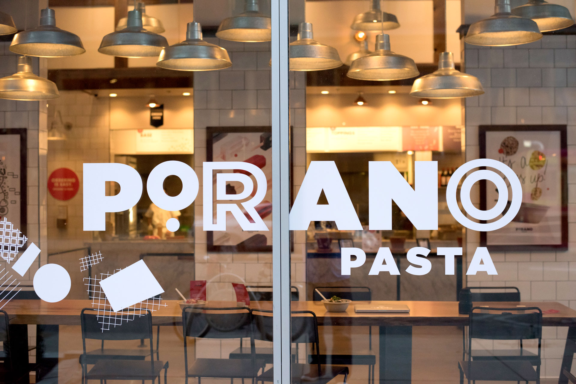
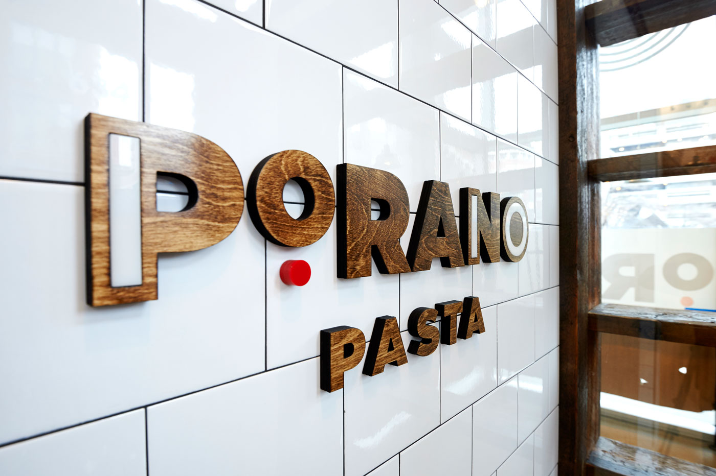
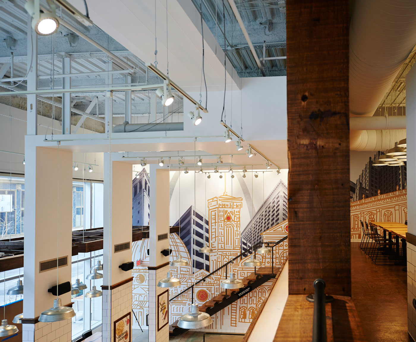
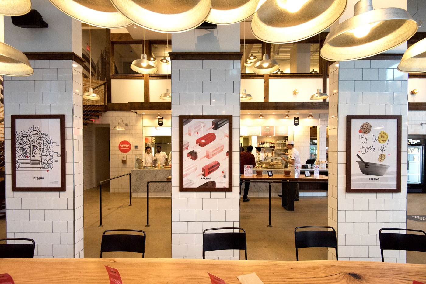
We took a similar approach to our environmental design in the space, mixing both modern and mid-century modern styles to create a look that’s uniquely Porano.
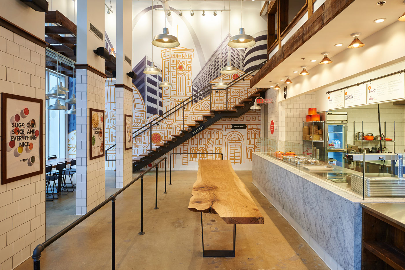
Illustrations of Italian-influenced buildings were fused with images of our own contemporary city to create a striking mural in the main hall. On another wall, a map that reflects the real town of Porano is expressed in a style that’s uniquely Porano Pasta.
The logo and in-store signage carries similar influences. Its letter styles vary throughout the space, yet at the same time bring a sense of clarity and consistency to branding and wayfinding.
There’s a special thrill to seeing work come together on the web or in print. But it doesn’t compare to standing in the physical space and seeing the pieces in place, especially after months of wondering if the work was any good in the first place.
As you probably expect, we’ll be talking more about how all of the pieces came together in future posts. But in the meantime, we’ll let the pictures speak for themselves. If you’re thirsty for more on the concept, check out the Porano Pasta website.
And of course, if you’re in the neighborhood, stop by and grab a bowl of pasta – and join us in congratulating Gerard on the launch of yet another successful restaurant.
Thanks to Greg Rannells for providing some really great photographs.
Want to keep up with the latest work from Atomicdust?
Subscribe to our newsletter for all the latest news, events and weekly marketing tips from our team.

