You’ve been there. Sometimes an idea seems too obvious. Too on the nose.
You push it out of your mind. You look at the problem from a thousand angles.
You reread the research and dig even deeper into the competition.
You take a thousand walks around the block. You talk about it, argue about it and set it aside.
But you keep coming back to it. It just feels right.
But is it?
That’s exactly how our True Media branding program unfolded.
And it all started with a question we asked ourselves from the very first step: “What’s in a name?”
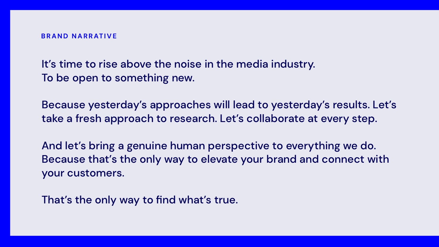
Finding what’s true.
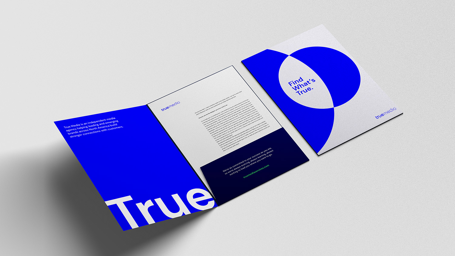
An independent media agency, True Media helps companies of all sizes—like RE/MAX, Lenovo, Mall of America and Abbott—plan and execute media strategies that elevate their brand.
Our brand research, including one-on-one stakeholder interviews, competitor audits and a whole lot of keyword research, uncovered a lot of great insights about True Media and the media industry as a whole.
The company has offices throughout the Midwest and two major cities in Canada. These are not traditional media hotspots, of course: a point that the mid-sized media company has played up in the past.

As True Media started to pursue larger and larger accounts, they recognized their humble Midwestern vibe wasn’t cutting it anymore. And this modest attitude never really played well in Canada, either.
True Media earned client praise for their team’s collaborative approach, deep research and keen insight. As client relationships deepened, however, one question always came up: “What does True Media stand for?” Clients even asked, “What does the name, ‘True Media’ mean, anyway?”
There wasn’t a single, clear-cut answer.
Internal stakeholders told a remarkably similar story. In every corner of the company, from Kansas City and Minneapolis to Calgary, employees said they took great pride in their work.
Everyone talked about how they’ll go above and beyond to help their clients. They had only the highest praise for their co-workers, and how much they put into their work. But most mentioned how they were missing that essential, now-almost-cliché Simon Sinek ingredient: the “why” behind it all.
And their internal teams, too, asked, somewhat rhetorically: “Why are we called True Media?”
What’s in a company name, after all? And what is True?
As we thought about how to shape their brand story, we initially dismissed leaning into True. But it was one of those ideas—can you even call something so seemingly obvious an “idea”?—that just wouldn’t go away.
But it just seemed, if you’ll forgive the phrase, true to them. They were so authentic, so dedicated that we couldn’t ignore it. And once we embraced it, the pieces started to fall into place.
Finding the right emphasis.
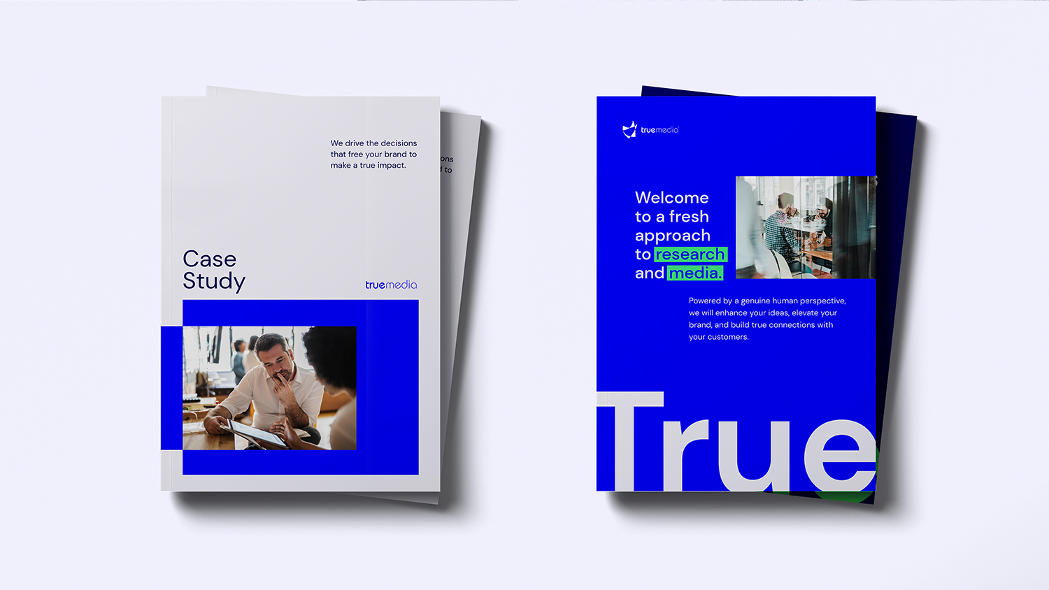
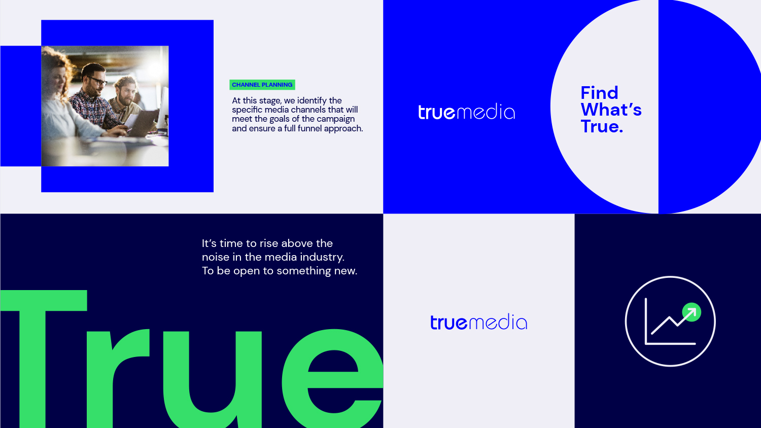
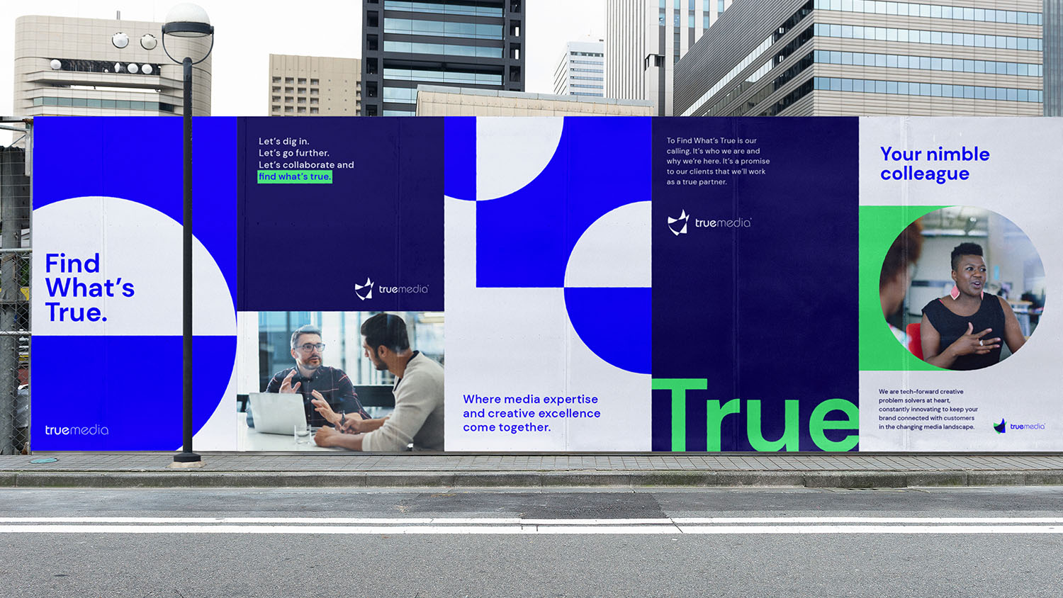
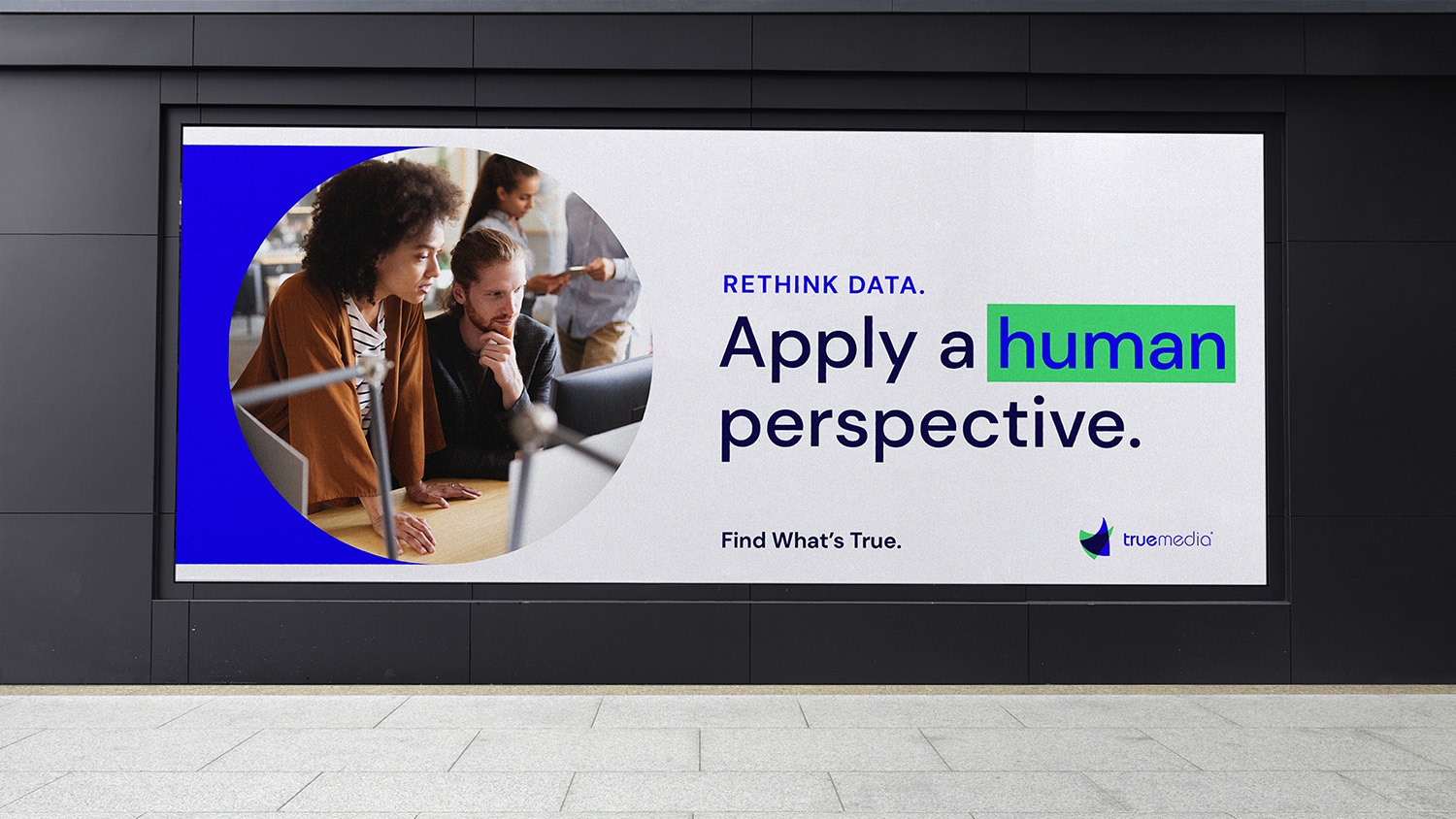
You can see our tagline lurking in the brand narrative: Find what’s true. It’s a promise to clients and it’s an internal rallying cry for employees.
These three simple words led us on a collaborative journey to find the truth in the brand.
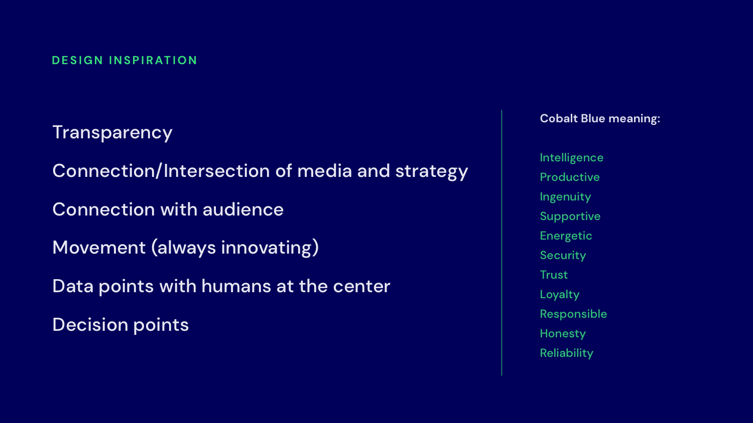
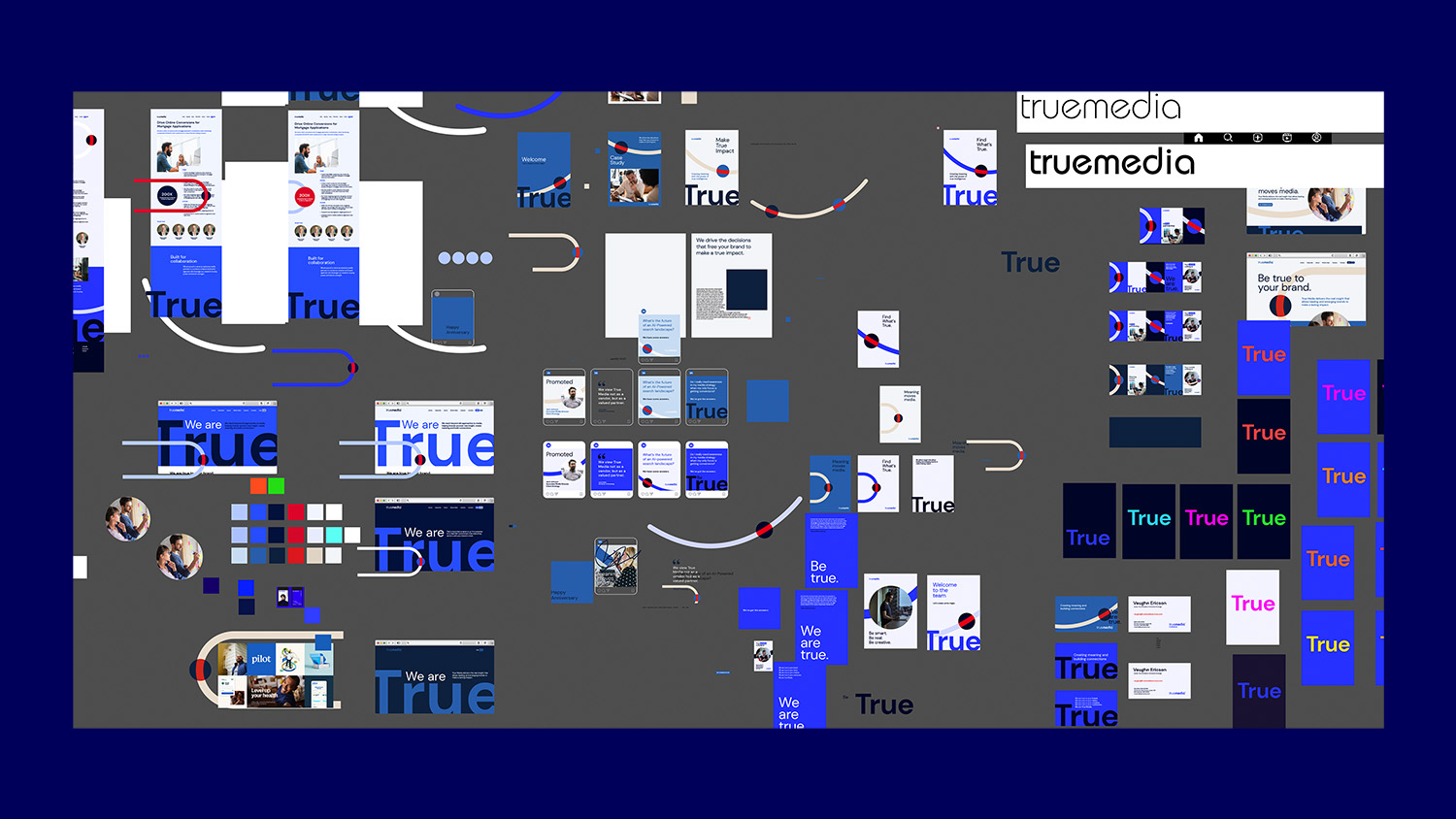
And what a journey it was. We explored several visual metaphors to portray the process of “finding what’s true.” From following a literal path to focusing on moments of discovery. We tweaked language here and there, changed colors and built a million art boards.
And we started to find our way.
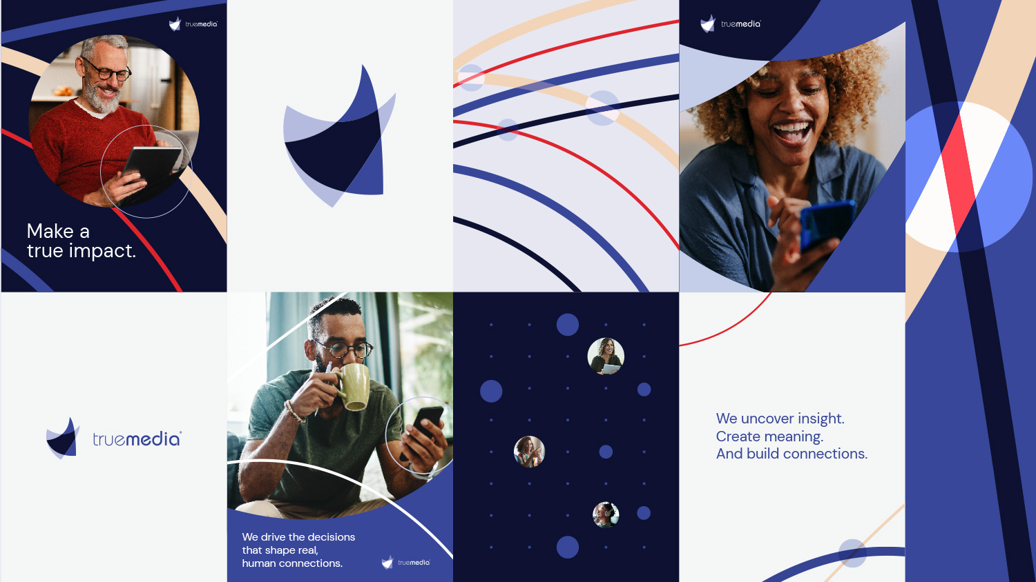
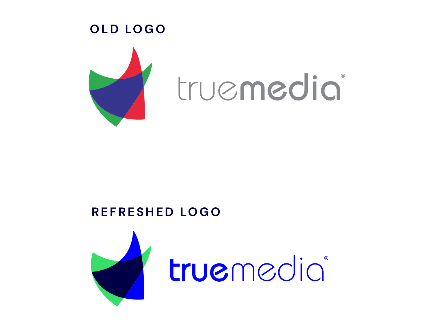
First up, a slightly evolved logo that shifts the emphasis from ‘media’ to ‘true’–to emphasize the differentiator.
Bringing everything together to create meaning.
We thought about the nature of inspiration and creativity. How true breakthroughs happen when people come together to create connections that others might miss. That’s where True Media shines.
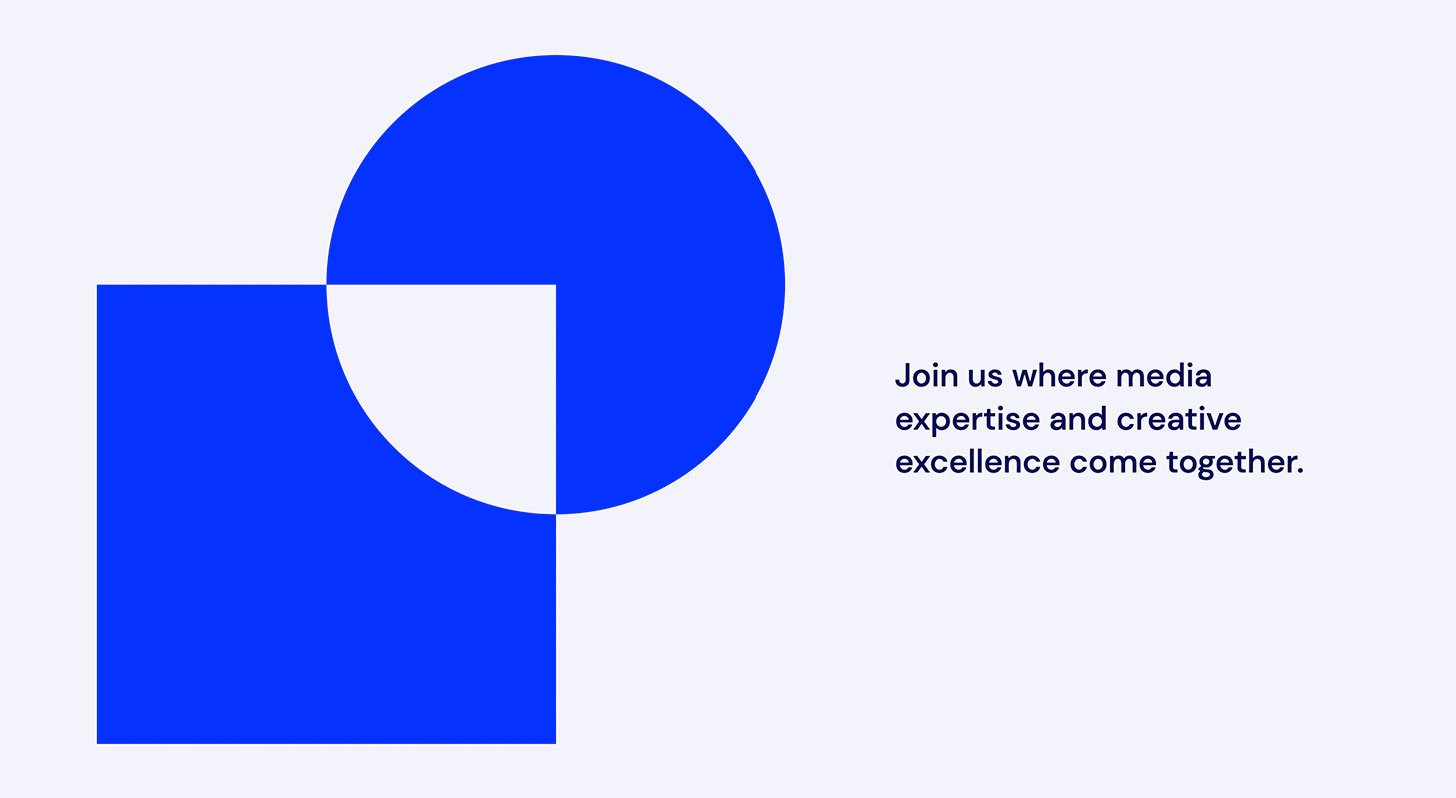
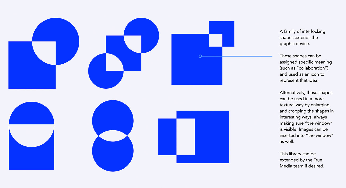
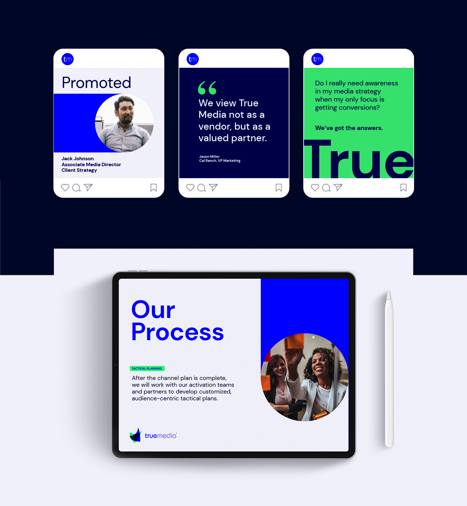
With bold shapes in bright colors, the visuals show that moment when clients find what’s true—about their brand, their business, their customers. And with a system of ownable graphic elements, we’re able to clearly demonstrate the value this insight brings.
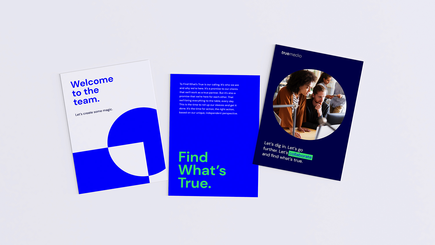 At the same time, we’ve given True Media a clear, consistent voice to speak to internal teams and on social media.
Being true to our creative selves, too.
We’d be lying if we said that going with an “obvious” answer made this an easy project. But as we progressed through the process, we could feel it was right.
The client was thrilled with the stories we uncovered, and how their updated brand reflected the true nature of this growing company.
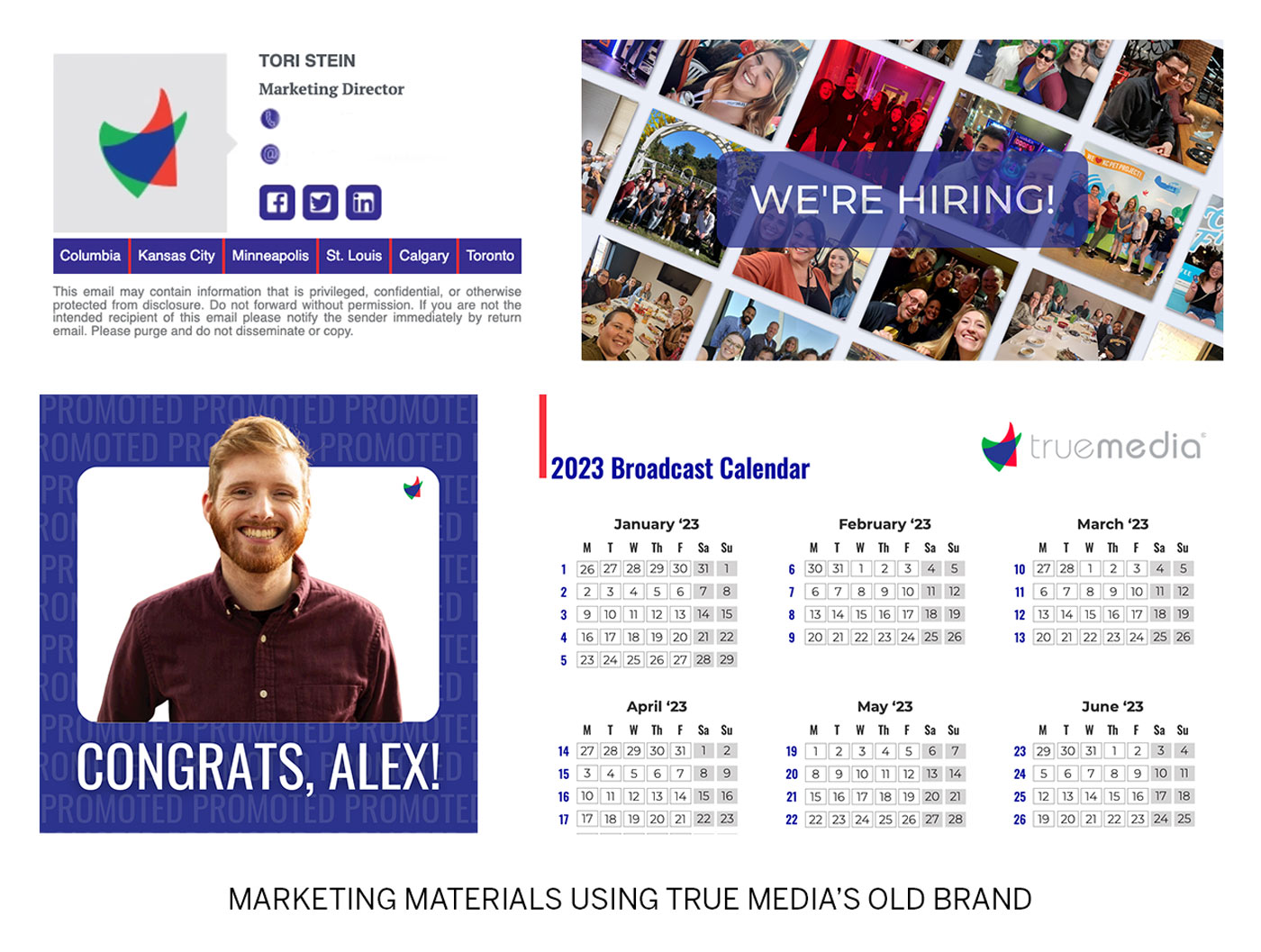
They’ve updated their website to reflect the new brand messaging and visuals, and have done a fantastic job infusing the new identity into a range of marketing materials.
We believe that’s the clearest sign of a successful rebrand: When a brand is authentic or—last time, I promise—true to the company it represents, expressing it becomes easy.