I have never lived in Polynesia. I (sadly) have never even been to the area. I did not grow up there in the ’80s. And even if I did – I bet the locally produced, small-budget television commercials weren’t half as good as what we had in St. Louis.
When I had heard Atomicdust was partnering with Tim and Travis from Retreat Gastropub to create a brand identity for a new tiki bar and restaurant concept, I instantly thought of 1980s late-night TV commercials.
Growing up in St. Louis, when TVs had dials on them, St. Louis had some amazingly entertaining, yet very low-budget late-night TV commercials. One was for a Polynesian bar that my 8-year-old self always wanted to visit – Terry’s Polynesian Room on North Kingshighway.
The commercial featured the owner, Terry, sitting in a wicker high-back chair, dressed in a Hawaiian shirt, sunglasses and a fedora. If I remember right, a couple of his much younger female friends stood next to him, fanning him with palm branches.
I don’t remember everything Terry said during the 15-second commercial – but the tagline he used when the commercial ended will happily be burned into my brain forever. He would smile at the camera, hold up a two-finger peace sign, and say “Aloha – and we’ll see you on the island.”
“It’s not going to be anything like that,” Jesse quickly shut it down. “We’re not going to be a cliche tiki bar.”
The new restaurant would walk the line. There would be plenty of tiki-inspired rum drinks, but upscale and contemporary. We thought about it as having a west coast and island vibe, but stayed clear away from nautical.
As my friend Jazzy would say, it would be tiki – but in the right way.
But first, we needed a name.
Naming the Brand
Since “Terry’s Polynesian Room” was already taken, we had to come up with something new.
Naming a new brand is a challenge. Your name is your brand’s story distilled in its shortest form. What makes a name great is when it serves as a shortcut to remembering the brand’s story. It can be the most important—and difficult—component of the brand to get right.
For Yellowbelly (before we called it Yellowbelly) we explored lists of name possibilities ranging from World War II bombers and old slang terms for liquors to distress signals and ingredient combinations commonly found in island drinks.
The name Yellowbelly was always on our shortlist. When we drilled down the meaning of it, we got really got excited.
At first glance, Yellowbelly is a description of tropical birds and fish. This makes sense and is an easy correlation.
Second – Yellowbelly is slang for “coward.” If you’re a coward, you run away from things you’re afraid of. Running in fear of something is to “retreat,” as in Retreat Gastropub, the name of Travis and Tim’s first, very successful, restaurant. We loved how these two secondary meanings could become a theme.
Lastly – calling someone a “Yellowbelly” is razing them. It’s a playful dare to get people to step inside a tiki bar – a style of bar and restaurant that they might have considered not for them. The tiki concept was a little new to St. Louis. Only Terry himself had braved the waters thus far.
We loved the name Yellowbelly. With all these meanings swirling around our conference room, we knew the name (and the brand) had legs to explore.
A Modern Hideout
If you’ve ever noticed a pattern to our work, it’s language. Atomicdust values (and argues internally a lot over) foundational brand language. One of the hardest pieces of brand language to create is the tagline.
Some people call it a theme, or a tagline, or a mantra, or even somewhat of a descriptor. For Yellowbelly, we arrived at “A Modern Hideout.”
If you think about Yellowbelly as slang for “coward,” the idea of hiding out is a perfect fit. Could we build a brand that aligned itself with tropical, modern aesthetics, and as a place to spend some time hiding out from the world?
Early Logo Concepts
We hand painted some early logos for the Yellowbelly brand identity. We loved the chunky, blocky, imperfect feel they had.
Early on, we had this crazy idea that we could have a poorly hidden person in all of the design executions. It would be a really whimsical way to tie in the hideout concept.
Here are a couple whiteboard sketches of the original idea.
Here’s an image of an early, hand-painted logo concept with our character hiding out. You might not notice it at first glance, but look at the last Y.
The hidden character was great living on our conference room whiteboard, but we needed to explore it more in executions. We call this exploration Brand Expressions: we try to be realistic enough to illustrate the brand’s direction, but not bogged down by exact details.
Putting all of these visuals together proved to us that we had a solid concept, but the playfulness of the hidden character and the hand-painted, chunky type didn’t fit the vision of a higher end restaurant in an affluent neighborhood. It needed to have a more elegant and upscale presence.
The elements of the Modern Hideout concept set the stage for the Yellowbelly brand – now our work was to refine them.
Returning to the Sea (and Spirits)
Have you ever found a piece of seaglass on the beach? When glass ends up in the ocean, the waves of the sea crash over it over time, smoothing out its rough edges.
“Sea and Spirts” is a simple, descriptive phrase that both embodies the modern tiki concept, and let guests understand the restaurant brand quickly. We let the language of “Sea and Spirits” crash over our work like waves on glass, and set the Modern Hideout concept adrift.
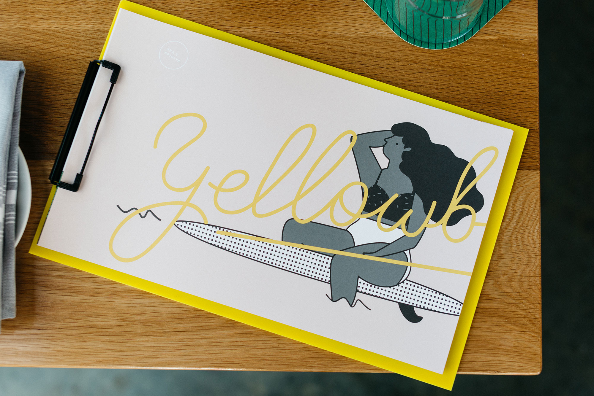
Our raw and hand painted logo evolved into a more polished and streamlined hand-lettered script type – complete with a fish hook.
We incorporated illustrated palm leaves (a simple twist on a tiki classic) throughout the brand executions, complete with vibrant colors, pattern, and subtle millennial pink. (Is that a real thing?)
And our hidden hero came front and center, with the same black and white style, but this time rocking a swimsuit and a surfboard.
The Song of the Siren
Can I share something with you? Most restaurant websites are boring. What’s even more boring are single page “Coming Soon” restaurant websites with just a logo.
I understand they’re necessary, and that you have to start somewhere, but still—pretty boring.
With Yellowbelly, the first “public” execution of our branding was the coming soon splash page.
To make it interesting, we knew it had to be a little strange, and a lot wonderful.
Somehow the idea came to us that we should have an old record player as the focus, playing strange, almost elevator-esque hula music. To make it a little stranger, we layered a sound bite of an announcer, calling out hula dance steps. The combination (to me) sounds like a timeless throwback to 1950s and tiki culture. It’s super weird, but weird is worth talking about. And for a new restaurant brand in a highly competitive market, weird is memorable.
Building the Yellowbelly landing page was also an exercise in how all the elements of the brand could come together and work as a whole. It all clicked. We had figured out the brand’s voice and system.
Bringing the Brand Together
In the months before the launch, we were busy creating concepts for how each customer would experience the Yellowbelly brand.
We introduced a variety of sea (and spirit) worthy elements to the brand, including the interiors, signage, menus, coasters, glasses and an Atomicdust first – a branded drink stirrer.
Makes the Dream Work
Just a few months ago, Yellowbelly opened and has been receiving rave reviews.
The architect for Yellowbelly is Mademan Design.
The wonderful hand-painted mural on the wall and the drink illustrations in the cocktail menu are both the work of Noah MacMillan (whose Eames House print hangs in my living room).
Thanks to Shawn Fogle for the printing and sourcing bright yellow acrylic for the menus.
We’ll See You on the Island
The Yellowbelly branding was a creative, collaborative, and really rewarding project to work on.
Walking in for the first time and seeing everything come together felt pretty amazing. It is definitely tiki – but in the right way.
After it opened, the branding and design for Yellowbelly was featured on Identity Designed, which showcases visual identities from around the world, and Grits and Grids which covers restaurant branding and design. The website received an ADDY in the 2019 St. Louis American Advertising Awards.
And while I never got to actually set foot inside of Terry’s Polynesian Room, I feel like the tiki gods are smiling. Aloha, and we’ll see you on the island.
Let’s stay in touch! Keep up with the latest from Atomicdust.
Subscribe to our email list for all the latest news, events and monthly marketing tips from our team.